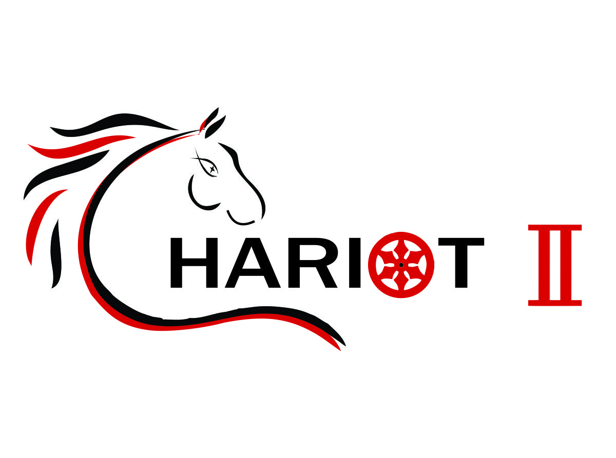
Bus Signage - Chariot mark 2
Want to win a job like this?
This customer received 11 signage designs from 2 designers. They chose this signage design from HollyBlue Studio as the winning design.
Join for free Find Design Jobs- Guaranteed
-
 A$140
A$140
-
 11 designs
-
 2 designers
Signage Design Brief
We have purchased a second hand bus (http://m8.i.pbase.com/o6/36/640536/1/103912338.vVmZYgQf.Bus2008MitsubishiFusoRosa29LBus007.jpg) that will be used in a non-profit capacity.
The bus will ferry students to Christian Surfer events, Christian school events, Red Cross Cadet events and be used by the general Christian community in our local coastal area.
We would like to have signage on the side of the bus that suggests the bus is a "chariot". An older bus, now too damaged to operate, was nick named "the chariot" and had a cartoon depiction placed on the side. The cartoon concept is outdated and we would like a design that has more of a logo feel with a clever combination of imagery.
Things to consider including
- coastal/surf region (http://www.worldvision.com.au/Libraries/ChristianEngagement/ChristianSurfersAustralia.gif)
- use of the red cross symbol (http://www.communities.wa.gov.au/PublishingImages/Cadets%20WA/cadets-australian-red-cross-logo.jpg)
- use of the Christian symbols (http://request.org.uk/wp-content/uploads/2013/07/LIFE-SYMBOLS-fish.jpg)
- colouring of red, black, grey and white
- integration of a chariot
- modern and even abstract design would be preferable to cheesy cartoon
Updates
This design is a gift for my Father. Have now involved him in the design processand these are now the preferences. Myapologies to anyone that has begun a design based on the old information. Only slight changes to design required.
Concepts to remain the same a before
- - Sign design for the side of a bus
- - Bus to be used for non profit events
- - Colouring of red, white, black and grey
- - Integrating a “wave” would still be appreciated
- - Christian fish symbol can still be integrated but is no longer essential
Things different to what was stated earlier
- - Red Cross symbol no longer needed
- - The words “Chariot 2” need to be fairly prominent
- - Preference is for the “2” to be written in Roman Numeral style
Dad’s comment was “if someone sees it for 2 seconds, they should be able to getwhat it is about”.
Added Tuesday, February 11, 2014
Target Market(s)
Locals in a coastal region
Suitable for the Christian and non christian audience
Industry/Entity Type
Non-Profit
Font styles to use
Look and feel
Each slider illustrates characteristics of the customer's brand and the style your logo design should communicate.
Elegant
Bold
Playful
Serious
Traditional
Modern
Personable
Professional
Feminine
Masculine
Colorful
Conservative
Economical
Upmarket
Requirements
Must have
- red
black
grey
white