ACPE Logo Rebrand
Want to win a job like this?
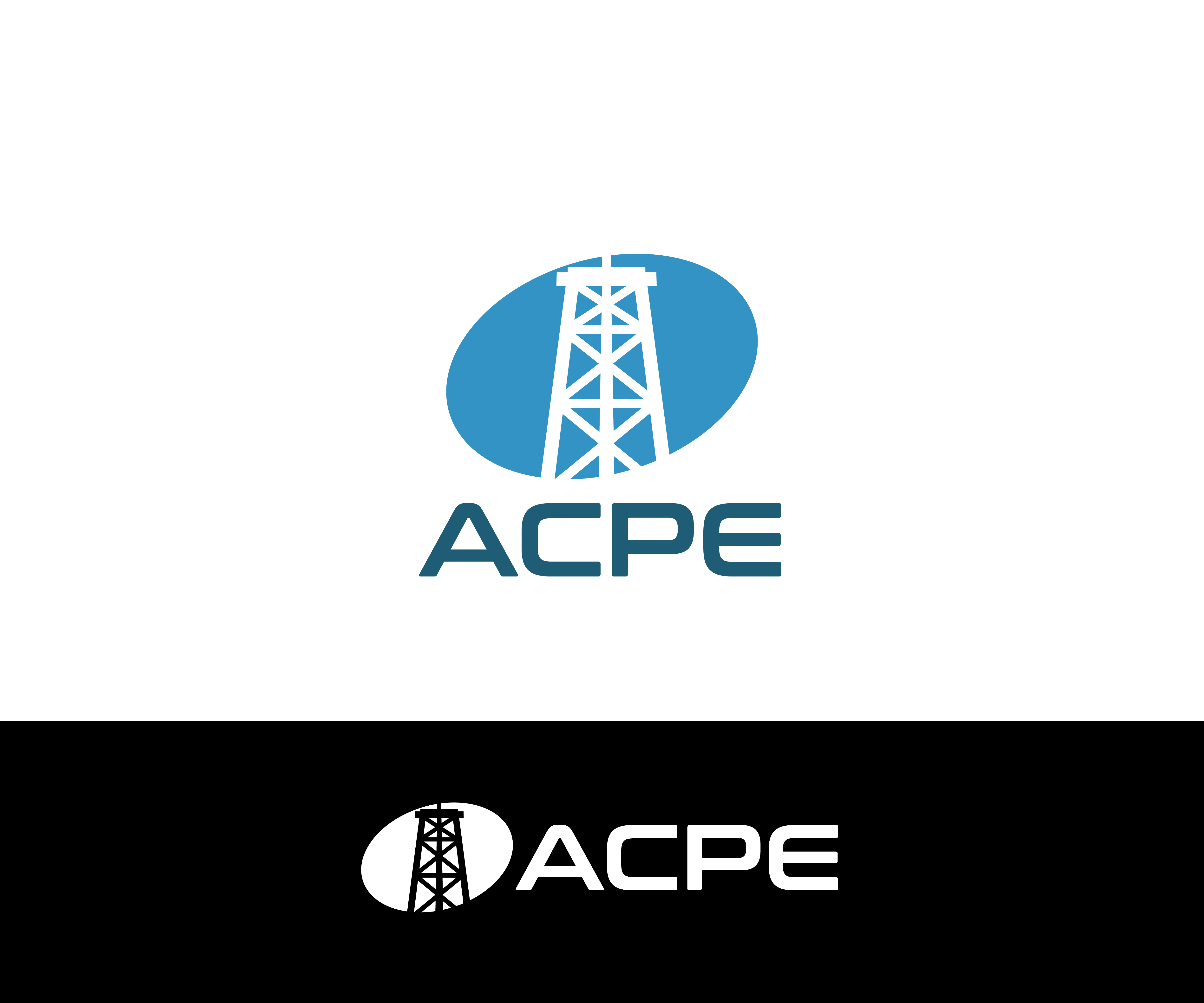
This customer received 19 logo designs from 7 designers. They chose this logo design from James J. as the winning design.
Join for free Find Design Jobs- Guaranteed
-
 US$110
-
 19 designs
-
 7 designers
Logo Design Brief
We already have a logo, but we are ready for a rebrand. ACPE is a company that takes old steel pipe (from oilfields) and retrofits it into other products (wine posts, horse corrals, fencing, structural supports, etc.)
While we like the oil derrick part of the logo, we feel that it should be incorporated (or blended) into the letters ACPE to make the logo more streamlined. We also like the colors (blue and orange) and don't want any changes here. We also created this logo nearly 20 years ago, so the oil derrick image is pretty dated and is probably also due for a refresh. Finally, would want a black and white version of the logo as well.
Target Market(s)
Our customers are farmers, ranchers, vineyards, and construction companies
Logo Text
ACPE (and incorporate in an oil derrick or something similar) -- do not want to spell out AC Pipe & Equipment, LLC anymore
Look and feel
Each slider illustrates characteristics of the customer's brand and the style your logo design should communicate.