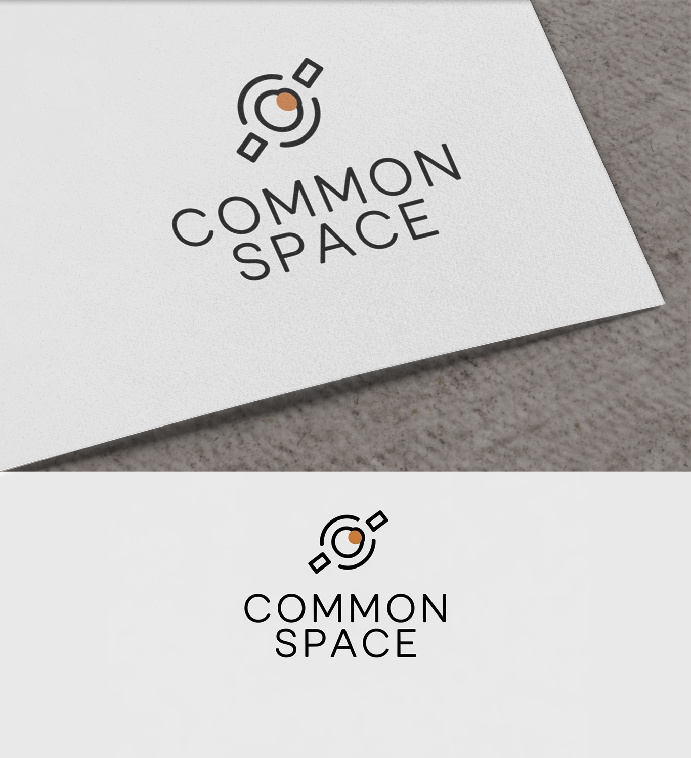
Common Space - Humanitarian satellite non-profit

Want to win a job like this?
This customer received 316 logo designs from 116 designers. They chose this logo design from Fiona sky as the winning design.
Join for free Find Design JobsLogo Design Brief
Common Space is a nonprofit Humanitarian and disaster response high-resolution imagery satellite constellation providing open data to humanitarians on the ground.
I'm looking for a recognizable logo, either scaled down or scaled up. It can contain the name 'Common Space' but having a stand-alone recognizable logo would be nice.
Target Audience - Humanitarian field workers, Humanitarian tech workers, and philanthropic donors
Style - Minimalist and modern, with clean lines and bold simplicity. well-balanced and visually recognizable, with an emphasis on flat design for versatility and digital compatibility.
Tone - we're looking to convey access, trust, and hope. Many space startup logos end up looking militaristic, which is NOT the vibe we're going for.
Colors - Keeping this fairly simple, no gradients please, and preferably no more than 3 colors.
Uploaded images are inspiration - not draft logos - some of them are from the industry, some are just designs, meant to show the style I'm looking for but please do not copy these.
Updates
Low design quality
Target Market(s)
Humanitarian field workers, Humanitarian tech workers, and philanthropic donors
Industry/Entity Type
Space, Satellites, Humanitarian aid and disaster response
Logo Text
Common Space
Logo styles of interest
Pictorial/Combination Logo
A real-world object (optional text)
Abstract Logo
Conceptual / symbolic (optional text)
Font styles to use
Colors
Designer to choose colors to be used in the design.
Look and feel
Each slider illustrates characteristics of the customer's brand and the style your logo design should communicate.
Elegant
Bold
Playful
Serious
Traditional
Modern
Personable
Professional
Feminine
Masculine
Colorful
Conservative
Economical
Upmarket
Requirements
Must have
- Logo, Simple, minimalistic, and refined. Able to be scaled up and down. Recognizable and not to be confused with other logos in the industry.
Nice to have
- Please put some thought into this. big fan of positive and negative space as well as well balanced logos.
Should not have
- No Saturn (circle with a ring around it) looking logos - no generic planet logos that just look like clip art -