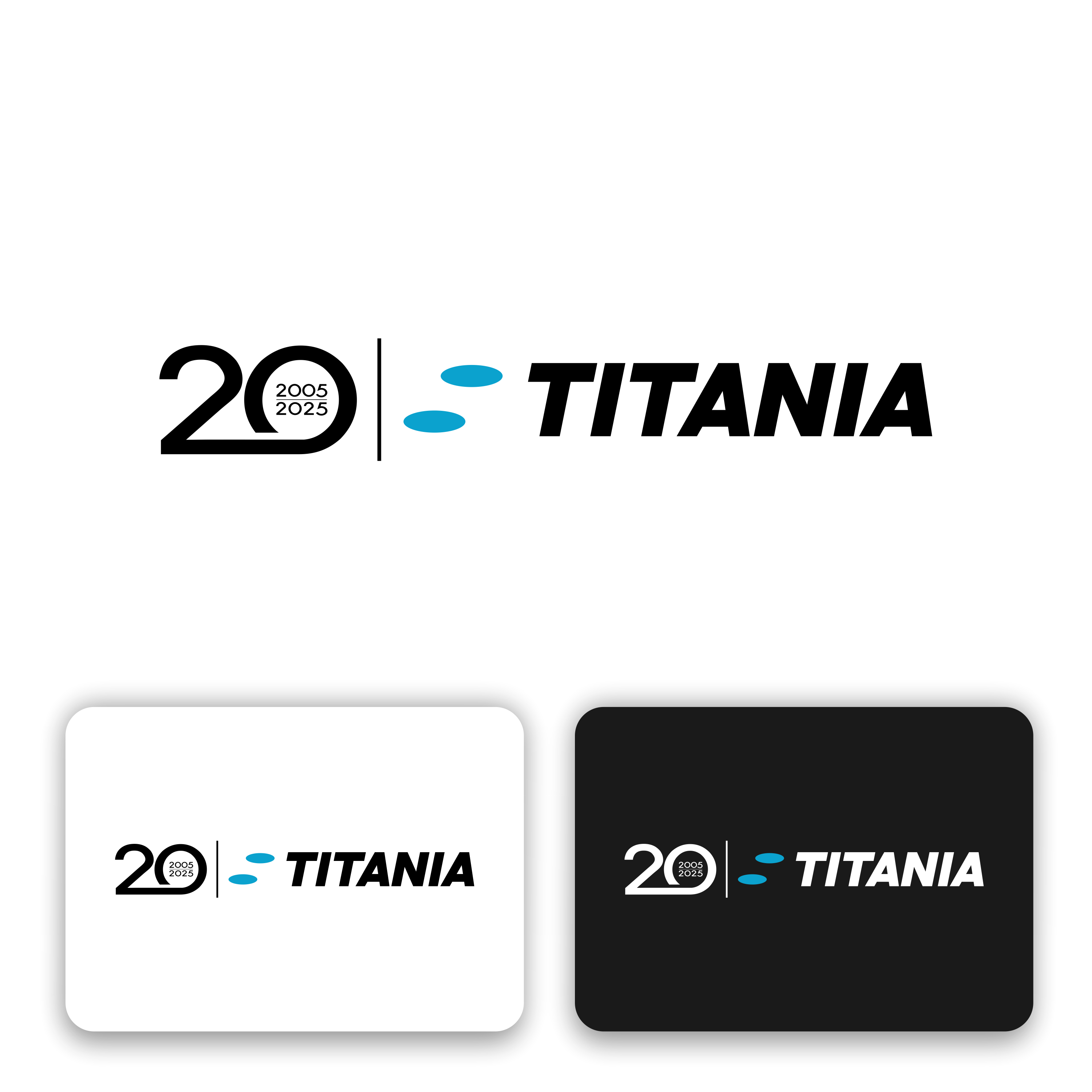
Real estate company 20 years anniversary

Want to win a job like this?
This customer received 145 logo designs from 60 designers. They chose this logo design from ArtAND_Studio as the winning design.
Join for free Find Design JobsLogo Design Brief
Titania is a real estate company from Sweden that was started 20 years ago. We want to celebrate the anniversary with a temporary logo. The logo will be used on the company website, on newsletters, email signatures etc. We want the number "20" to dominate the logo and "2005-2025" to be included somehow. The logo should only contain digits, we don't want the word "years" to be included in the logo. Our usual Titania logo (attached) should be included in the design, preferably but not necessarily separated from the temporary logo. See attached example from another Swedish real estate company (JM) for inspiration. The Geogrotesque font family could preferably be used, but it's not a must. The temporary logo should communicate seriousness, financial stability and strength.
Target Market(s)
Investors
Industry/Entity Type
Real estate
Logo Text
20, 2005-2025
Look and feel
Each slider illustrates characteristics of the customer's brand and the style your logo design should communicate.