Modernizing the Downeasters Chorus Logo
Want to win a job like this?
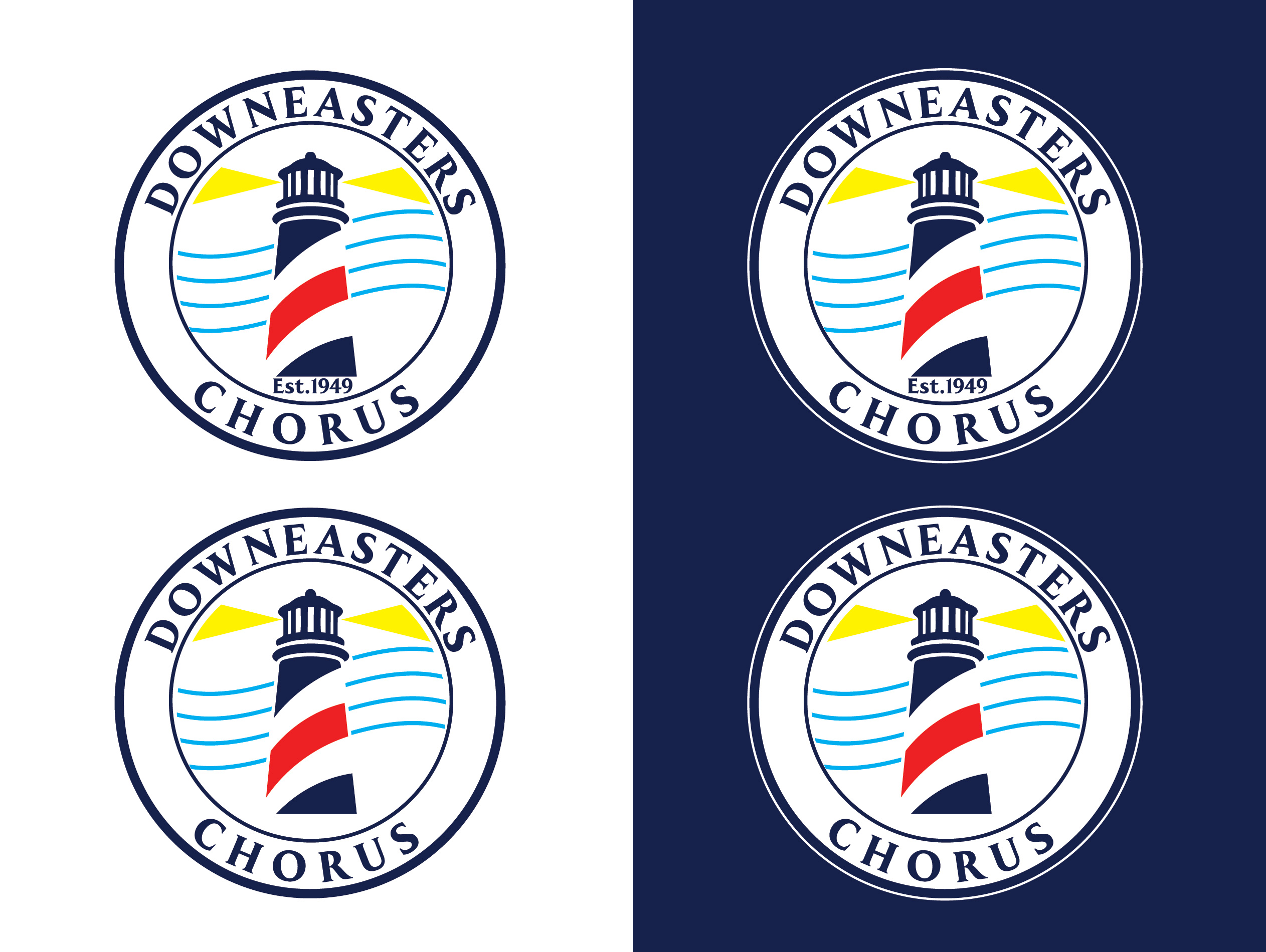
This customer received 100 logo designs from 39 designers. They chose this logo design from jika as the winning design.
Join for free Find Design Jobs-
 US$150
-
 100 designs
-
 39 designers
Logo Design Brief
The chorus wants to modernize this logo which is seen on their website - https://www.downeasters.org/ - with the goal being to modernize and simplify while keeping the lighthouse and barberpole aspects. Should be something that can be used easily in color or BW applications, good for printing and use on apparel. Color scheme is not set in stone but i wouldn't want to stray too far from what we have already. Consider we're also buying new outfits that will be keeping the black blue red scheme we've been using the last few years. Usually this involves black pants, blue oxford shirts, red ties, black vest or coat, red accents, similar for women. I would like to use the design technique called "negative space design" or "negative space logo design." - using the empty space around or within a design element to form additional shapes or complete the overall image. I've attached the current logo and this is also on the website. We also want to highlight perhaps that the chorus is over 75 years old, established in 1949 (maybe) - want to see options with/without this. also may be helpful to incorporate elements of the overall Barbershop Harmony Society logo - https://www.barbershop.org/ - which is fairly new. I don't like the faces in this, but the staff lines are nice. We don't want it to be "TOO' red white and blue and look TOO patriotic or TOO boring like a BANK. We do think it probably should contain a small portion of the yellow as in the original. Adding several examples of negative space logos and specifcially lighthouse options below.. needs to have a stripe and a lighthouse and ideally incorporate something musical to combine images and create the negative space logo
Target Market(s)
young singers
Industry/Entity Type
singing
Logo Text
Downeasters Chorus - (maybe est. 1949) but we're leaning away from that -
Look and feel
Each slider illustrates characteristics of the customer's brand and the style your logo design should communicate.
Elegant
Bold
Playful
Serious
Traditional
Modern
Personable
Professional
Feminine
Masculine
Colorful
Conservative
Economical
Upmarket
Requirements
Must have
- Negative space, minimalistic if possible
Nice to have
- incorporate any element of musical notes, staff - anything that might mirror the BHS barbershop.org logo
Should not have
- a barbershop pole - or scissors or anything having to do with haircuts - the lighthouse with a stripe is enough.