MosierData Logo Redesign Concept
Want to win a job like this?
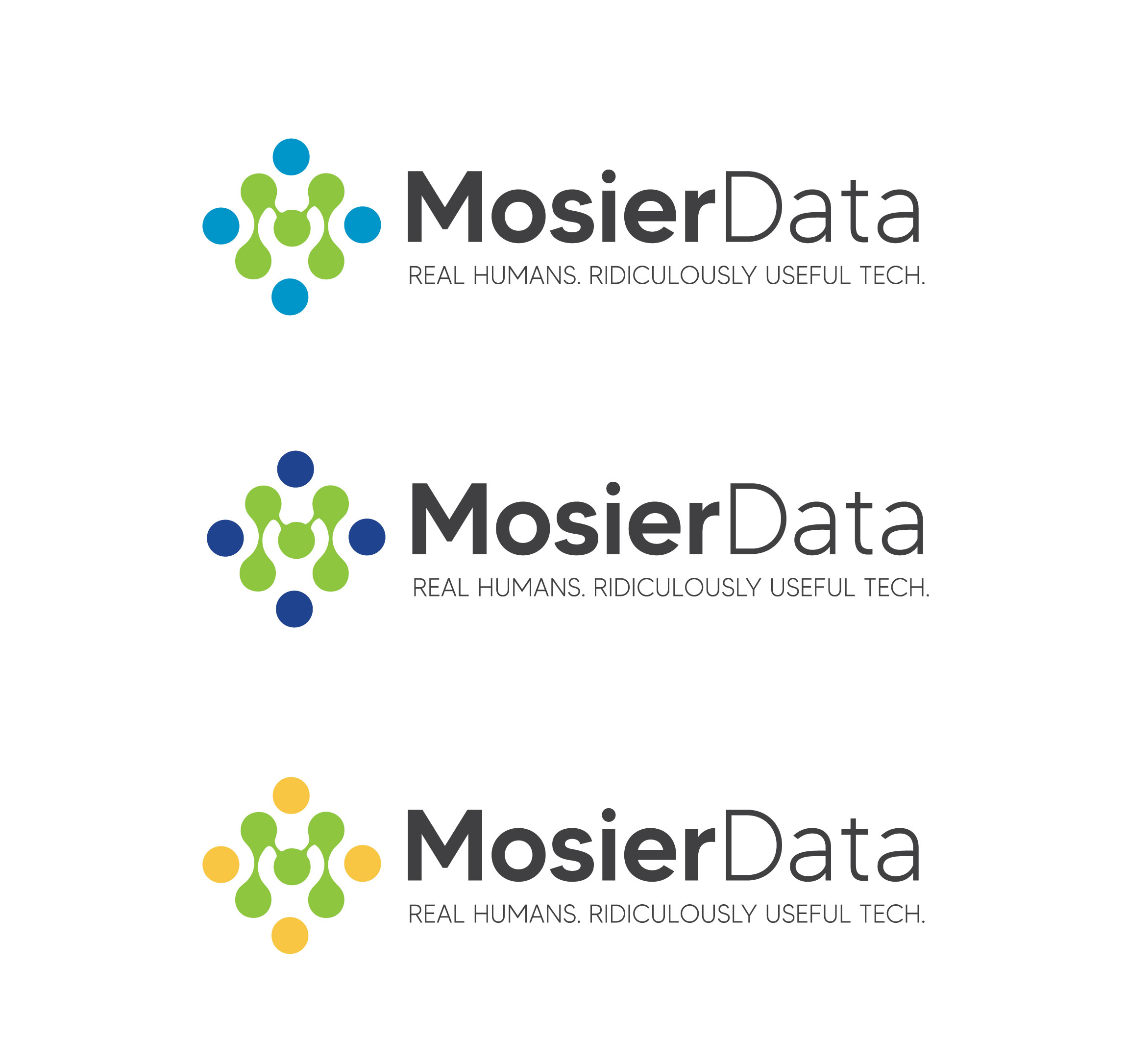
This customer received 88 logo designs from 36 designers. They chose this logo design from DesignerFarid as the winning design.
Join for free Find Design Jobs- Guaranteed
-
 US$179
-
 88 designs
-
 36 designers
Logo Design Brief
We’re refreshing the MosierData logo to reflect our evolution from a traditional web agency to an AI-first consulting and automation firm. The new identity should feel clean, modern, and human — with a nod to our past. We want to keep the current color palette but reimagine the symbol (currently RSS-style arcs) into something that communicates intelligence, simplicity, and connection — like a minimalist AI node pattern, neural mesh, or smart waveform.
The typography should be clean and timeless. The new tagline is “Real humans. Ridiculously useful tech.” and should be integrated naturally. The final logo should be flat (no gradients), versatile, and feel like a confident but humble brand rooted in tech with a heart.
Logo Text
MosierData | Real humans. Ridiculously useful tech.