BOP AMP LOGO
Want to win a job like this?
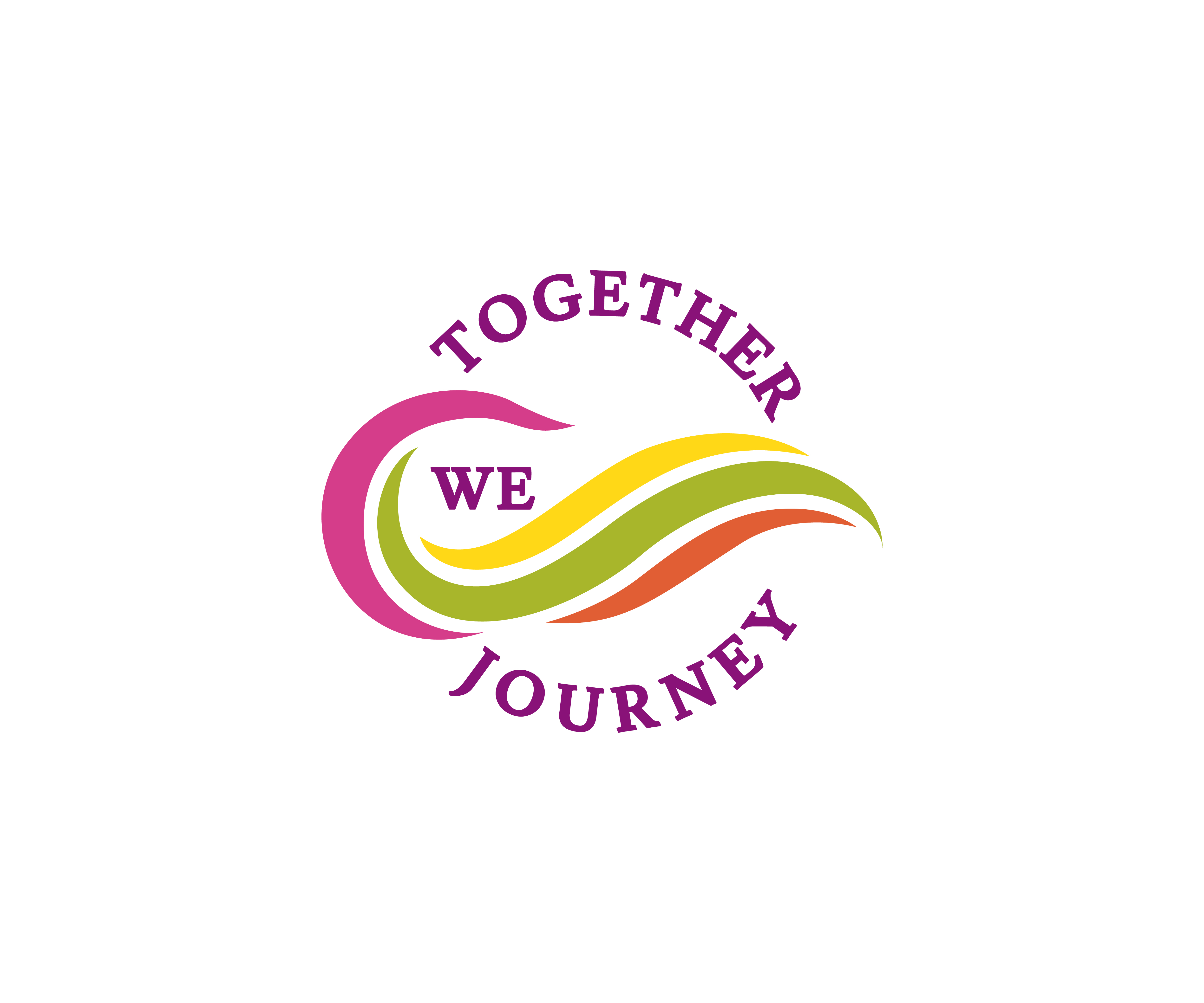
This customer received 11 logo designs from 3 designers. They chose this logo design from James J. as the winning design.
Join for free Find Design Jobs-
 NZ$120
-
 11 designs
-
 3 designers
Logo Design Brief
1. Logo is for an Amputee community organisation but rather than focusing on disability, would like to focus on ability and therefore would like a design that encompasses a wave with the colours in the logo representative of the umbrella national organisation (attached), and not the disabled figurines in the original. Rough idea provided in attachments with notes written on but open to other concepts.
2. Colours must match Amputee Society Logo (exact shades). Don't want it to look like a rainbow though please.
3. Theme/Overall Vibe/Feel: A mixture of the 2 attached photos. Flowy wave but clear writing as well, community organisation overall style.
4. Circle shape of the overall logo like the photo with drawn in notes but round the text around a circle top and bottom, either inside or outside (looking forward to your suggestions).
5. No calligraphy style fonts please. Clear writing.
6. Really important colours stay within the Amputee Society logo colours attached.
Our clients have the attached ideas but are also really keen to see what other people might come up with so are open-minded.
Thank you!
Logo Text
Together We Journey