Rockridge Logo: New Community Branding Needed
Want to win a job like this?
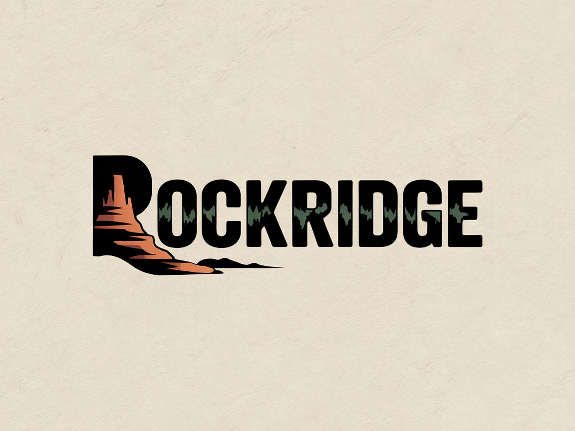
This customer received 214 logo designs from 87 designers. They chose this logo design from Hyanirana as the winning design.
Join for free Find Design Jobs- Guaranteed
-
 US$300
-
 214 designs
-
 87 designers
Logo Design Brief
Rockridge is a new residential neighborhood development located in the Amarillo, Texas Panhandle. Inspired by the rugged beauty of nearby landscapes like Palo Duro Canyon, this community will blend natural elegance with timeless design. The neighborhood emphasizes outdoor living, regional character, and connection to nature.
Objective:
Create a memorable and versatile logo that reflects the spirit of Rockridge — rugged yet refined, rooted in the Texas Panhandle, and evocative of the land’s natural elements. The logo should feel upscale but grounded, fitting for signage, branding materials, and digital platforms.
Design Inspiration:
Please refer to the attached image boards, which showcase the desired textures, materials, and tone. Visual references include:
Rock formations and desert terrain from the Panhandle (especially hoodoos and mesa lines)
Native grasses and yucca plants
Warm earth tones, especially rusted steel, sandstone, burnt orange, deep evergreen or pine green
Clean, timeless typography with a nod to heritage or Western fonts
Natural materials like weathered stone, corten steel, and native timber
Nighttime landscape lighting and carved/laser-cut metal patterns
Design Elements to Consider Including:
A stylized hoodoo or mesa rock formation, possibly inspired by Palo Duro Canyon
Desert plants like yucca or native grasses at the base of the rock
A clean layout that can scale well for large monument signage and small digital use
Tone & Feel:
Grounded
Sophisticated but natural
Heritage-rich
Warm and welcoming
Earthy and regionally rooted
Unique and custom-feeling font
Strong and legible—avoid overly generic serif or sans-serif styles
Could be slightly vintage or handcrafted in feel, but with a modern polish
The name “ROCKRIDGE” should stand strong on its own, even without the icon
Logo Use:
Needs to work well on signage, print materials, online branding, and merchandise
Scalable for both large entry signs and small digital applications
Should include a primary version (with full imagery) and a simplified version (just text or icon) for flexibility
Target Market(s)
Buyers who want to live in Amarillo, Texas. Homes will range from $250,000 and up.
Logo Text
Rockridge
Look and feel
Each slider illustrates characteristics of the customer's brand and the style your logo design should communicate.
Elegant
Bold
Playful
Serious
Traditional
Modern
Personable
Professional
Feminine
Masculine
Colorful
Conservative
Economical
Upmarket
Requirements
Must have
- Grounded, Sophisticated but natural, Heritage-rich, Warm and welcoming, Earthy and regionally rooted, Unique and custom-feeling font, Strong and legible—avoid overly generic serif or sans-serif styles, Could be slightly vintage or handcrafted in feel, but with a modern polish. The name “ROCKRIDGE” should stand strong on its own, even without the icon. Should include a primary version (with full imagery) and a simplified version (just text or icon) for flexibility.