Harvard Plate Design
Want to win a job like this?
This customer received 29 graphic designs from 11 designers. They chose this graphic design from dadaMEDIA as the winning design.
Join for free Find Design Jobs- Guaranteed
-
 US$100
-
 29 designs
-
 11 designers
Graphic Design Brief
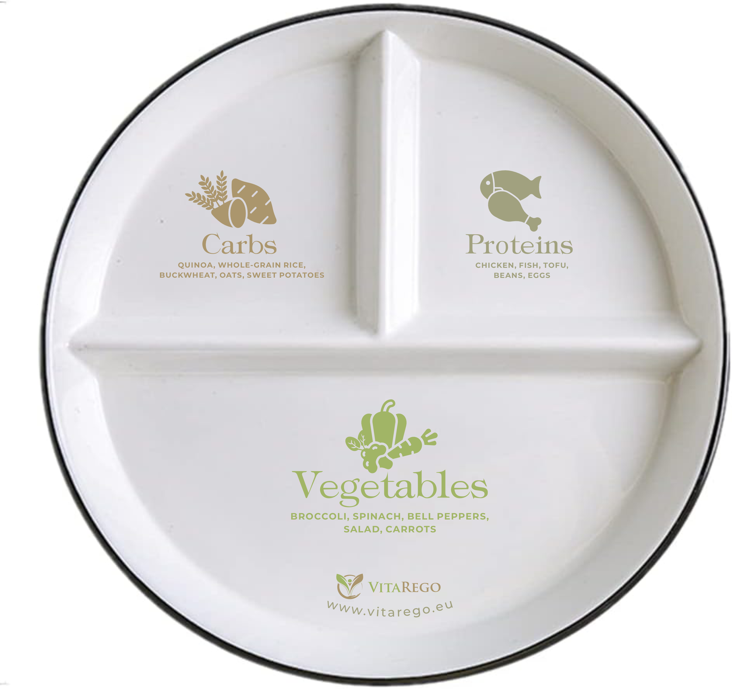
We are launching a product inspired by the Harvard Healthy Eating Plate, designed to help clients easily understand how to build a balanced meal.
We already have a physical producer for these plates — now we need an eye-catching, educational, and premium design to be printed directly onto the plates.
The design should visually guide users on what to put in each section, following the Harvard plate proportions:
1. Vegetables & fruits — large section (about 50%)
Label: "Vegetables" (main word in large clear font)
Subtitle/examples: "Broccoli, spinach, bell peppers, salad, carrots" (you can illustrate or use small icons)
Additional text: "vitarego.eu" (placed elegantly, not intrusive)
2. Whole grains or carbs — small section (~25%)
Label: "Carbs"
Subtitle/examples: "Quinoa, whole-grain rice, buckwheat, oats, sweet potatoes"
3. Proteins — small section (~25%)
Label: "Proteins"
Subtitle/examples: "Chicken, fish, tofu, beans, eggs".
Style suggestions:
Modern, minimalistic, yet friendly
Clear and readable typography
Soft, health-related color palette (e.g., greens for vegetables, beige/brown for carbs, blue or neutral for proteins)
Must be vector format (Adobe Illustrator — .ai file)
A subtle circular arrow or flow line to suggest the plate as part of an overall healthy lifestyle
Small leaf or natural motifs
A short motivational line like "Healthy plate, healthy you!" — if it fits elegantly
CMYK color mode (for print)
Clearly separated layers (texts, illustrations, outlines)
Updates
Low designer entries