Greek Yogurt Design
Want to win a job like this?
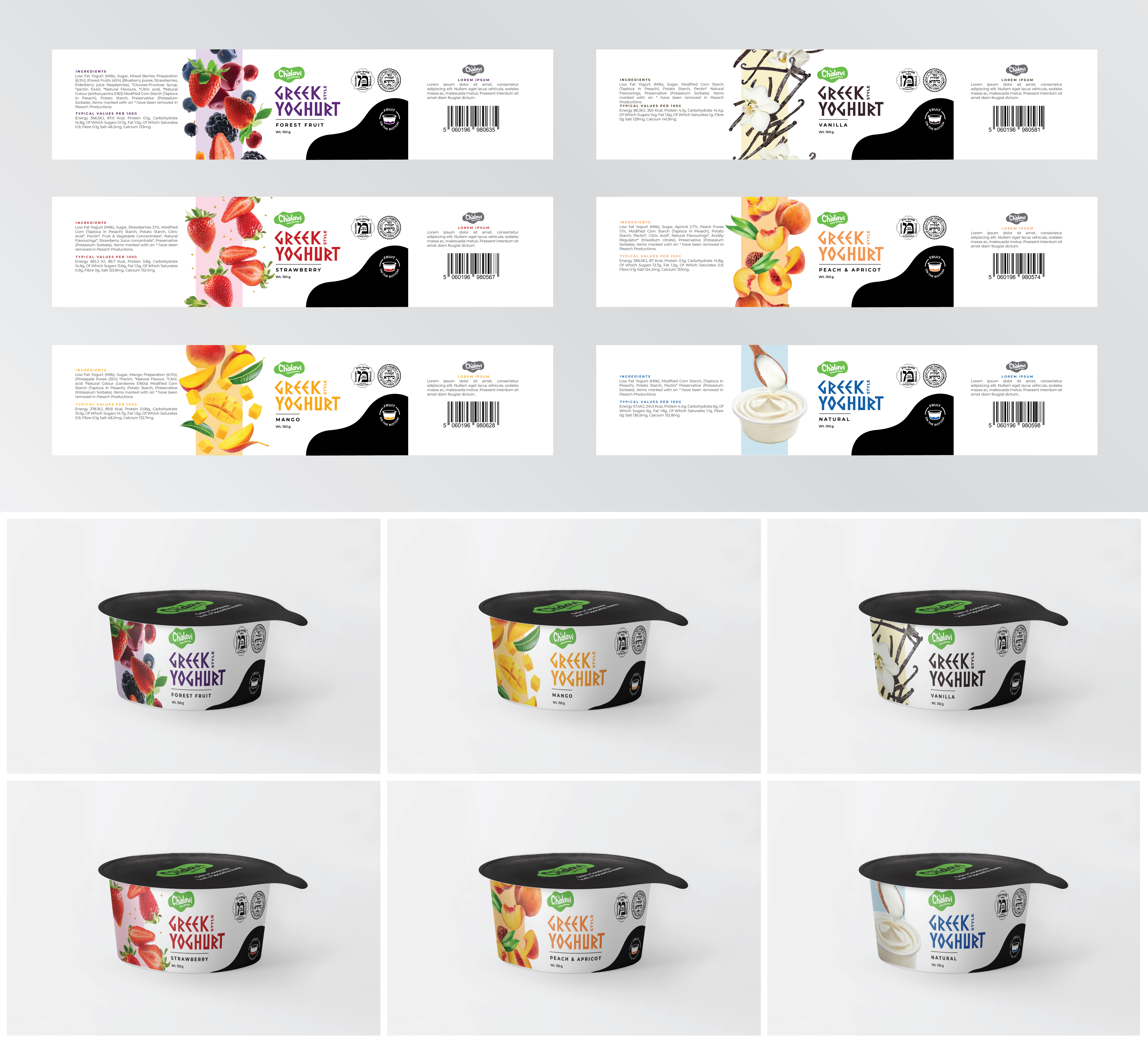
This customer received 114 graphic designs from 31 designers. They chose this graphic design from Limonero DG as the winning design.
Join for free Find Design Jobs- Guaranteed
-
 £380
£380
-
 114 designs
-
 31 designers
Graphic Design Brief
Design Brief – Premium Greek Yogurt Line (150g Pot)
Background
We are a small-to-medium dairy producer launching a new premium Greek yogurt range. This line will come in slightly larger pots than our standard yogurts, and we are targeting an upmarket clientele with a higher price point.
Product Details
Product: Greek Yogurt (fruit on the bottom, yogurt on top)
Flavours:
Natural
Strawberry
Forest Fruit
Peach & Apricot
Vanilla
Mango
Weight: 150g
Kosher Certification: 2 logos must be applied neatly (logos provided).
Lid: Standard universal lid (not flavour-specific).
Design Style
Clean, elegant, and premium feel (avoid clutter).
Should stand out as sophisticated compared to our standard range.
Visual hierarchy:
Brand & product type (Greek Yogurt) should be clear.
Flavour indicated with subtle but distinct cues (colour palette, fruit illustration/photography).
“Fruit on the bottom” message should be communicated simply.
Premium cues: minimalist typography, restrained colour palette, elegant fruit imagery.
References / Inspiration
Mehadrin Yogurt
– clean, bold, dairy-traditional.
Tims Dairy Greek Style
– natural, elegant design.
Chobani Greek Yogurt
– modern, colourful yet clean.
Deliverables
Pot sleeve / pot design (to wrap around container).
Must work across all flavours with colour/flavour variation.
Space for universal lid (do not design individual lids).
Application of 2 kosher logos in a balanced way.
Updates
Low designer entries
Gathering more feedback
Industry/Entity Type
Dairy
Colors
Designer to choose colors to be used in the design.
Look and feel
Each slider illustrates characteristics of the customer's brand and the style your logo design should communicate.