Logo creation for Business Process transformation consulting company
Want to win a job like this?
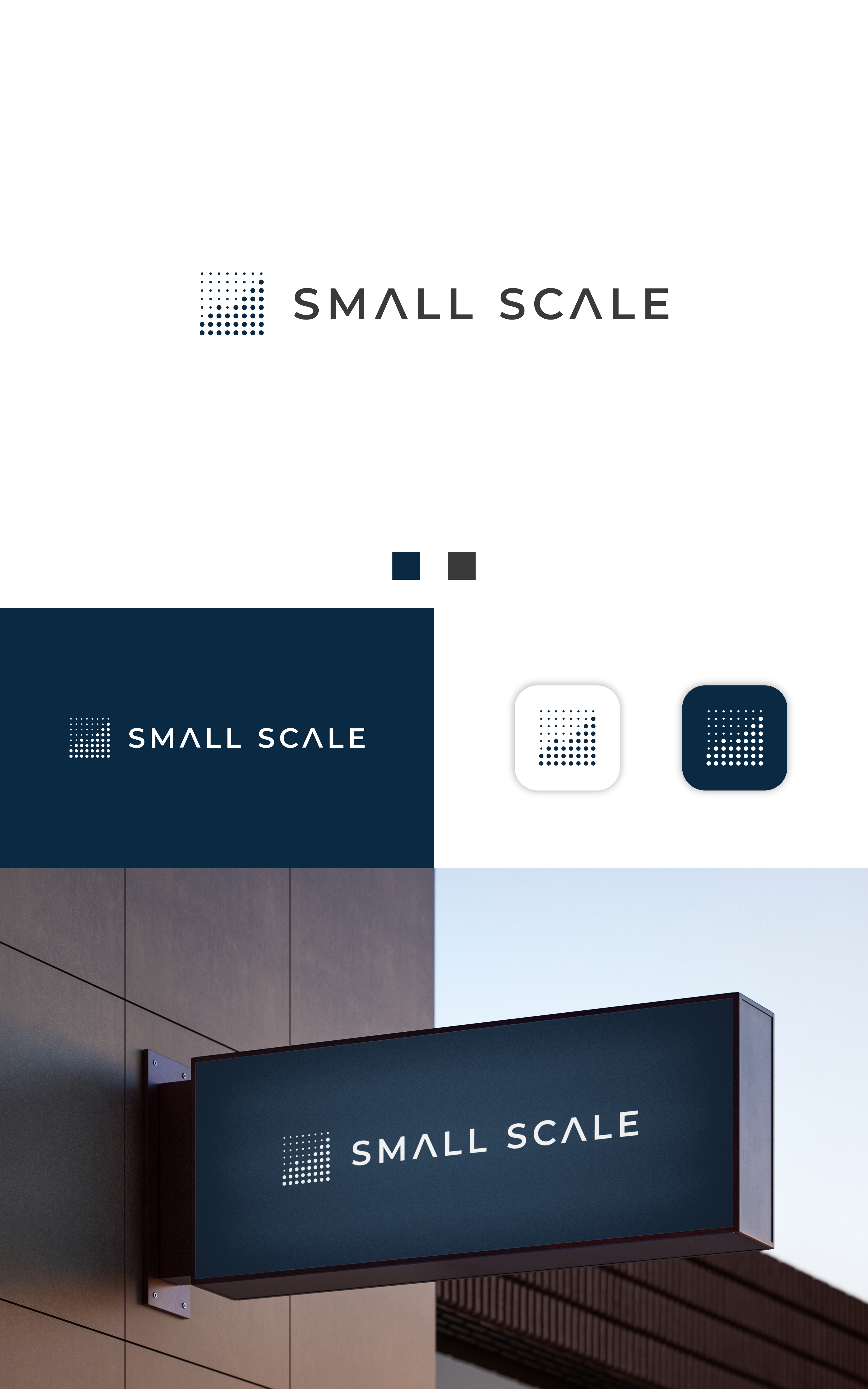
This customer received 83 logo designs from 46 designers. They chose this logo design from Dell_a.Design as the winning design.
Join for free Find Design Jobs-
 €110
€110
-
 83 designs
-
 46 designers
Logo Design Brief
The brand name is Small Ccale, written as two separate words. The website is smallscale.ch. Small Scale is a business process transformation and implementation consulting firm. We help organizations redesign and implement business processes so that regulatory compliance is achieved by design, not through bureaucracy. We are not an audit firm, not a technology vendor, and not an outsourcing provider. We are positioned as a premium, executive-level consulting partner working with CEOs, boards, and senior leadership.
The objective of the logo is to create a minimalist, executive-grade identity that visually reflects business process transformation, reconfiguration, and progress through small, structured change. The logo must include a graphic component that represents business process transformation, not technology, cybersecurity, or generic growth. The overall feel must be calm, precise, intelligent, trustworthy, and premium.
The wordmark must read Small Scale. The font should be clean, modern, neutral, and timeless, with a Swiss-style corporate feel. Decorative, playful, handwritten, or overly geometric fonts should be avoided.
The preferred color direction is deep blue (RGB 10, 42, 67), slate grey (RGB 58, 58, 58), and white (RGB 255, 255, 255), with accent red (RGB 213, 43, 30) allowed only in a very restrained way. High contrast, calm tones, and print-safe colors are required.
The logo must work in full color, black, and white (including inverted white on dark), and must remain clear and legible at small sizes such as favicon scale. It will be used on executive presentations, regulatory documents, and a corporate website, so it must feel credible in serious, regulated environments.
Final deliverables must include full-color, black, white, and icon-only versions of the logo, provided in SVG, AI or EPS, PNG with transparency, and print-ready PDF formats.
Target Market(s)
Corporations, Companies undergoing IPO processes
Industry/Entity Type
Consulting
Logo Text
Small Scale
Logo styles of interest
Pictorial/Combination Logo
A real-world object (optional text)
Abstract Logo
Conceptual / symbolic (optional text)
Character Logo
Logo with illustration or character
Wordmark Logo
Word or name based logo (text only)
Font styles to use
Other font styles liked:
- Inter, SF Pro, IBM Plex Sans
Colors
Designer to choose colors to be used in the design.
Look and feel
Each slider illustrates characteristics of the customer's brand and the style your logo design should communicate.
Elegant
Bold
Playful
Serious
Traditional
Modern
Personable
Professional
Feminine
Masculine
Colorful
Conservative
Economical
Upmarket
Requirements
Must have
- The logo must include both a wordmark and a graphic component that represents business process transformation. The transformation must be expressed through structure, change, reconfiguration, progression, or process logic — not through generic “growth” symbolism. The name must appear as “Small Scale”, written in standard case with capital S for both words. The typography must be clean, modern, neutral, and timeless, suitable for a premium executive consulting brand. The logo must work perfectly in full color, black, and white, including inverted white on dark. It must remain legible at very small sizes such as favicon scale. The final delivery must include SVG, AI or EPS, PNG (transparent), and print-ready PDF formats.
Nice to have
- A subtle sense of modularity, layers, sequencing, or reconfiguration in the graphic element is a plus. A layout that works both as a horizontal primary logo and a compact stacked version is desirable. A standalone icon-only version that still clearly feels like the brand is a plus. Visual balance between the words “Small” and “Scale” that avoids a rigid or overly symmetrical feel is welcome. A solution that feels Swiss, European, or architecturally precise is also a plus.
Should not have
- No arrows, bar charts, rockets, lightning bolts, or generic “growth” icons. No shields, locks, cyber, security, or IT-specific symbolism. No cartoon, playful, illustrative, or startup-style graphics. No loud, neon, or trendy gradient-heavy color schemes. No overly decorative, script, hand-drawn, or futuristic geometric fonts. No clichés commonly used in consulting or compliance branding. No visual language that feels like a tech product, SaaS startup, or audit firm