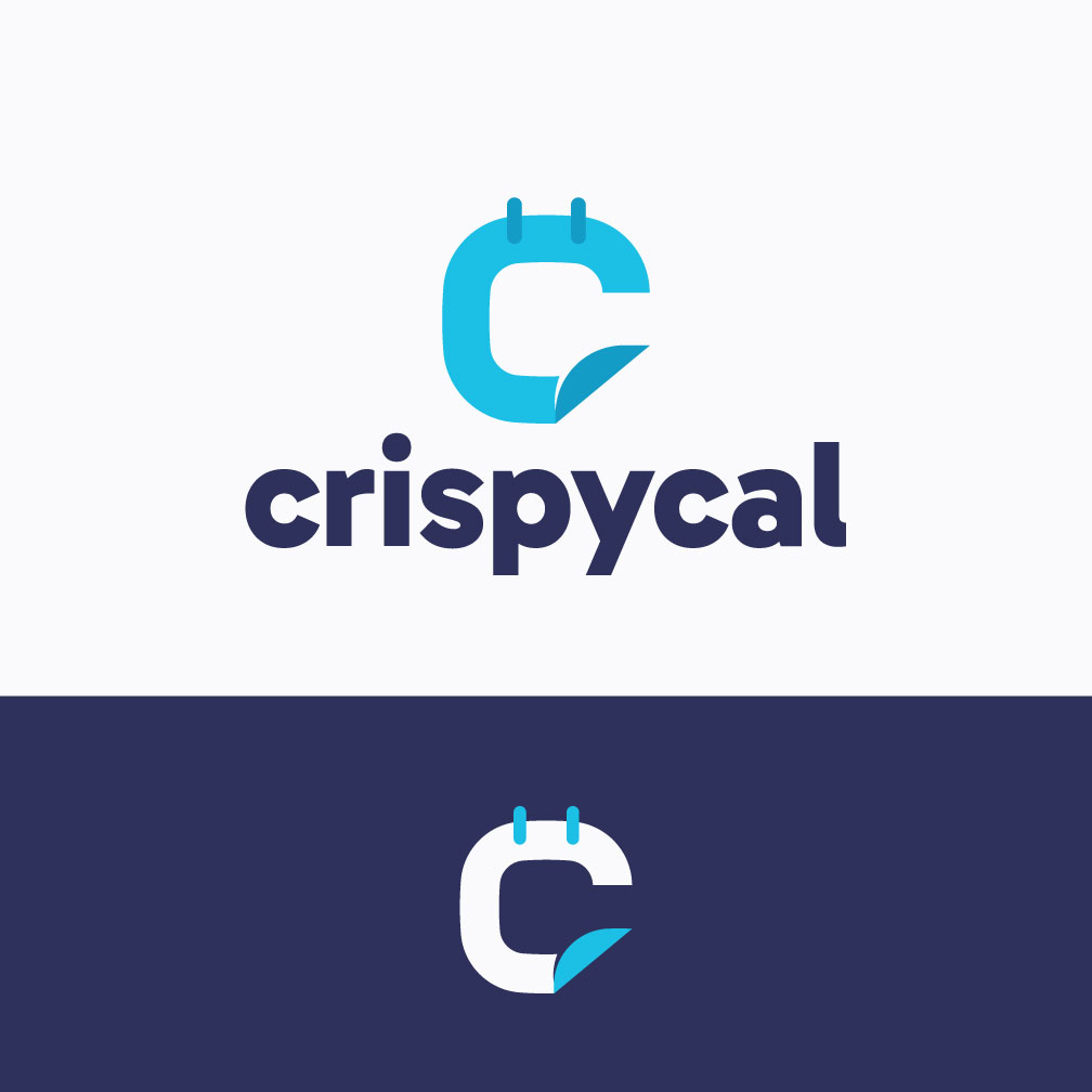
crispycal website logo for use in SaaS solution for booking peoples time
Want to win a job like this?
This customer received 10 logo designs from 3 designers. They chose this logo design from Franabanana as the winning design.
Join for free Find Design Jobs- Guaranteed
-
 A$120
A$120
-
 10 designs
-
 3 designers
Logo Design Brief
crispycal.com will be the website , its essentially a competitor to savvycal or calendly . the logo should feel comparable in quality and tone to modern SaaS brands like SavvyCal, Linear, Notion, or Vercel — simple, confident, and timeless rather than trendy.
Logo Design Brief – Crispycal
Brand name: Crispycal
Product: Modern calendar & scheduling SaaS (competitor to SavvyCal / Calendly)
Target audience: Professionals, founders, consultants, tech teams
Brand positioning: Premium, modern, clean, Silicon-Valley style
Overall Feel
The logo should feel clean, crisp, modern, and understated, with a premium tech-product aesthetic. Think effortless sophistication rather than playful or loud branding. \
Style & Inspiration
Minimalist and modern
Flat design (no gradients, bevels, or heavy effects)
Strong focus on clarity and balance
Subtle, confident — not trendy or gimmicky
Feels like a serious SaaS product people trust with their time
Icon Concept (Very Important)
The logo should ideally include:
a calendar of some sort if possible.
A simple abstract icon that can stand alone (for favicon, app icon, mobile, etc.)
The icon may subtly reference:
Time
Calendars
Overlapping schedules
Alignment / clarity
Precision
Preferred ideas (not mandatory):
Overlapping shapes (e.g. circles or rounded rectangles) to suggest availability alignment
A refined calendar motif without looking literal
Clever use of negative space
A subtle integration of a “C” form (optional)
Avoid literal clock faces, alarm clocks, or cartoon calendars.
Typography
Clean, modern sans-serif
Professional and legible at small sizes
No handwritten, playful, or overly rounded fonts
Wordmark should feel balanced and calm
Colour Preferences
Open to suggestions, but prefer:
Neutral tones
Black / charcoal / slate
Subtle accent colour (if used)
Must work perfectly in:
Black on white
White on dark background
Avoid loud or overly saturated colours
Usage Requirements
The logo must work well:
On a SaaS website header
As a favicon and app icon
In light and dark modes
In monochrome
Deliverables Expected
Primary logo (icon + wordmark)
Icon-only version
Black and white versions
SVG + PNG formats
Clean, scalable vector design
Logos to Avoid
Anything playful, childish, or cartoon-like
Overly complex illustrations
Generic calendar clip-art
Trend-heavy styles that won’t age well
Updates
Low design quality
Target Market(s)
Professionals, founders, consultants, and teams who use online scheduling tools (e.g. SavvyCal / Calendly alternatives) and value clean, modern, high-quality software.
Industry/Entity Type
Software / SaaS (Scheduling & Productivity)
Logo Text
crispycal (all lowercase)
Logo styles of interest
Emblem Logo
Logo enclosed in a shape
Pictorial/Combination Logo
A real-world object (optional text)
Abstract Logo
Conceptual / symbolic (optional text)
Wordmark Logo
Word or name based logo (text only)
Lettermark Logo
Acronym or letter based logo (text only)
Font styles to use
Colors
Designer to choose colors to be used in the design.
Look and feel
Each slider illustrates characteristics of the customer's brand and the style your logo design should communicate.
Elegant
Bold
Playful
Serious
Traditional
Modern
Personable
Professional
Feminine
Masculine
Colorful
Conservative
Economical
Upmarket
Requirements
Must have
- Clean, modern SaaS-style logo Professional and premium (Silicon Valley tech startup feel) All-lowercase text: crispycal Simple, highly legible wordmark Optional icon that works well as an app icon / favicon Works well on white and dark backgrounds Scales cleanly to very small sizes, based on a calendar or clock would be great!
Nice to have
- Minimal calendar-inspired icon or abstract mark Subtle sense of clarity, simplicity, or upward momentum Flat design (no heavy gradients, shadows, or textures) Icon that can be used independently from the wordmark Modern sans-serif typography
Should not have
- No mascots or cartoon characters No playful, childish, or novelty fonts No overly complex illustrations No busy or detailed calendar graphics No script or handwritten fonts No clip-art style icons