Design Brief – Quality Seal "ERDFREUND"/ “EARTHFRIEND” DEUTSCH / ENGLISH
Want to win a job like this?
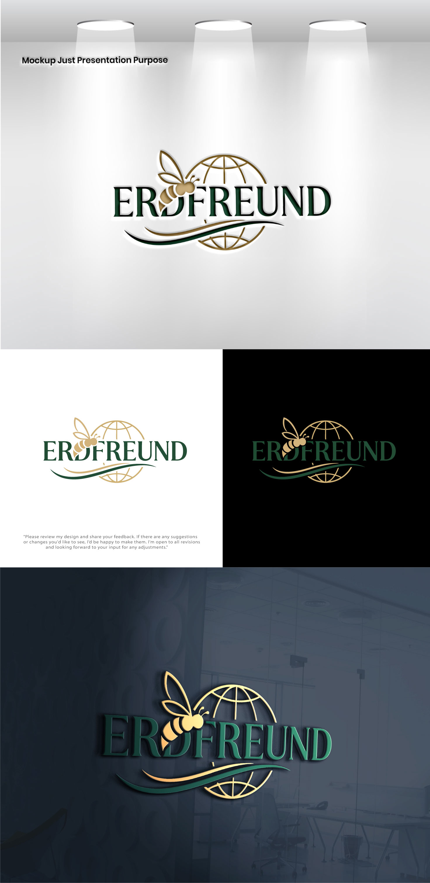
This customer received 141 logo designs from 71 designers. They chose this logo design from Pixel Signature as the winning design.
Join for free Find Design Jobs- Guaranteed
-
 €110
€110
-
 141 designs
-
 71 designers
Logo Design Brief
Zweck des Gütesiegels / Purpose of the Seal
DE: Das Gütesiegel „ERDFREUND“ zeichnet Unternehmen aus, die sich aktiv für Bienenschutz und Biodiversität engagieren – insbesondere durch das Platzieren von Bienenvölkern und die Unterstützung nachhaltiger Bienenschutzmaßnahmen.
EN: The “ERDFREUND” quality seal is awarded to companies that actively contribute to bee protection and biodiversity, especially through the placement of bee colonies and the support of sustainable bee protection initiatives.
Zielgruppe / Target Audience
DE: Unternehmen (B2B & B2C), Kund:innen, Mitarbeiter:innen, Partner sowie Öffentlichkeit und Medien.
EN: Companies (B2B & B2C), customers, employees, partners, as well as the general public and media.
Kernaussage / Core Message
DE: Dieses Unternehmen übernimmt Verantwortung für die Erde und ihre Bestäuber.
EN: This company takes responsibility for the Earth and its pollinators.
Gestaltungselemente / Visual Elements
DE:
• Weltkugel – globale Verantwortung
• Biene als Satellit – subtil, intelligent
• Schriftzug „ERDFREUND“ – klar integriert
• (Optional) Schützende Hände – Fürsorge & Bewahrung
EN:
• Globe / Earth – global responsibility
• Bee as a satellite – subtle and intelligent
• Typography “ERDFREUND” – clearly integrated
• (Optional) Protective hands – care and stewardship
Stil & Tonalität / Style & Tone
DE: Nobel, dezent, hochwertig, zeitlos. Keine verspielte oder kindliche Darstellung.
EN: Noble, understated, high-quality, timeless. No playful or childish elements.
Farbe & Anwendung / Color & Application
DE: Muss in Farbe und Schwarz/Weiß funktionieren. Gut erkennbar in kleinen Größen.
EN: Must work in color and black & white. Clearly recognizable at small sizes.
Marken-Kompatibilität / Brand Compatibility
DE: Passend zur Bienenzentrale, ergänzend zur bestehenden Markenwelt. (LOGO beigefügt)
EN: Visually aligned with the Bienenzentrale brand, complementary to existing branding. (LOGO attached)
Referenzen / Inspiration
DE: Anmutung wie UNICEF oder internationale NGO-Gütesiegel.
EN: Comparable in tone to UNICEF or international NGO certification seals.
Form & Flexibilität / Shape & Flexibility
DE: Bevorzugt rund oder Badge-artig. Standalone & kombinierbar.
EN: Preferably circular or badge-like. Works standalone and alongside logos.
Erwartetes Ergebnis / Deliverables
DE:
• Farb- & Schwarz/Weiß-Version
• Kurze Erläuterung
EN:
• Color and black & white versions
• Short design rationale
Logo Text
ERDFREUND