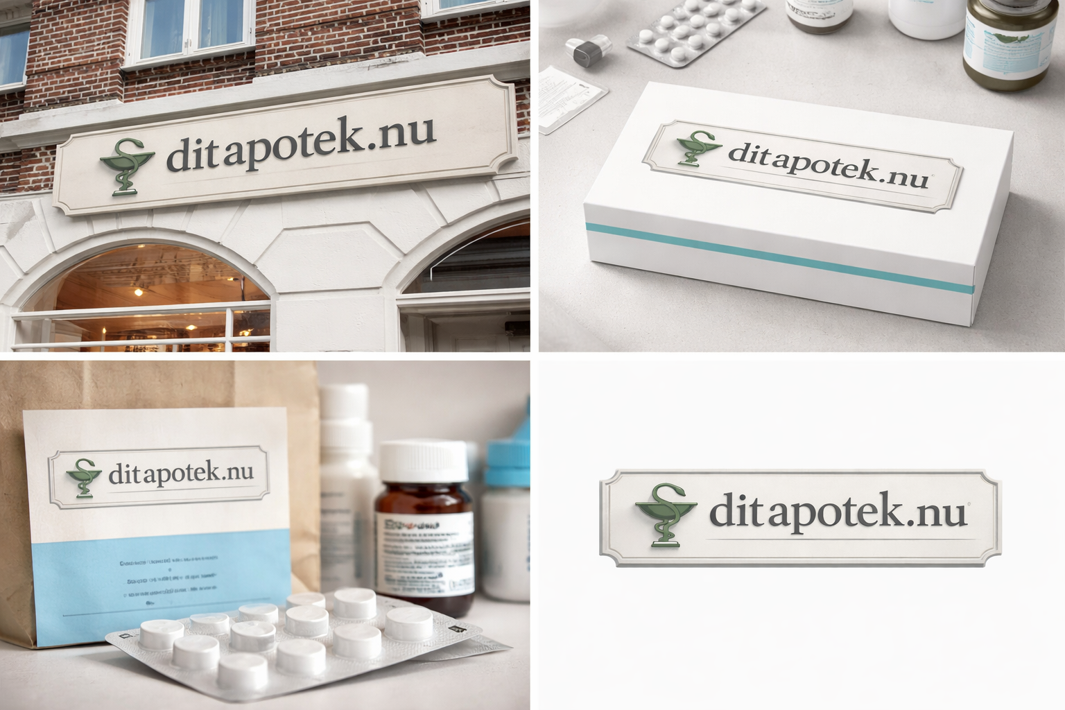
Logo Design for Danish Online Pharmacy Inspired by Traditional Apotek Signage
Want to win a job like this?
This customer received 217 logo designs from 101 designers. They chose this logo design from md_samim_mia as the winning design.
Join for free Find Design Jobs- Guaranteed
-
 S$150
S$150
-
 217 designs
-
 101 designers
Logo Design Brief
The logo must align visually with traditional Danish brick-and-mortar pharmacies (Apotek), which share a highly recognizable and consistent typographic style across Denmark.
Physical pharmacies in Denmark typically feature:
Strong serif typography
Dimensional or slightly embossed lettering
Neutral, muted color palettes
Clean, architectural presentation
A formal, authoritative tone
The objective is to create a logo for a Danish online pharmacy that feels like a natural extension of this established visual system.
It should:
Immediately signal “Danish pharmacy”
Feel legitimate and regulated
Resemble traditional Apotek signage in style
Avoid looking like a tech startup or wellness brand
Maintain simplicity and Scandinavian restraint
The logo should look as if it could realistically appear on a physical pharmacy facade in e.g. Copenhagen, while functioning effectively in a digital environment (website, mobile, packaging, prescription labels).
Target Market(s)
Primary Market: Patients residing in Denmark who prefer ordering medicines online rather than visiting a physical pharmacy branch. These customers already trust traditional Danish pharmacies . Value legitimacy and regulatory compliance Expect high standards of safety and professionalism Want convenience without sacrificing trust. May include elderly, families, and chronically ill patients Core Motivation: Easy access to medicines with the same level of trust and credibility as a physical Danish pharmacy. Emotional Drivers: Security Familiarity Danish reliability Convenience Professional healthcare standards
Industry/Entity Type
Retail pharmacy
Logo Text
ditapotek.nu
Logo styles of interest
Pictorial/Combination Logo
A real-world object (optional text)
Character Logo
Logo with illustration or character
Lettermark Logo
Acronym or letter based logo (text only)
Font styles to use
Other font styles liked:
- Trajan Pro / Adobe Caslon / Baskerville
Colors
Colors selected by the customer to be used in the logo design:
Look and feel
Each slider illustrates characteristics of the customer's brand and the style your logo design should communicate.
Elegant
Bold
Playful
Serious
Traditional
Modern
Personable
Professional
Feminine
Masculine
Colorful
Conservative
Economical
Upmarket
Requirements
Must have
- The logo must clearly replicate the established visual language of standardized Danish brick-and-mortar pharmacies (Apotek).
Nice to have
- While strict alignment with the standardized Danish pharmacy aesthetic is mandatory, creative interpretation within that framework is encouraged such as Subtle refinements of classic serif typography, Modern simplification of dimensional signage effects, Elegant spacing and proportion adjustments, Sophisticated typographic hierarchy between “mit” and “apotek”, Discreet architectural framing elements (e.g., plaque, signboard, subtle border), Controlled depth, shadow, or relief effects inspired by physical signage
Should not have
- Color, Elaborate or decorative color palettes, Bright, vivid, or neon colors, Strong gradients, Trend-based color combinations, High-contrast tech-style palettes