

 Refresh
Definedly Different - Neuro-affirming career coaching
Want to win a job like this?
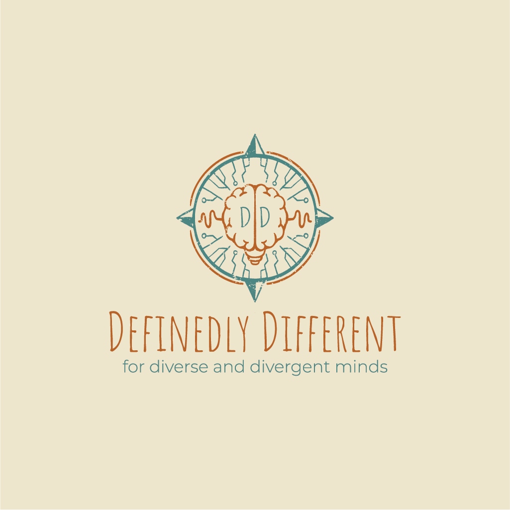
This customer received 13 logo designs from 5 designers. They chose this logo design from Jerwin Intac as the winning design.
Join for free Find Design Jobs
-
 US$110
-
 13 designs
-
 5 designers
Logo Design Brief
I am looking for a logo for my Neuro-affirming career coaching business, Definedly Different, a boutique career guidance and coaching service tailored specifically for neurodivergent and differently wired individuals who struggle to fit conventional pathways.
Some ideas for the logo include elements like a brain, a lightbulb, a compass, "brainwaves", some sort of pathway/map element (like a subway map with stations, stops, different lines etc. something that matches the tone of being different by design, striking yet somewhat curious or peculiar.
Colour palette oranges and teals, "butchers paper" coloured background. more muted and slightly boho/vintage look. Classy but distinct and not conventional corporate feel.
The logo would ideally be able to combine these elements from the coaching process stages and be able to be "layered" to create the overarching final logo, with each stage's individual elements able to be separately used or stacked with other elements.
Stage 1 — Brain Core Minimalist brain outline only. Represents identity, cognition, and self‑awareness.
Stage 2 — Idea Spark Brain from stage 1 turns into a brain‑shaped bulb with glowing "DD" filament. Symbolises ideas, interests, thoughts, and feelings. Warm amber glow introduces emotional warmth and curiosity.
Stage 3 — Pathways Map Introduces minimalist teal pathways map behind the brain/lightbulb with orange/cream circular nodes (like on a train network/subway map with multiple intersecting routes). Symbolises routes, waypoints, and markers along the journey. Expands the composition outward, showing exploration. Stage 4 — Insight /Brain Waves Adds teal brainwave lines flowing through/around the bulb and eminating "infront" of the network map from stage 3 behind. Represents psychometric insight and deeper research. Suggests rhythm, motion, and cognitive depth.
Stage 5 — Compass Direction Adds teal compass ring with four cardinal points around the lightbulb/brain. Represents orientation, clarity, and decision‑making. Grounds the system visually and conceptually.
Stage 6 — Articulation
Integrate the wordmark Definedly Different below the logo with catchphrase "for diverse and divergent minds" below. Represents voice, clarity, and self‑definition. Marks the moment of articulation — the brand’s verbal identity. Stage 7 — Integration Zooms out and Combines all elements: bulb, brainwaves, pathways, compass, and wordmark. Represents alignment, synthesis, and full identity expression. Serves as the hero mark for the complete Definedly Different system
Target Market(s)
Highschool aged leavers, university students and mid-career changers - neurodivergent/alternative/highly intelligent
Industry/Entity Type
Education, Career Coaching
Logo Text
Definedly Different "For diverse and divergent minds"
Logo styles of interest
Pictorial/Combination Logo
A real-world object (optional text)



Abstract Logo
Conceptual / symbolic (optional text)



Font styles to use
Other font styles liked:
- Handwriting font or typewriter font
Colors
Colors selected by the customer to be used in the logo design:
Look and feel
Each slider illustrates characteristics of the customer's brand and the style your logo design should communicate.
Elegant
Bold
Playful
Serious
Traditional
Modern
Personable
Professional
Feminine
Masculine
Colorful
Conservative
Economical
Upmarket
Requirements
Must have
- Colour palette is soft yet bright and warm/welcoming (oranges and teals), striking visual image for the logo, clean text
Nice to have
- inverted versions of colours for different print materials, "hand drawn" image and text elements providing morerustic style, "DD" or "dd" woven into the image part of the logo itself as a sort of "easter egg", text below image to have Definedly Different (and then also below that the catchphrase "for diverse and divergent minds"
Should not have
- not corporate vibe, not standard or boring