

 Refresh
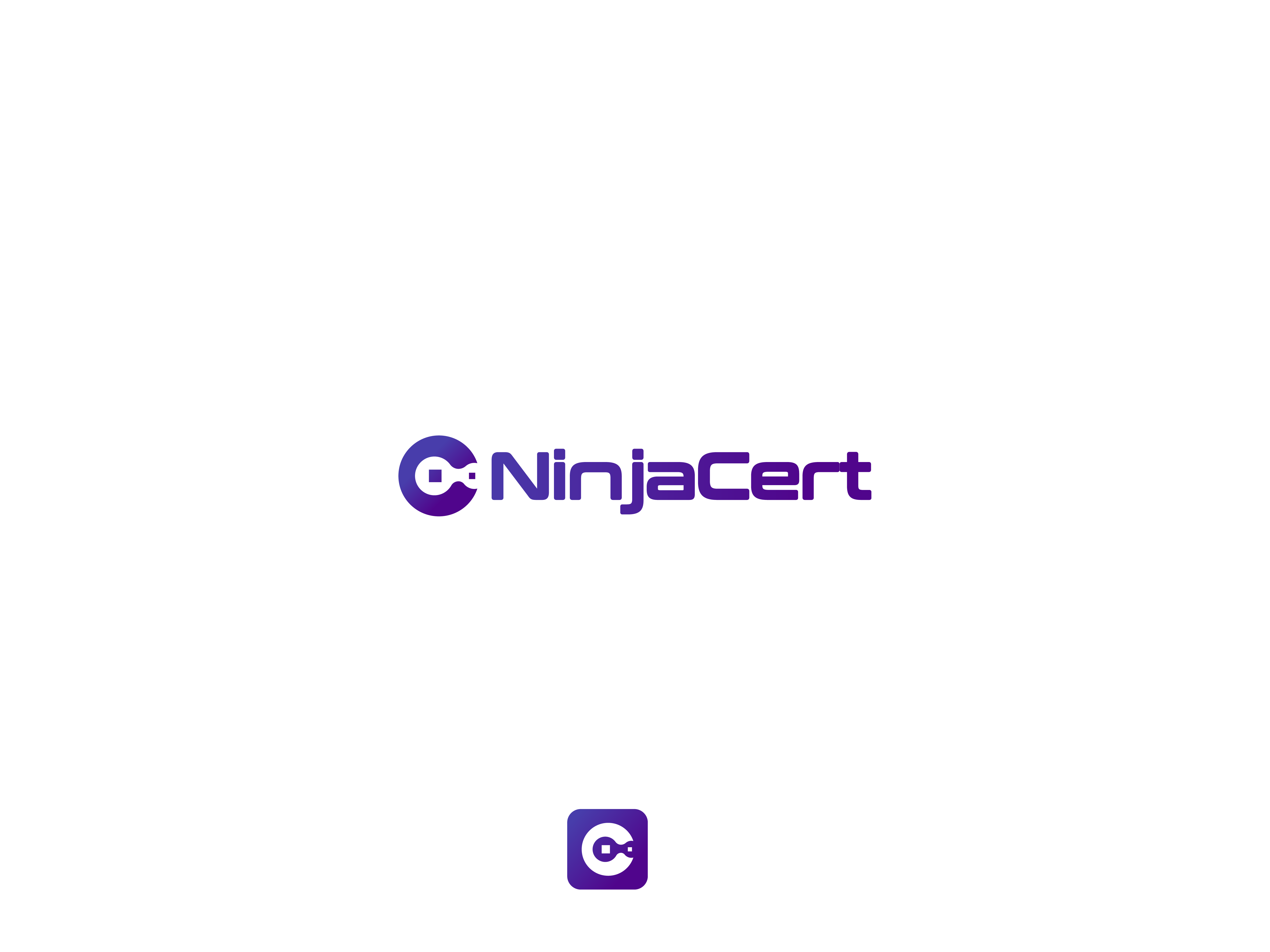
NinjaCert Logo/Branding Design
Want to win a job like this?
This customer received 491 logo designs from 184 designers. They chose this logo design from AbrinaDesign as the winning design.
Join for free Find Design Jobs
- Guaranteed
-
 US$150
-
 491 designs
-
 184 designers
Logo Design Brief
NINJACERT, LLC
Logo & Brand Identity Design Brief
LOGO & BRAND IDENTITY REDESIGN
Prepared for crowdsourced designers (DesignCrowd) · July 8, 2026
PROJECT AT A GLANCE
Project: NinjaCert Logo/Branding Design
Company: NinjaCert, LLC — NinjaCert.com
Deliverable: Redesigned logo system: horizontal wordmark, vertical/square hero mark, favicon, and B&W version — in light & dark mode
Primary color: Brand purple #50058C (RGB 80·5·140) — baseline anchor
Files: Full vector package (AI/EPS/SVG) + transparent PNGs + favicon sizes
1. ABOUT NINJACERT
NinjaCert is an online IT-certification study platform that is actually affordable. It runs on a subscription model with two plan tiers and helps people prepare for and pass real IT certification exams. The platform gives subscribers practice tests, study guides, flash cards, and competency/readiness analysis — all built to mirror the real exam experience, by people who have actually sat these exams.
NinjaCert currently supports 56 exams across 8 providers: CompTIA, ISC2, ISACA, EC-Council, Microsoft, Cisco, AWS, and Google. It is a single-member LLC — a lean, independent brand competing against much larger names, so the identity needs to punch above its weight and look genuinely trustworthy.
2. TARGET MARKET
The people studying on NinjaCert are motivated adults investing in their careers. They are discerning about where they spend both money and study time, and the brand needs to earn their confidence at a glance.
- Aspiring and current IT professionals studying for certifications (entry-level through advanced/security and cloud).
- Career-changers and students breaking into IT who are price-sensitive but serious about passing.
- Mostly 18–45, comfortable with technology, and they judge credibility fast — a cheap or 'AI-generated' looking brand makes them doubt the product.
- A secondary audience: IT content creators / influencers who may partner with NinjaCert and show the logo to their followers, so the mark must look sharp on other people's channels, thumbnails, and merch.
3. COMPETITORS & DESIGN REFERENCES
NinjaCert competes in the IT-cert prep space against creator-led brands, dedicated test engines, and large course platforms. Two competitor identities to look at for quality reference (not to copy):
- CBT Nuggets — clean, modern, confident tech branding. This is the polish level to aim for.
- MeasureUp — a professional, credible test-prep identity that signals reliability.
Other names in the space for context include Dion Training, Professor Messer, Boson, Udemy, and Pocket Prep. The takeaway: our current logo looks less professional than these, and the redesign needs to close that gap.
4. WHAT SETS NINJACERT APART
- Affordability without feeling cheap — genuinely low-cost prep, which makes a premium-looking brand even more important so 'affordable' doesn't read as 'low quality'.
- Built to mirror the real exam, created by people who have actually taken these certifications — authenticity and credibility are core.
- Breadth — one platform, 56 exams across 8 major providers, with practice tests, study guides, flash cards, and readiness analysis in a single subscription.
- The 'ninja' idea — mastery, focus, precision, and quiet confidence. That's the personality the mark should capture (without being a cartoon).
5. DESIGN HISTORY & THE PROBLEM TO SOLVE
NinjaCert already has a live identity: a ninja-themed mascot/character plus a 'NinjaCert' text wordmark in the top-left of the site, and a ninja-styled hero image. It uses the brand purple #50058C against dark backgrounds and supports both light and dark website themes.
What's wrong with it:
- It looks too 'AI-generated' and not quite professional enough — the single most important thing to fix. It needs to look like a real, established brand.
- Legibility in light mode is broken: the deep purple (#50058C) is so dark it blends into the black elements, so the logo and the word 'NinjaCert' are hard to read on light backgrounds.
- The mark does not currently hold up cleanly across the different placements the site needs (small favicon, top-left bar, large hero).
Bottom line: keep the ninja DNA and the purple, but deliver a cleaner, more credible, professionally-executed identity that is unmistakably readable in both light and dark modes.
6. WHY WE'RE DOING THIS (PROJECT MOTIVATION)
This is a brand refresh / redesign of an existing identity — not a brand-new company. The goal is to raise the professionalism of the brand and fix real usability problems (contrast and legibility) that are undermining trust with paying and prospective subscribers, while preserving what already works: the ninja concept and the brand purple.
7. KEY MESSAGE & BRAND PERSONALITY
The logo should communicate, at a glance: this is a credible, modern IT study platform run by people who know their stuff — and it should feel like a ninja: sharp, focused, precise, quietly confident.
Personality keywords:
- Modern & techy — clearly an IT/tech product, current and clean.
- Ninja-referenced — the artwork MUST reference something ninja-related. It does not need a cartoony ninja character; a subtle, clever nod (mask, shuriken, blade, stealth/motion, negative space) is very welcome. Designers are encouraged to explore anywhere on the range from a subtle motif to a distinct iconic mark.
- Professional & trustworthy — looks established and worth paying for; no 'AI slop.'
- Bold & confident, yet approachable — memorable and encouraging for people under exam stress.
8. BUSINESS OBJECTIVES
- Increase trust and perceived quality so more visitors convert to paid subscriptions.
- Fix legibility so the brand is clearly readable in both light and dark modes on every device.
- Give NinjaCert a versatile, professional mark that looks great when content creators show it to their audiences (a core marketing channel).
- Establish a consistent, reusable logo system for the site, favicon, documents, and future merch.
9. DESIGN REQUIREMENTS (MUST-HAVES)
Non-negotiables:
- Works in BOTH light and dark modes. Provide/confirm versions that stay crisp and readable on white/light backgrounds AND on dark/black backgrounds. This is the #1 technical requirement.
- Legibility first. The purple must never blend into black. Wordmark and icon must stay clearly readable at small sizes; aim for strong contrast (target WCAG AA, ~4.5:1, against each intended background).
- Built on the brand color. Purple #50058C is the required baseline anchor. See the color spec in section 12.
- Must reference the ninja theme somewhere in the artwork.
- Vector, scalable, and clean
- Must provide a favicon design also
Palette flexibility (invited):
We have a lot of in-house talent, but graphic designer is not a skill we have. If the current purple-on-dark palette isn't working, We welcome your recommendations for a better, more accessible palette — for example an additional lighter/brighter purple or an accent color to solve the light-mode contrast problem. The one hard rule: the brand purple #50058C must remain the minimum baseline of the palette.
Logo variations required:
- Horizontal lockup — icon/wordmark, for the top-left of the website header.
- Vertical / square lockup — a more stacked, square-ish composition for the hero area.
- Icon / mark only — a standalone symbol that works as the favicon (fab icon) at very small sizes.
- Black-and-white / single-color version — must look great in pure black and white, e.g. on memo letterhead, faxes, or stamped merch.
- Light-mode and dark-mode treatments of each, as needed for clean contrast.
10. DELIVERABLES & FILE FORMATS
Please provide a full, future-proof package:
- Editable vector source — AI and/or EPS, plus SVG.
- Transparent PNGs of each variation, in light-mode and dark-mode versions.
- Favicon set — the icon exported at standard favicon sizes (16, 32, 48, 180, 512 px) / .ico.
- Black-and-white files of the primary lockup.
- A one-page style sheet — final color values (hex), the fonts used, and clear-space/minimum-size guidance.
12. TIMELINE
Target timeline is approximately two weeks from contest launch to final files — enough time for initial concepts, a feedback round, and revisions on the chosen direction. Final source files are due at the end of that window.
13. COLOR SPECIFICATIONS
Web (required baseline): Brand purple, HEX #50058C · RGB 80, 5, 140.
HEX (web): #50058C
RGB: 80, 5, 140
CMYK (print, approx.): 43, 96, 0, 45
Pantone (approx.): Closest ≈ PMS 2607 C / 2612 C — designer to confirm exact match
Note: #50058C is a deep, dark purple — that darkness is the source of the light-mode legibility problem. Additional lighter purple tints and/or an accent color are welcome to solve contrast, as long as #50058C stays in the system as the baseline brand color.
14. PLEASE AVOID
- Anything that looks AI-generated, generic, or template-y.
- A cartoony or childish ninja mascot as the primary mark (a tasteful, subtle ninja reference is what we want).
- Purple placed so close to black that the two blend together — the exact problem we're fixing.
- Low-contrast combinations that fail in either light or dark mode.
- Thin details or effects that disappear at favicon size.
The more you understand about NinjaCert, the faster we'll get to a great result — questions are welcome. Thank you!
Target Market(s)
TARGET MARKET The people studying on NinjaCert are motivated adults investing in their careers. They are discerning about where they spend both money and study time, and the brand needs to earn their confidence at a glance. - Aspiring and current IT professionals studying for certifications (entry-level through advanced/security and cloud). - Career-changers and students breaking into IT who are price-sensitive but serious about passing. - Mostly 18–45, comfortable with technology, and they judge credibility fast — a cheap or 'AI-generated' looking brand makes them doubt the product. - A secondary audience: IT content creators / influencers who may partner with NinjaCert and show the logo to their followers, so the mark must look sharp on other people's channels, thumbnails, and merch.
Industry/Entity Type
SaaS IT-centric Study Platform
Logo Text
NinjaCert
Logo styles of interest
Character Logo
Logo with illustration or character
Wordmark Logo
Word or name based logo (text only)


Font styles to use

Colors
Designer to choose colors to be used in the design.
Look and feel
Each slider illustrates characteristics of the customer's brand and the style your logo design should communicate.
Elegant
Bold
Playful
Serious
Traditional
Modern
Personable
Professional
Feminine
Masculine
Colorful
Conservative
Economical
Upmarket
Requirements
Must have
- - Works in BOTH light and dark modes. Provide/confirm versions that stay crisp and readable on white/light backgrounds AND on dark/black backgrounds. This is the #1 technical requirement. - Legibility first. The purple must never blend into black. Wordmark and icon must stay clearly readable at small sizes; aim for strong contrast (target WCAG AA, ~4.5:1, against each intended background). - Built on the brand color. Purple #50058C is the required baseline anchor. See the color spec in section 12. - Must reference the ninja theme somewhere in the artwork. - Vector, scalable, and clean - Must provide a favicon design also