

 Refresh
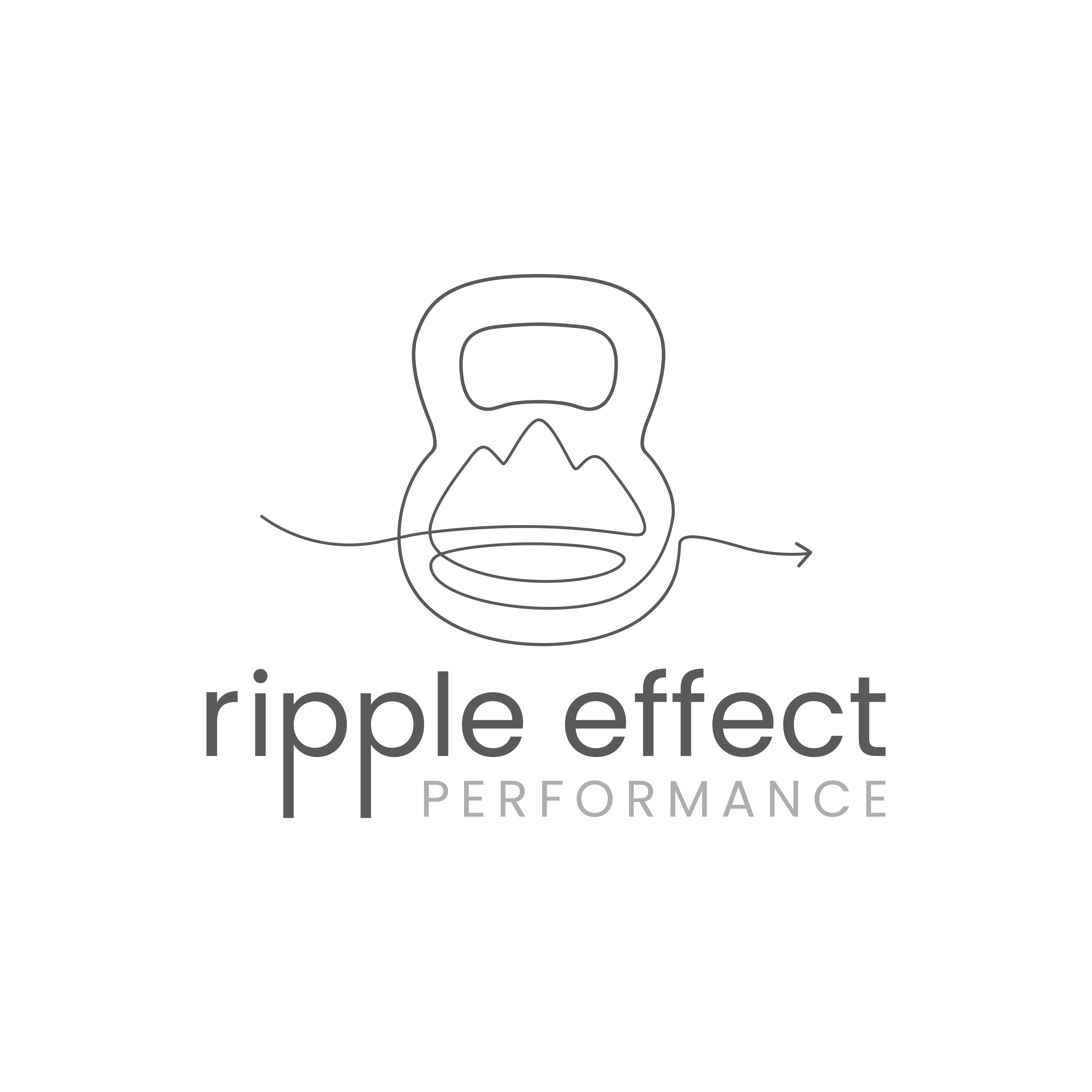
Design a Single-Line Kettlebell Logo with Integrated Mountain and Water Imagery
Want to win a job like this?
This customer received 21 logo designs from 4 designers. They chose this logo design from Harold C as the winning design.
Join for free Find Design Jobs
-
 US$120
-
 21 designs
-
 4 designers
Logo Design Brief
Ripple Effect Performance is a strength and performance coaching business built around the idea that strength should carry into life.
I want the logo to be a true single-line drawing: one continuous, unbroken stroke with one start point and one end point. Every visible element should belong to that same line. I do not want separate icons assembled together or generic minimalist line art.
The kettlebell should be clearly recognizable at first glance and central to the mark. Inside or through the body of the kettlebell, I would like the same uninterrupted line to also suggest mountain terrain and water movement. These elements should feel integrated, almost as if one form naturally becomes the next.
The line itself represents the path we are already on. It is not perfectly straight, fixed, or predetermined. It changes with the terrain, our bodies, our circumstances, and what we learn along the way. We keep moving, adapting, and finding our line.
The ripple represents what carries forward from that work. Strength, confidence, skill, consistency, and self-trust do not stay contained to a workout. They affect what we are willing and able to do outside the gym and how fully we participate in our lives.
The kettlebell represents the practice: simple, versatile, and capable of developing strength, power, endurance, coordination, mobility, and confidence. Training is the vehicle, not the destination.
The mountain and water are not meant to be decorative outdoor symbols. They represent the terrain we move through in life: challenge, change, resistance, flow, stillness, adventure, and adaptation.
Visually, I want one elegant stroke to move through these ideas without becoming busy or overly literal. The kettlebell should remain unmistakable, but the mountain and water can be more suggestive.
I am open to a subtle directional finish or arrow at the end of the line if it feels natural, but it should not dominate the mark.
The overall feeling should be calm but strong, capable but not aggressive, organic but not rustic, modern but not trendy, outdoors-connected without looking like an outdoor adventure company.
Please avoid:
- separate mountain, wave, and kettlebell icons
- multiple disconnected lines
- double-line handle details that break the continuous-line concept
- clip-art styling
- overly feminine or masculine cues
- aggressive gym branding
- gradients, shading, or excessive detail
- generic “mountain fitness” aesthetics
The most important requirement is that the design is a true continuous contour drawing: one line, one movement, no pen lifts.
The idea I want the mark to hold is:
Find your line. Build strength. Let it carry forward.
Target Market(s)
Ripple Effect Performance serves adults who want to feel stronger, more capable, and more confident in what their bodies can do. They may be new to strength training, returning after time away, or looking for training that better supports the life they want to lead—from everyday activities to hiking, cycling, and outdoor adventures. They value approachable coaching, practical skills, and progress that fits their circumstances. The brand should feel welcoming to someone who is intimidated by strength training while still credible to someone who already enjoys being active. It should communicate that strength is something you can develop and take with you into life.
Industry/Entity Type
Fitness / Strength & Performance Coaching
Logo Text
Ripple Effect Performance
Logo styles of interest
Abstract Logo
Conceptual / symbolic (optional text)

Font styles to use
Other font styles liked:
- For typography, I’m drawn to clean, contemporary sans-serif lettering with some warmth and enough weight to feel grounded. Manrope Medium or SemiBold is a useful starting reference, but I welcome alternatives that complement your mark. Please explore “Ripple Effect” in title case with “PERFORMANCE” smaller beneath it, while keeping the full name readable at small sizes. The lettering should give the flowing single-line symbol a clear, steady counterpart. Avoid thin lettering, script fonts, and heavily condensed athletic styles.
Colors
Colors selected by the customer to be used in the logo design:
Look and feel
Each slider illustrates characteristics of the customer's brand and the style your logo design should communicate.
Elegant
Bold
Playful
Serious
Traditional
Modern
Personable
Professional
Feminine
Masculine
Colorful
Conservative
Economical
Upmarket
Requirements
Must have
- I want a true single-line mark: one continuous, unbroken stroke with one start point and one end point. Every visible part of the symbol must belong to that same path. The kettlebell must be clearly recognizable at first glance and central to the design. Within or through its body, the same line should suggest mountain terrain and water or ripple movement. These forms should feel inseparable, as though one naturally becomes the next. The meaning behind the mark is “Find your line. Build strength. Let it carry forward.” The line represents navigating your own changing path. The kettlebell represents the practice of building strength. The ripple represents how that work carries into the rest of your life. The design should remain clear at small sizes and work in a single color.
Nice to have
- I would love an interior contour that can suggest both terrain and water without needing to illustrate either literally. A subtle directional ending or arrow could work if it emerges naturally from the line, but it is optional and should never dominate. Please explore a symbol that works on its own as well as paired with the business name. I’m drawn to an elegant, organic line that feels calm and intentional while still conveying strength.
Should not have
- Please avoid assembling a mountain, wave, and kettlebell as separate icons. I’m looking for one integrated visual idea. There should be no disconnected details, separate inner handle outline, or extra strokes added to complete the image. A minimalist line-art style alone does not meet the single-line requirement. Please do not make the kettlebell so abstract that it becomes difficult to recognize. Avoid aggressive gym imagery, rustic outdoor badges, clip art, dominant arrows, excessive detail, shading, and gradients.


