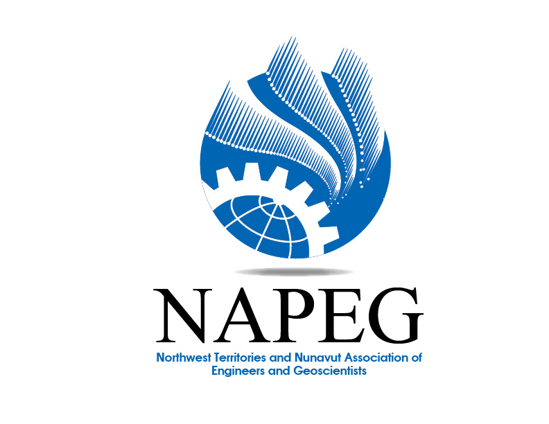
NAPEG Corporate Logo Design

Want to win a job like this?
This customer received 99 logo designs from 17 designers. They chose this logo design from rkailas as the winning design.
Join for free Find Design Jobs- Guaranteed
Logo Design Brief
The Northwest Territories and Nunavut Association of Engineers and Geoscientists (a.k.a. NAPEG) licenses and regulates Professional Engineers and Professional Geoscientists and Firms practicing in the Northwest Territories and Nunavut to serve and protect the interests of the public.
The logo on the current site www.napeg.nt.ca.
NAPEG is part of a larger group of associations of Professional Engineers and Professional Geoscientists.
The objects are: (a) to regulate the practices of professional engineering and professional geoscience and to govern the professions in accordance with the Acts and the By-Laws; and (b) to establish and maintain standards of knowledge, skill, care and professional ethics among NAPEG members and licensees.
The association represents academic excellence, experience, strength of character, and ethics i.e. protecting the public interest and safety.
The logo design should represent the geography of the two Canadian jurisdictions (Northwest Territories and Nunavut)
The logo should represent:
Professionalism i.e. two professions of Engineering and Geoscience, forward thinking and adaptable
There are elements of protection of environment
The logo look should be:
Elegant
Professional
Have a somewhat serious tone
Modern look
Gender neutral
More on the conservative side
Middle ground (upmarket)
Use of Symbolisms
Not to be used are igloos, inuksuk, animals, first nations symbols
What is allowable is the Aurora Borealis, play on letters NAPEG, combination earth and engineering symbols, open to suggestions
Updates
Project Deadline Extended
Reason: Our selection commitee is away and would like to extend the deadline.
Added Friday, June 22, 2012
Project Deadline Extended
Reason: Execute council has been away for the past week and had not enough time to evaluate
Added Sunday, July 08, 2012
Project Deadline Extended
Reason: I need to extend this again. The President and Executive director are away till next week. We hope to make a decision shortly thereafter.
Added Tuesday, July 24, 2012
Target Market(s)
The audience comprises of Professional Engineers and Professional Geoscientists and Firms practicing in the Northwest Territories and Nunavut.
Industry/Entity Type
Conservative
Logo Text
NAPEG or Northwest Territories and Nunavut Association of Engineers and Geoscientists
Look and feel
Each slider illustrates characteristics of the customer's brand and the style your logo design should communicate.
Elegant
Bold
Playful
Serious
Traditional
Modern
Personable
Professional
Feminine
Masculine
Colorful
Conservative
Economical
Upmarket
Requirements
Nice to have
- The logo should represent:
Professionalism i.e. two professions of Engineering and Geoscience, forward thinking and adaptable
There are also elements of protection of environment,
the geography of the two Canadian jurisdictions (Northwest Territories and Nunavut)
What is allowable is the Aurora Borealis, play on letters NAPEG, combination earth and engineering symbols, open to suggestions.
The logo on the current site (www.napeg.nt.ca) is actually the corporate seal which also needs to be redesigned at some point. There is no specific use of colours but colours used on the site are more or less the colours we have been working with for some time (i.e. it must blend/work well with the website).
Should not have
- Not to be used are igloos, inuksuk, animals, first nations symbols