Logo for iWorkwell
Want to win a job like this?
This customer received 1255 logo designs from 195 designers. They chose this logo design from MOH Studio as the winning design.
Join for free Find Design Jobs- Guaranteed
-
 US$770
-
 1255 designs
-
 195 designers
Logo Design Brief
Design a BRAND NEW LOGO for our company, iWorkwell, Inc.
Our tag line is "HR Made Easy." (However, this will not be included in our new logo.)
Our service is a members-only website for Human Resource (HR) professionals and other managers to use to do their job of managing subordinate employees. The site is an interactive A-to-Z resource & training/support app (e.g., articles, forms, courses, wizards, policies, templates, news).
BRAND POSITIONING / GOALS: Following are the key attributes of our brand, to be communicated through the logo:
"The BEST"
1. Quality (e.g., highly professional; delivering trustworthy expertise).
2. Value (gives you the most for your money).
And also Comprehensive, and User-friendly.
FONT TYPEFACE: You may choose 1 of the following 4 typefaces for your logo designs:
• Antenna Condensed Bold
• ITC Conduit Extra Bold
• Neue Aachen Medium
• Neue Aachen Semibold
For each design you submit, please tell us which of the 4 fonts you've used (in the Concept field).
Please do NOT submit the same logo design in multiple or different fonts. We want YOU to choose whichever one of the four fonts YOU think best achieves iWorkwell's "Brand Positioning / Goals" above.
Having said that, you do NOT need to use the font strictly in its original, pure form; feel free to tweak or alter some aspect of any letter(s) to better achieve iWorkwell's "Brand Positioning / Goals" (and give your design more unique character).
The text in our new logo should only include the letters "iWorkwell" (without a "TM" sign). - Note: The letters can be in any upper/lower case combination, but NOT ALL-CAPS.
COLORS: See PDF attachment, "iWorkwell Color Palette & Website Screenshot." Feel free to use ANY* colors IN OUR color PALETTE - as well as WHITE and BLACK - in either the foreground or background. *However, do NOT use #065067 as a SOLID BACKGROUND, because that will be the color of our navigation bars on the new site.
OTHER ELEMENTS OF DESIGN: Beyond font and color, feel free to add any other creative aspects of design (i.e., shapes, etc) that you think best achieves iWorkwell's "Brand Positioning / Goals." Since we’re an HR company, your design COULD reference human resources. However,
- Do not use neckties (which are masculine and therefore exclude females) or anything else that's gender-specific.
- Make sure your illustration does not remind us of something off topic (e.g., holding hands, a famous statue, a snowflake).
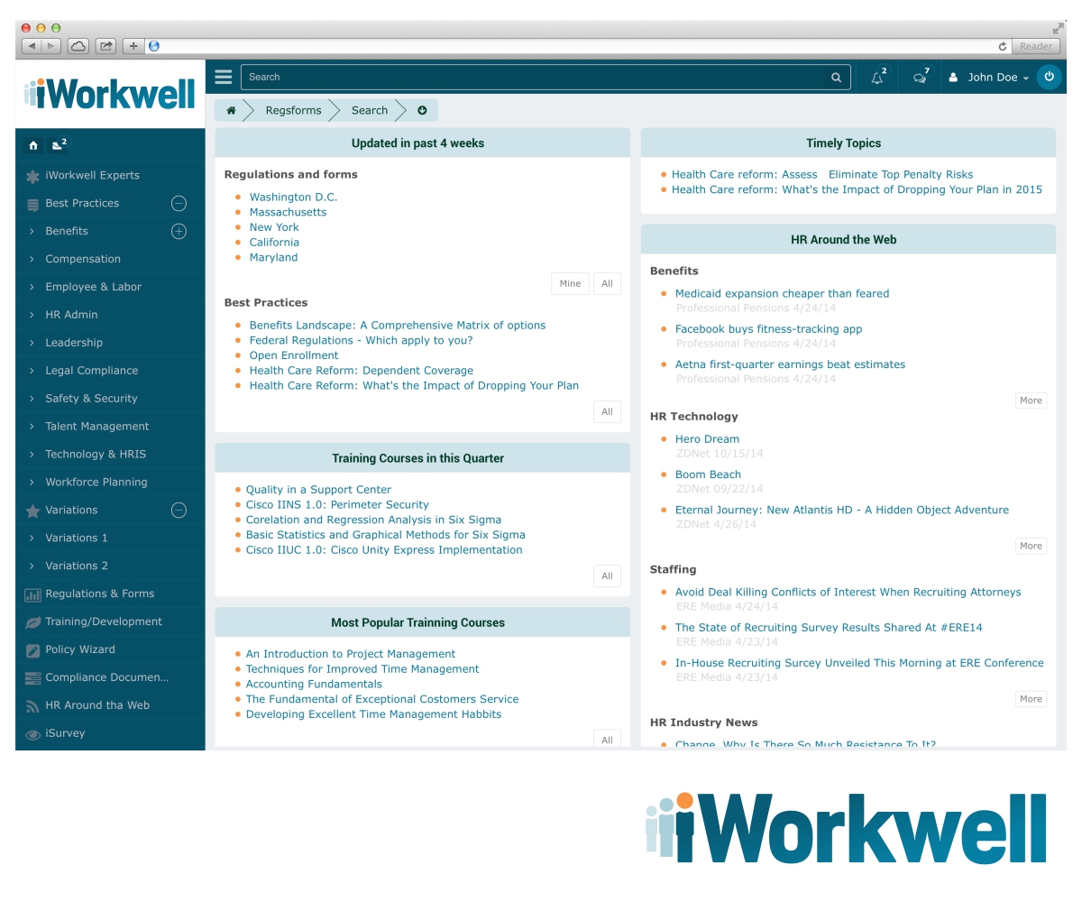
NEW DIMENSIONS: 504 x 180 pixels. We have expanded the dimensions of the space (doubling the height) where the logo will sit (in the upper left corner) on our new website. See PDF attachment, "iWorkwell Color Palette & Website Screenshot."
You may or may not wish to change the proportions of your previous designs - you can now make your logos taller. The choice is yours. But remember, you must fit in and use that whole space: any areas within this new size and aspect ratio that you do not utilize in your design will therefore become 'white space' (i.e., whatever background color you've employed in your design).
We will judge each logo primarily based on: a) how well it achieves iWorkwell's "Brand Positioning / Goals," b) how good it looks, and c) how well it "goes with" the top & left navigation - in the upper left corner of our new website. That location will be the most prominent use of the logo, where everybody will first see the brand every time, so it must be easy to read, look great, and convey iWorkwell's "Brand Positioning / Goals."
Nevertheless, on other locations on our website (such as a splash or marketing page, and landing pages) and in emails and print, we will not always be so space-restricted, so your logo design should also look great when resized up or down.
** Please refer to attached PDF showing the color palette for our brand (p.1), and a screenshot of our in-progress new website (p.2). **
Updates
Please see our totally revised brief (May 28).
Added Wednesday, May 28, 2014
As per our updated Brief:
1) There should be NO "Inc." or "TM" mark at the end of our name.
2) For each design you submit, please tell us which of the 4 fonts you've used (in the Concept field).
Thanks!
Added Tuesday, June 03, 2014
Project Deadline Extended
Added Thursday, July 03, 2014
Project Deadline Extended
Added Thursday, July 10, 2014
Project Deadline Extended
Added Wednesday, August 13, 2014
Project Deadline Extended
Added Thursday, August 28, 2014
Target Market(s)
1. Business executives and managers in the US (CFOs and HR directors)
2. Employee benefit brokers (those who sell group health insurance to businesses)
Industry/Entity Type
Marketing
Logo Text
iWorkwell
Logo styles of interest
Emblem Logo
Logo enclosed in a shape
Pictorial/Combination Logo
A real-world object (optional text)
Character Logo
Logo with illustration or character
Wordmark Logo
Word or name based logo (text only)
Font styles to use
Other font styles liked:
- Antenna Condensed Bold, ITC Conduit Extra Bold, Neue Aachen Medium, or Neue Aachen Semibold.
Look and feel
Each slider illustrates characteristics of the customer's brand and the style your logo design should communicate.
Elegant
Bold
Playful
Serious
Traditional
Modern
Personable
Professional
Feminine
Masculine
Colorful
Conservative
Economical
Upmarket
Requirements
Must have
- The text in our new logo should only include the letters "iWorkwell" (NO "TM" sign).
Font typeface: You may choose 1 of the following 4 typefaces for your logo designs:
• Antenna Condensed Bold
• ITC Conduit Extra Bold
• Neue Aachen Medium
• Neue Aachen Semibold
For each design you submit, please tell us which of the 4 fonts you've used (in the Concept field).
Colors must be from our palette (see PDF attachment) - or Black or White.
Dimensions maximum: 504 x 180 pixels.
See also Project Overview.
Nice to have
- You can try different color variations (while still using our palette), to experiment with additional backgrounds - especially a white background (remember, we want your first/main design to be on background #077699) - since we will want to print the logo in color on white paper in addition to it being on our website.
Should not have
- - Do not use neckties (which are masculine and therefore exclude females) or anything else that's gender-specific.
- Make sure your illustration does not remind us of something off-topic (e.g., holding hands, a famous statue, a snowflake).
Do NOT use #065067 as a SOLID BACKGROUND, because that will be the color of our navigation bars on the new site.
Do not write our name in all-caps.
See also Project Overview.