Logo Design Project
Want to win a job like this?
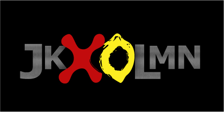
This customer received 78 logo designs from 30 designers. They chose this logo design from Andrea as the winning design.
Join for free Find Design Jobs- Guaranteed
-
 US$360
-
 78 designs
-
 30 designers
Logo Design Brief
I'm a photographer, specializing in Gritty, Edgy images. I'm looking for a logo that will work as a small "watermark" and also work as a larger logo on Websites and Business cards.
I photograph under the name Jk Lmn (I prefer that all the letters be in CAPS, but the J and the L be a little larger than the other letters). The name is pronounced "Jack Lemmon". The logo I'd like is a JACK (like from the child's game: Knucklebones) along with a Lemon. I'd like those two objects the same size, side by side (not overlapping). I'd love for the shapes to 'suggest' an X and an O.
I'm thinking of having the Jk be on the Left of the Jack and Lemon, and the Lmn being on the right side of the Lemon. I'm thinking of a strong, blocky font like "dirty headline" for the letters.
I'd love it if the letters could be used on their own, and the Jack and Lemon could be used on their own.
I'm imagining the lemon being yellow, but I'd like the logo to work as a single color image also.
Please write if there are other questions. I'd love to help you however I can. I am hoping that YOU win!!
-
some additional notes:
[forgive the ALL CAPS it's a typing tick]
- The Jack and the Lemon should have a little more WEIGHT, (a little more Height) than the "Jk" and the "Lmn". Perhaps there could be a sense that they are in the FOREGROUND. somehow, even though they live IN BETWEEN the "Jk" and the "Lmn" the challenge will be to have them get "read" FIRST by most viewers. The design shouldn't look like 7 symbols with somewhat equal Weight, but instead like TWO strong symbols, and then 5 somewhat less large letters.
- It'd be great if the Jack and the Lemon could feel MORE like they are Abstractions created by a confident artist working somewhat fast, as opposed to like clip-art.
- (i don't know if this is possible) but if there's a way to 'hollow out' or give less weight to the INSIDE of the Lemon, to help it resemble an O.
Industry/Entity Type
Weight
Logo Text
Jk Lmn (all caps, but with the J and the L larger)
Look and feel
Each slider illustrates characteristics of the customer's brand and the style your logo design should communicate.