UnCommon Tea is a bridge for the people who drink tea to connect with the people who make the tea an
Want to win a job like this?
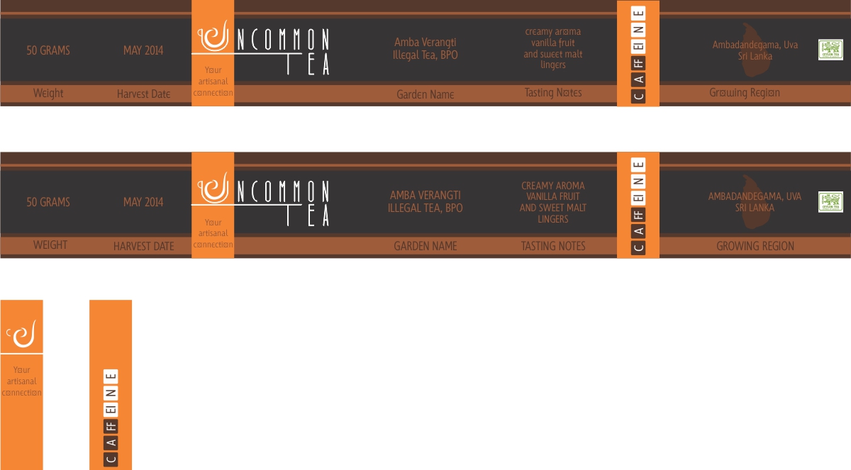
This customer received 40 label designs from 8 designers. They chose this label design from Marilena as the winning design.
Join for free Find Design Jobs- Guaranteed
-
 US$400
-
 40 designs
-
 8 designers
Label Design Brief
UnCommon Tea is a bridge for the people who drink tea to connect with the people who make the tea and the environment in which it is grown.
As a start-up, UnCommon Tea needs to establish a fluently persuasive brand image that articulates its unique mission to the up-market tea drinker.
Our passion for high quality tea and our respect for people are boundless. But our budget is shoe-string. Still, we will allocate a disproportionate amount to evolving a brand; including logo, labeling, and packaging, and hope this initial effort will lead to a long-term relationship with a designer. The UnCommon label, as a component of the brand, must deny the commodity image of tea by broadcasting the uniquely flavorful, healthful, and relaxing experience of drinking tea.
The logo is an image of a liquor pouring from above into a stylized outline of a cup and gracefully folding over on itself within the cup. The image is an echo of video clips that will be featured on the Product page of the ecommerce site. Our initial thought is for the liquor and cup to be white on a rich blue background. But you may have a better idea.
The label must fit a seamless tin canister 4" in diameter; 2" high with a "window" in the lid. There are really three distinct parts to the label: a) wrap-around for the body of the tin; b) a distinct piece to be applied underneath the tin; and c) security strip (s) that connect the lid and the bottom of the tin. The wrap-around must include the following components: the logo, the brand name 'UnCommon Tea', the name of the specific tea and space for the following characteristics of the tea: Tea / Garden Name, Harvest Date, Tasting Notes, Weight, Location, and Caffeine content. The piece to be affixed underneath the tin should accommodate Ingredients, Brewing Instructions, and contact details for UnCommon Tea. The security strip(s) should be an integral part of the overall visual.
The color scheme should be expandable, i.e.; different colors for different teas.
We are thinking about rich and bold colors. But am eager to see what inspires you!
A very rough proto-type is captured in the attached files.
Updates
Project Deadline Extended
Reason: Several designers are actively engaged and have requested an extension.
Added Saturday, May 10, 2014
Target Market(s)
Ages 25 to 45 in densely populated areas of the U.S. and Canada will an above average house-hold income and an interest in what they eat / drink.
Industry/Entity Type
Environment
Look and feel
Each slider illustrates characteristics of the customer's brand and the style your logo design should communicate.
Elegant
Bold
Playful
Serious
Traditional
Modern
Personable
Professional
Feminine
Masculine
Colorful
Conservative
Economical
Upmarket
Requirements
Must have
- 1. Three separate pieces: 1) wrap around for the body of the tin; 2) piece to be affixed to the bottom of the body of the tin; 3) security strip (s). A word about strips: am unsure about one vs two because, two will add to overhead and processing while one will block the view of the contents. Maybe you know how to resolve.
2. clean, crisp lines
3. uncluttered
Nice to have
- 1. a color scheme to accommodate up to 30 different teas. Do not fall into the trap of incorporating the color green on the label for a 'green tea' and yellow for a lemon flavored tea. That approach is limited and has been overdone.
2. a color scheme that, as it expands to accommodate 30 teas, also is anchored by a brand color set. In other words, all labels include a recognizable color set.
3. express the level of caffeine via a gauge or metric
Should not have
- photo images,