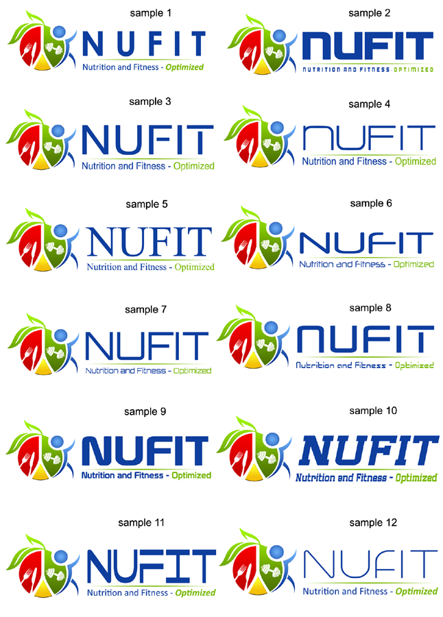
NUFIT Logo Redesign

Want to win a job like this?
This customer received 21 logo designs from 11 designers. They chose this logo design from DDR_design as the winning design.
Join for free Find Design JobsLogo Design Brief
Hello. Im looking to redesign my business logo and what my business stands for. My business name is NUFIT and I run a Modern Sports Nutrition consultation business however i have now moved into small group training additionally. Please have the design a little more focused on Nutritional aspects but still have the training aspect there too, if that makes sense.
My website for more info is here: www.nufit.com.au
Basically I want my design to be CLEAN, SIMPLE, FUN, PROFESSIONAL and represent what NUFIT stands for. The design must be universal, appealing to all age groups.
I want the writing of NUFIT to be CLEAN and CLEAR please.
Additionally id also like the sub heading to read "Nutrition and Fitness. Optimized"
I have uploaded my rough design. I do like my concept however you guys are the professionals and know what looks good!
Thanks in advance for your creative and hard work!
Updates
Just to clarify; In the design I have drawn, the "circle" with the red,yellow and green represents a PLATE.
The RED represents animal protein or MEATS
The YELLOW represents FATS
The GREEN represents VEGETABLES
The BLUE circle which is the "Head" actually doubles as a glass of water.
The designs are awesome so far!
Added Saturday, May 03, 2014
Industry/Entity Type
Training
Logo Text
NUFIT Nutrition and Fitness. Optimized.