Logo for Computer Repair and Technology Consulting Firm
Want to win a job like this?
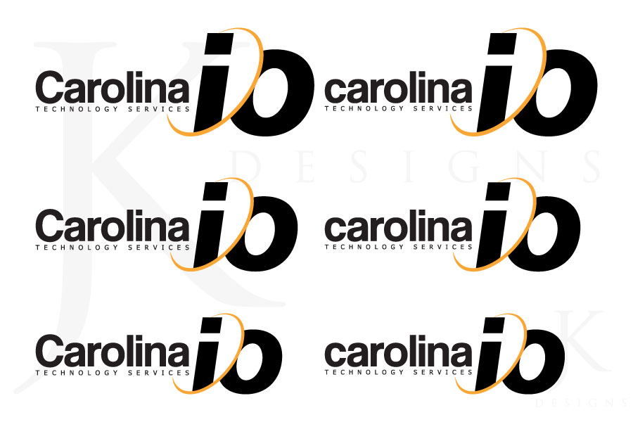
This customer received 95 logo designs from 19 designers. They chose this logo design from JK as the winning design.
Join for free Find Design Jobs- Guaranteed
-
 US$200
-
 95 designs
-
 19 designers
Logo Design Brief
I'm looking for a simple, memorable logo that describes and represents locality and technology or technology services. A unique take on an .io or I/O business name. My local market area is the Research Triangle Park, NC, often referred to as the Triangle.
**Update**
I removed my previous ideas on this logo because I don't want to influence design.
Updates
Added Thursday, May 29, 2014
Please no shadows or major gradients.
Added Thursday, May 29, 2014
I would like to see some designs where the text is integrated with a symbol or the i/o.
Added Friday, May 30, 2014
If there is a way to make the / in "Carolina I/O" subtle while keeping carolina and io two words, that would be great.
Also, if someone were to include a triangle this is the shape I am going for. http://imgur.com/NZ8H74T
Added Friday, May 30, 2014
Target Market(s)
All ages for Computer Repair and ages 30+ for Small Business consulting. I service Raleigh, Durham, Chapel Hill area (NC, USA).
Industry/Entity Type
Business
Logo Text
"carolina i/o" (any case combo) or "carolina i/o (below) technology services
Logo styles of interest
Pictorial/Combination Logo
A real-world object (optional text)
Wordmark Logo
Word or name based logo (text only)
Lettermark Logo
Acronym or letter based logo (text only)
Font styles to use
Requirements
Must have
- I would like the logo to display or print well in a single color (Not that I want it in a single color but when it is, it doesn't lose it's character or shape).
Nice to have
- If there is a symbol or pictorial i'd like it to be able to fit well in a 1:1), or at least have the symbol or pictorial stand alone as an 1:1 icon
Should not have
- **Update** Please no shadows or major gradients.
**Update** I don't like the I/O superscript
I don't want it to be too wide or too tall. If there is a symbol or pictorial i'd like it to be able to fit well in a 1:1)