 Refresh
trading data display webpage
Want to win a job like this?
This customer received 55 web designs from 14 designers. They chose this web design from Digital Waltz as the winning design.
Join for free Find Design Jobs
- Guaranteed
-
 US$600
-
 55 designs
-
 14 designers
Web Design Brief
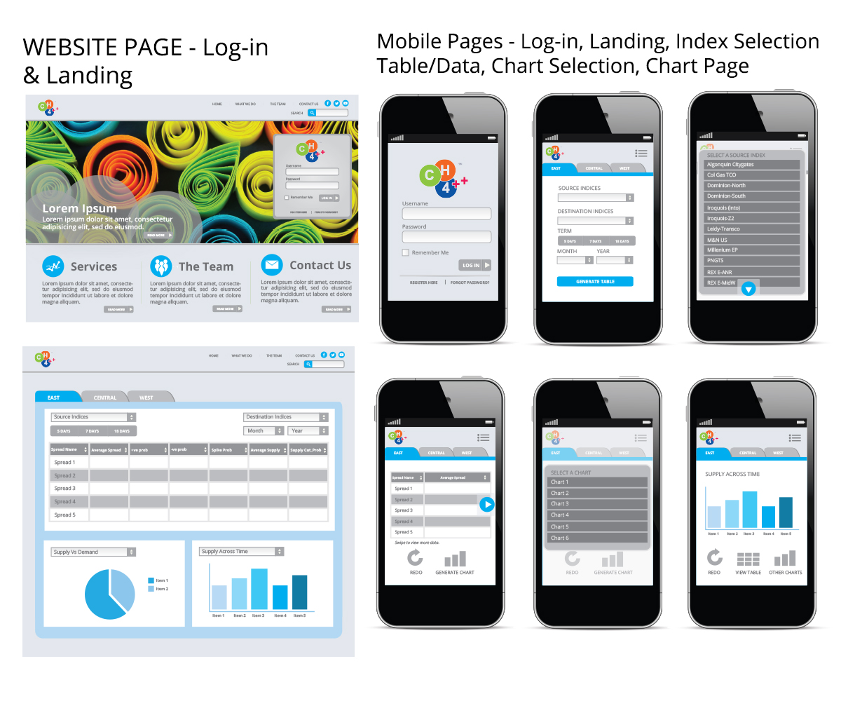
We have build a rough wireframe of the two webpages that we want to display .The two wireframes are attached as a pdf document.
there will be login page. after login , the user will see the index page. that is the first page of the wireframe.
what we are displaying is essentially spread data. we are taking the difference in prices are two places and displaying the data. some calculations are done and is shown in the grid.
below the grid we show the behaviour on a graph. we will use bubble chart. I did not find a sample, hence have thrown in a placeholder.
this is time series data ( changes daily) and hence we need to check the behaviour.
the second wire frame shows how the user will choose the source price points and the destination price points.
we are talking here of natural gas prices hence the reference to source prices and destination prices.
you need to design the page/ pages such that the end-user loves it and is easy to use. the intent here is easy to use and easy to understand.
this will be responsive webpage since the end user will check it out on a tablet or a smartphone.
so if possible tell us how the navigation bar, the button bar, etc should fall when the screen size decreases.
I have uploaded 2 files. one is the wireframe ( pdf document) and second is the logo file.
please also let us know where to place the logo.
Updates
Hi
I have updated the brief and provided more details. please feel free to ask questions.
regards
Parag
Added Tuesday, June 03, 2014
Hi guys
we are only looking for the design.we are looking for a responsive design. it means the following.
1. we are looking for your inputs , when the screen size decreases.
the inputs can be the following. for example.
1. the navigation bar disappears ( hidden)
or
2. the drop down menu disappears ( hidden)
or
3. the data grid disappears. ( hidden)
making the design elements stack up or disappear in any order is pretty easy using media queries in css3.
the design component is the difficult part. what stays and what disappears.
I hope that I have made things clear.
regards
Parag
Added Thursday, June 05, 2014
Hi guys
your design has to be in *.png & *.psd or *.jpg and *.psd.
the answers to the responsive part of the design can be written down and provided in text
ie in a tablet ( the three design components are visible)
ie in a smart phone ( the two design components are visible)
alternatively
you could show your design in tablet ( smaller browser window) & a smart phone ( much smaller window) format too.
hope this helps
Parag
Added Thursday, June 05, 2014
HI guys
this is not a winner take all project. using the participation fee , I plan to reward most of the designers
depending on the response in a few more days, the participation fee will be increased.
the first prize award is only a place holder.
your hard work is much appreciated.
regards
Parag
Added Thursday, June 05, 2014
Hi guys
I have asked for responsive web design . it means thinking for the smthinall box too. one way of doing this is to break things into components. I am posting here is one way of thinking small. the order of components is as follows.
1. login screen
2. choose zones ( the tabs).
3. choose source index.
4. choose destination index.
5. show him a couple of data-grid components
6. show him one of the chart
we have less real estate hence need to pick and choose.
you can choose your own order.
I can use css3 to hide components when things collapse.
hope this is ok
regards
Parag
Added Thursday, June 05, 2014
Hi guys
since you guys are providing a responsive design, the general guide lines for the mobile version is as follows :
mobile design:
1. page 1 (login simple and awesome)
2 page 2 :top level tabs falling down in a single col .
3.page 3 : user chooses a tab and sees
source indices,
destination indices
term
month
year
generate table button
4. page 4 : table generated. col 1 hidden, col 2 seen large
5.page 5: table generated : col 3 seen large
6 . page 6: table generated. col 4 seen large
7. page 7 : graph1
8 page 8 : graph2
9 page 9: graph3
thanx and regards
Parag
Added Friday, June 06, 2014
Hi All
web design without the responsive part , will be considered incomplete and will be eliminated immediately. please take care to provide the responsive web part. I have provided extensive documentation in the brief about responsive part. please follow the details
regards
Parag
Added Thursday, June 12, 2014
Target Market(s)
the target market is traders and data analyst
Industry/Entity Type
Build
Colors
Designer to choose colors to be used in the design.
Look and feel
Each slider illustrates characteristics of the customer's brand and the style your logo design should communicate.
Elegant
Bold
Playful
Serious
Traditional
Modern
Personable
Professional
Feminine
Masculine
Colorful
Conservative
Economical
Upmarket
Requirements
Must have
- 1. design for the web.
2. but think how the design will look when the screen size decreases.
3. tell if possible what screen components to keep and what to hide.
_brief035757.jpg?AWSAccessKeyId=ASIARQT47ZIU2OGUXPOW&Expires=1783857270&response-content-disposition=attachment%3Bfilename%3D%22CH4%2B%2B%20logo%20%281%29%20Tuesday%2C%2003%20June%202014%2012_57_57.jpg%22&x-amz-security-token=IQoJb3JpZ2luX2VjEAIaCXVzLWVhc3QtMSJGMEQCIFepnvIlqVBTBvhP%2BLtBwHhlDrckntvh%2FclA4DJM7O06AiAfZ6UHQOEeut1u2PhUTUyLrPSkDyLMcSbkfLxq4m7VsSr0AwjK%2F%2F%2F%2F%2F%2F%2F%2F%2F%2F8BEAAaDDEwNDQxNTA4NzE0NSIM3xvd6Ie%2FrLMzRFPxKsgDYxgrMz3mrsGEAbV89e3B4HIH1vMvGyIQ5WNHAxXtzreNocKRrSULKirHDGns2Xz2SZ5X7Nl8fwsXEHkeuC9K45zYnilAtQRL6c3WoozsDky1VaJooZFMac3PXZtcAvYQBAWDSb3RAsXjzMdU6Vi66QkcFQzC6yJHFGZWyMm3pI%2FDnAm9ogbj4uKVBS5mqyvsyfyf3sUZSO7FpF8DD5Fv5E05eXFmcJxuqaqB8K7UBAMZkNpbvfh6GzbTEJwDShTPWMLVaKnN39PL1gTVlUtwK6LPf9yfVKaQu6PGXjNVLMptwhFoYsOZSFKdV3mWHaWlWW31RtyLIWd5viZwa1SWy912ChSTaVV2biWD8MK2vZDb4aurGTpYh65djJQv6Z%2FTU0vChLl5f3xJGoxYG8KCaP9wPyGyJEbjNVhTxQYEbXkyoYzy7tcZ%2B06eL9cFdyBZqJ0jLS93%2BVV1gNXz0dzfzP3VsyAVMCtU7E3%2FXr1FhOzU45XFAl62Sc43pFtBnMaesg0pmf3vbUcfO4zdGK920toYU6lNiYWnOFToTiTaqJmGWhK6557uixeos3nwBKqnGlFuLn9ozeVHb22p5C7Gkt%2BYK4A0bg9UMMiSyNIGOqYB1Czvo%2BRsQG1%2BnFM6%2FjmPDW7o7pTD9MkHBdoNFnWqJMZ6lEgnxMSJCsNuwSV4M1a8zB8TmEnFgKaalNJy97DbnNyzkVqgzRuabiaWyuSNOfVdxm3cxZmlF%2FkjyqVdrttT%2BshESdTChnP2FP8egXsrtdNYyBq5eHdL%2BxAW3ekrJy3RRPfDx8qWQJbZbRzUyLqpZweAFpFlEqsWDbLiEgjbfjGSlJoMXQ%3D%3D&Signature=DA2Wjlxy62G9isack1OQGF8Ehxo%3D)