upscale chicago style pizzeria needs a logo
Want to win a job like this?
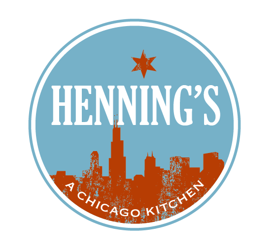
This customer received 86 logo designs from 28 designers. They chose this logo design from TSEdesign as the winning design.
Join for free Find Design Jobs-
 US$460
-
 86 designs
-
 28 designers
Logo Design Brief
We need a logo design for an upscale chicago style pizzeria based in naples, fl called Henning's. the tag line for the restaurant is going to be Henning's, a Chicago Kitchen. We are a family run restaurant serving from scratch artisanal food like thin and thick crust pizza, ground in house sausage, and seasonal produce, and curing our own bacon. Our idea was to use the chicago flag in the logo using the white and blue striped and the 6 pointed red stars. maybe distressed the flag maybe not. decor of the restaurant is going to be flea market chic.
Here are my thoughts on the logo. The current reflected-skyline design will only work with high-quality, high-resolution full-color printing, and therefore has very limited applications, in my opinion. Something more graphic, like the star, or skyline in silhouette, that can be achieved with two ink colors and will be impactful on fabric, card stock, glass, etc. will be more versatile. You could still incorporate references to the skyline in wall decor, at the bottom edge of a menu or other print material, on your menu board or website, etc.
Also in my attachment are examples of more the muted colors I had in mind. I think a 'fuzzy" star in a barn red, rather than a crisp star in a true red, would erase any associations with a Chinese flag. They also relate more to an interior with aged, weathered surfaces than the bright, clean colors the designer is showing. Of course i plan to work the interior around the logo, whatever you go with, but to me, those bright colors have a fast-food vibe. ( I included that wheel design to show that you still get the Chicago reference without using the true flag colors) I show paint colors on the attachment, but I can specify some Pantone (printers) colors for the designer if you want.
Updates
Project Deadline Extended
Reason: We have decided to extend the project to get more designs. Here are some notes, I will post idea board soon.
Here are my thoughts on the logo. The current reflected-skyline design will only work with high-quality, high-resolution full-color printing, and therefore has very limited applications, in my opinion. Something more graphic, like the star, or skyline in silhouette, that can be achieved with two ink colors and will be impactful on fabric, card stock, glass, etc. will be more versatile. You could still incorporate references to the skyline in wall decor, at the bottom edge of a menu or other print material, on your menu board or website, etc.
Also in my attachment are examples of more the muted colors I had in mind. I think a 'fuzzy" star in a barn red, rather than a crisp star in a true red, would erase any associations with a Chinese flag. They also relate more to an interior with aged, weathered surfaces than the bright, clean colors the designer is showing. Of course i plan to work the interior around the logo, whatever you go with, but to me, those bright colors have a fast-food vibe. ( I included that wheel design to show that you still get the Chicago reference without using the true flag colors) I show paint colors on the attachment, but I can specify some Pantone (printers) colors for the designer if you want.
Added Monday, July 07, 2014
Project Deadline Extended
Added Monday, July 07, 2014
Target Market(s)
Upper income 45+ age people
Industry/Entity Type
Restaurant
Logo Text
Henning's, a Chicago Kitchen; or just Henning's
Logo styles of interest
Pictorial/Combination Logo
A real-world object (optional text)
Wordmark Logo
Word or name based logo (text only)
Font styles to use
Look and feel
Each slider illustrates characteristics of the customer's brand and the style your logo design should communicate.