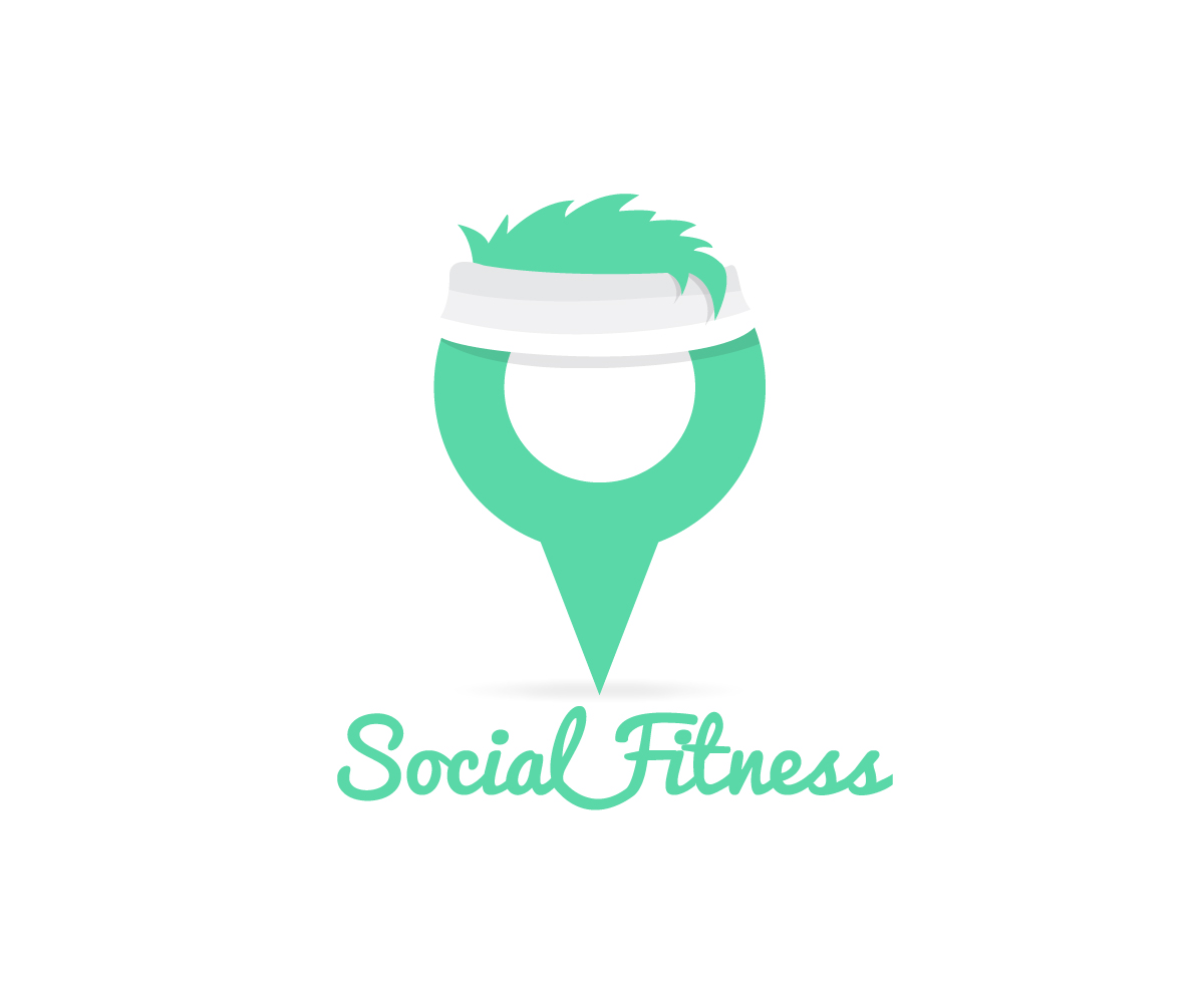
Logo Design for a Social Fitness mobile application
Want to win a job like this?
This customer received 165 logo designs from 43 designers. They chose this logo design from Ricardo Best as the winning design.
Join for free Find Design Jobs- Guaranteed
-
 A$400
A$400
-
 165 designs
-
 43 designers
Logo Design Brief
We need a logo designed for a mobile application that connects users via their GPS location to other people that want to exercise. The main feature of the application is viewing a map that displays people around you that want to go for a run, ride, swim or other exercise activities.
I would like a clean, modern and fresh logo based around the colours listed below. The logo should make it clear to everyone what Social Fitness is so should include an illustration or design element to project this.
Colours:
- Primary: #5ad8a8
- Lighter: #9de8cb
- Darker: #51c397
The design must show that Social Fitness is:
- Fitness/exercise related.
- Uses mapping (by the use of map pin).
Our slogan is (does not have to be included in the logo design):
'Exercise Together'
Our description is:
'Exercise doesn’t have to be lonely or boring
(although it often feels that way). We connect you to people and help turn your fitness journey into a fun and social experience.'
Please contact me for any questions you have as I will response to all enquiries.
Target Market(s)
Our target market ranges from teenagers to adults around 40 that are looking for like minded people to exercise with.
Industry/Entity Type
Fitness
Logo Text
Social Fitness
Look and feel
Each slider illustrates characteristics of the customer's brand and the style your logo design should communicate.
Elegant
Bold
Playful
Serious
Traditional
Modern
Personable
Professional
Feminine
Masculine
Colorful
Conservative
Economical
Upmarket
Requirements
Must have
- - A clean, colourful and modern design.
- Clear and easy to read text (unless the type is use as part of an illustration).
- Look fun, social and inviting to people.
- Project what Social Fitness is by using illustration or creative type.
Nice to have
- I like the idea of the map pin exercising is some sort of way.
Should not have
- No old style fonts, grey text.