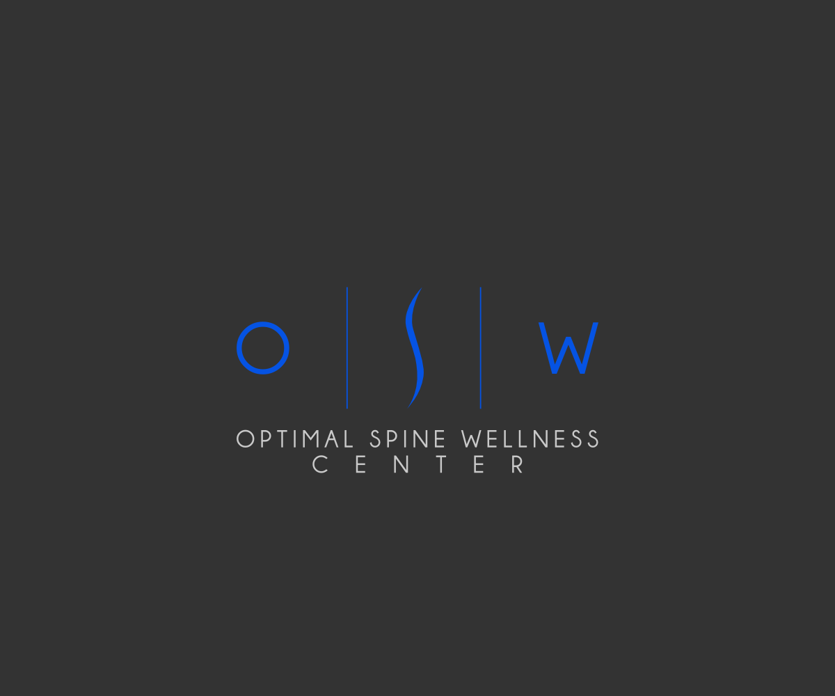
Optimal Spine Wellness Center logo design
Want to win a job like this?
This customer received 230 logo designs from 44 designers. They chose this logo design from Sleeping Sun as the winning design.
Join for free Find Design Jobs- Guaranteed
-
 US$390
-
 230 designs
-
 44 designers
Logo Design Brief
We are a new and innovative chiropractic and wellness center opening in Plano, Texas this summer. We specialize in non-invasive structural spinal correction and nutrition/lifestyle intervention. The difference between a corrective chiropractor and a traditional chiropractor is similar to the difference between an orthodontist and a dentist.
Our business culture/associations: Paleo lifestyle, whole foods, organic, medication-free, CrossFit
We are looking for a clean and professional design that speaks to the nature of our unique advanced specialized care. We would like a professional image that is bold and stands out, yet is simple, appealing, and easily recognizable. We would also like to stay away from “cutesy” and “cartoonish” images.
Color options we would like to see: greens, blues, grays, and black
Don't hesitate to contact us if you would like more specific information.
Updates
Thank you to all designers for submitting your ideas!
We would really like to see some that utilize a font similar to the Aria Resort and Casino font (attached file), as well as some utilizing the Ellecor (attached file) logo.
Also, they don't all have to be kelly green and blue, they can also be shades of these colors combined with gray or black!
Added Tuesday, July 01, 2014
We'd like to stay away from logos with people or drawings of people. We are looking for a more unique symbols and designs, similar to the attached logos. They do not have to be exactly like those, but that is more of the direction we would like to go.
Added Tuesday, July 01, 2014
We like the clean, simple, unique feel of the GolfHalo (attached image) and like the color green that they use. Again, we don't want a replica, but want to go more in that direction, as opposed to some of our current submissions.
Added Tuesday, July 01, 2014
PLEASE NOTE the newly added file (Five Pound Apparel). We would like to see SOME options utilizing this concept. We would like to see an "O" in the far left box, an image of a spine in the middle box, and a "W" in the last box, while keeping in mind all earlier suggestions.
And we would still like to see other original ideas besides this one. Thanks!
Added Tuesday, July 01, 2014
Project Deadline Extended
Reason: Want to see small changes made
Added Wednesday, July 09, 2014
Target Market(s)
Adults 25-55 in the United States with families.
Industry/Entity Type
Business
Logo Text
Optimal Spine Wellness Center
Logo styles of interest
Pictorial/Combination Logo
A real-world object (optional text)
Abstract Logo
Conceptual / symbolic (optional text)
Wordmark Logo
Word or name based logo (text only)
Lettermark Logo
Acronym or letter based logo (text only)
Font styles to use
Other font styles liked:
- Aria Resort and Casino building font (attached image)
Look and feel
Each slider illustrates characteristics of the customer's brand and the style your logo design should communicate.
Elegant
Bold
Playful
Serious
Traditional
Modern
Personable
Professional
Feminine
Masculine
Colorful
Conservative
Economical
Upmarket
Requirements
Nice to have
- Open to abstract images of the spine
Should not have
- No "cutesy" or "cartoonish" images