SHAN SHAN Luxury Logo Redesign
Want to win a job like this?
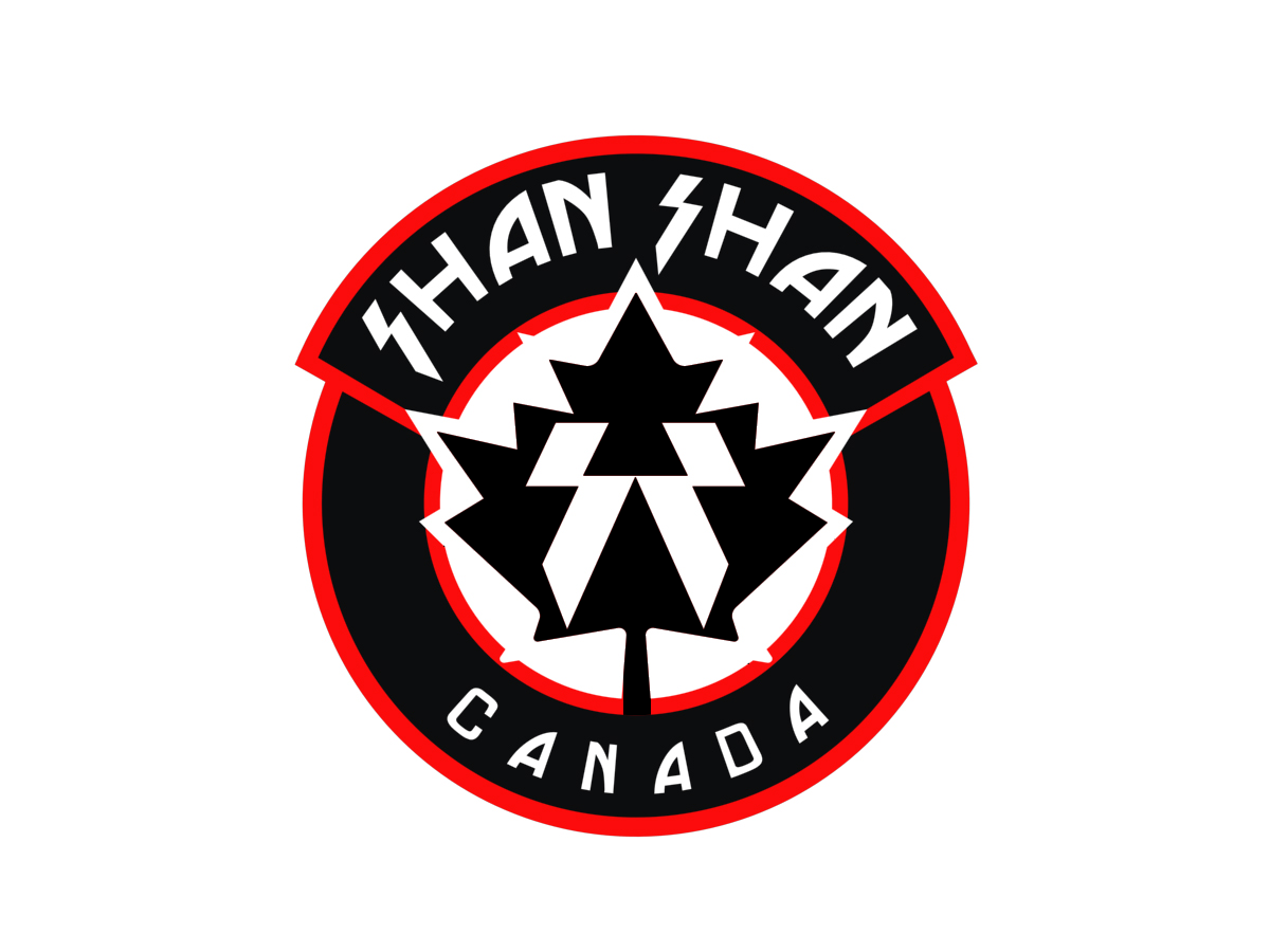
This customer received 189 logo designs from 38 designers. They chose this logo design from Graphicsbox as the winning design.
Join for free Find Design Jobs- Guaranteed
-
 US$400
-
 189 designs
-
 38 designers
Logo Design Brief
Take existing SHAN SHAN luxury logo and make it into an emblem style, as opposed to the current style (seperate emblem + text). Please use the CANADA GOOSE and MONCLER logos as examples. SHAN SHAN sells $1,000-$2,000 goose down jackets and $1,000-$50,000 hand made cowboy boots, the logo needs to have a feel of quality to it. LUXURY. Require 1) The logo itself in a flat 2D form. 2) mockups of the logo from various angles/lighting in 3D form as it would appear as a large metal/wood logo on front of a store. 3) Mockups in with 3D effect showing how it would appear as a stitched emblem/arm patch on a jacket.
Updates
Project Deadline Extended
Reason: Still waiting to see ideal design, giving feedback to others to get there.
Added Thursday, October 11, 2012
Project Deadline Extended
Added Tuesday, October 16, 2012
Industry/Entity Type
Store
Logo Text
Original logo attached.
Look and feel
Each slider illustrates characteristics of the customer's brand and the style your logo design should communicate.
Elegant
Bold
Playful
Serious
Traditional
Modern
Personable
Professional
Feminine
Masculine
Colorful
Conservative
Economical
Upmarket
Requirements
Must have
- 1) The logo itself in a flat 2D form. 2) mockups of the logo from various angles/lighting in 3D form as it would appear as a large metal/wood logo on front of a store. 3) Mockups in with 3D effect showing how it would appear as a stitched emblem/arm patch on a jacket.
Nice to have
- A straight take on the CANADA GOOSE logo, with emblem in centre and "SHAN SHAN" (including current font and lightning bolt style "S") curving around top and "CANADA" curving around the bottom. BUT do not take any of the elements other than emblem in middle and text around outside from the Canada Goose logo, I don't want it to look anything like it, just following the same structure as emblem in middle and text around outside. Don't use red for anything other than the maple leaf in the centre, you can even experiment with having the maple leaf a different color than black.