Premium Relish Company Needs Postcard size Shelf talker
Want to win a job like this?
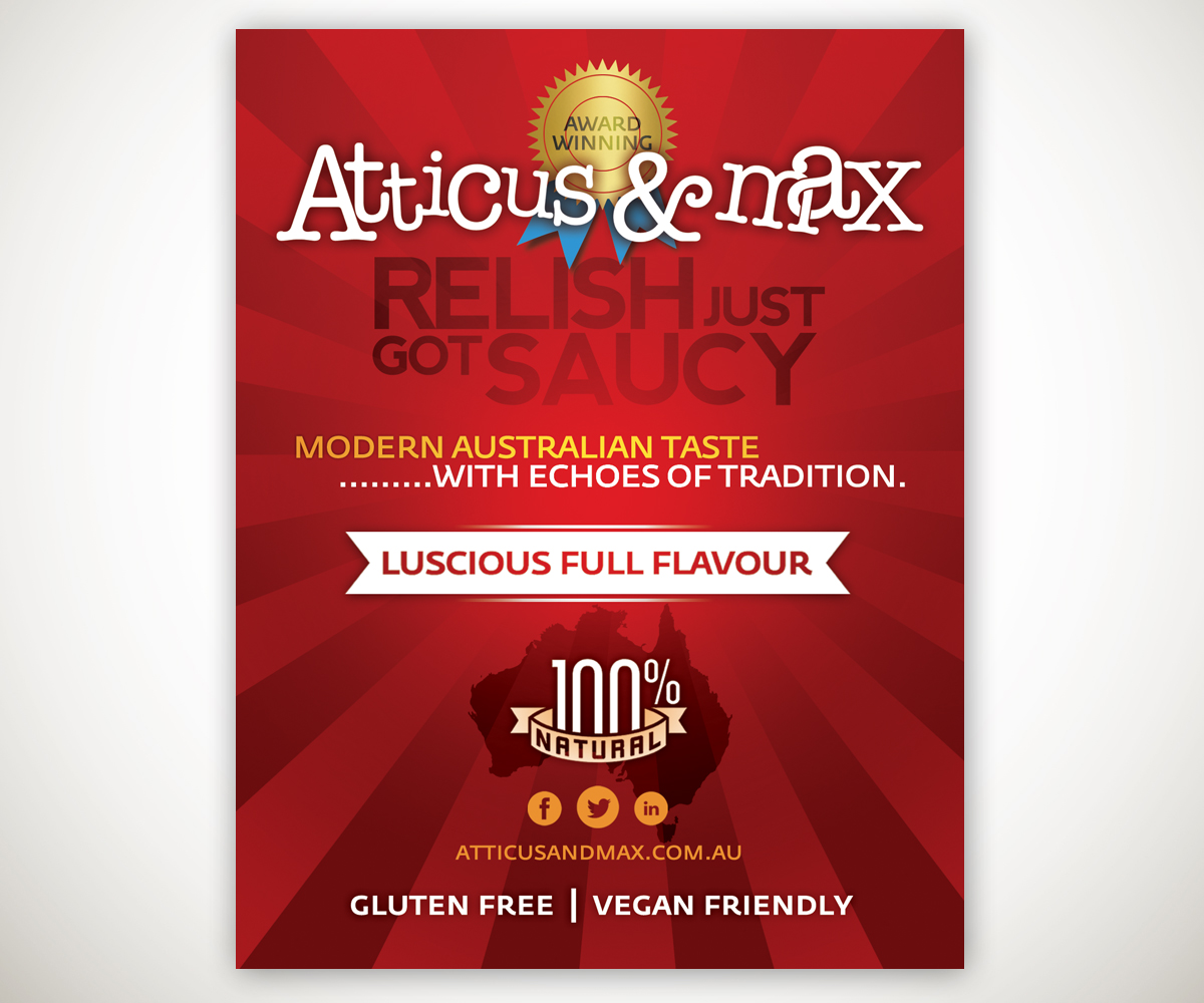
This customer received 30 postcard designs from 6 designers. They chose this postcard design from Joshua Carmichael as the winning design.
Join for free Find Design Jobs-
 A$130
A$130
-
 30 designs
-
 6 designers
Postcard Design Brief
Business name: Atticus & Max Sublime Foods
www.atticusandmax.com.au
Product/service/brand name:
Atticus & Max Sublime Foods. We produce the MOST delicious premium relishes in Australia and they retail in all premium deli’s, butchers, and high end supermarkets in NSW and VIC. Please see our website for further details: www.atticusandmax.com.au
Key Objective:
Design a Post card size shelf talker. These are small signs that attach to a retail shelf ledge. Shelf Talkers are an effective way to attract and communicate with customer's in-store as they are wandering the aisles. OUR key objective is to attract EVERY single potential customer to the relish and make them buy.
Marketing objectives:
Build Brand awareness, Increase sales by creating enough curiosity for a customer to purchase the product immediately without trying it. We want something that will catch the eye and increase their interest until picking up the product off the shelf and putting it in their basket seems the most logical and sensible option to them, as opposed to them feeling they are involved in a great risk.
Our Image:
We like humour and our two phrases "Relish just got saucy" & "Makes everything better. - EVERYTHING!" reflect this. We like to appeal to their happier side when they purchase our product.
We don't want busy imagery.
Please avoid the brash colours and imagery associated with take away food. This is premium cuisine, with a modern urban angle – but not up itself. It is the perfect accompaniment to a fantastic quality BBQ for average Australian and the perfect condiment to always keep in the fridge as it is the only condiment on the market that is FULL of REAL flavour.
Key Concepts:
FUNNY, URBAN, RELEVANT
FUNNY – Chaotic Adult fun. A strong sense of the child within.
NOT CHILDLIKE
URBAN – Stay away from the conservative “country image” that most of our competitors use. We don’t want to look like we were made out on a farm somewhere.
RELEVANT – THIS IS SOMETHING EVERYONE WILL WANT TO EAT!
It is relevant to everyone and will make everything they eat it with better. Everything.
Target Audience:
Our target audience is ANYONE who loves premium quality food and is willing to pay a little bit more for a great tasting product as opposed to settling for a cheaper relish that is below average, processed and filled with additives and nasties. Our current demographic is middle-class, comfortable income, mainly Anglo-Saxon Australians - age range is quite broad from young up to professionals to comfortably set retirees.
Non Negotiable Elements of the design: The Logo
Size: Postcard - PORTRAIT ORIENTATION
File format: Happy for you to suggest which format is best.
Stock : 350gsm paper
Colours: Dominant colour must be a “Roma Tomato” Red, however keep colours down to Maximum 4
Design:
Double sided .
Front will have writing as follows with long logo incorporated as well:
ATTICUS & MAX (LOGO)
Relish just got saucy (this should fit right under the logo )
• 100% Natural
• Luscious Full Flavour
• Award Winning
• Gluten Free
• Vegan Friendly
• Modern Australian Taste
.........with echoes of tradition.
Makes everything better. Everything!
Back will have burger image with short logo above it
Updates
SORRY! Forgot to mention that design layout needs to be PORTRAIT. Thanks
Added Saturday, July 12, 2014
Project Deadline Extended
Reason: I have been away and need a bit more time to consider designs.
Added Wednesday, July 16, 2014
Industry/Entity Type
Conservative
Look and feel
Each slider illustrates characteristics of the customer's brand and the style your logo design should communicate.