Grassroots Youth Arts Charity Needs Your Design for Rebrand!
Want to win a job like this?
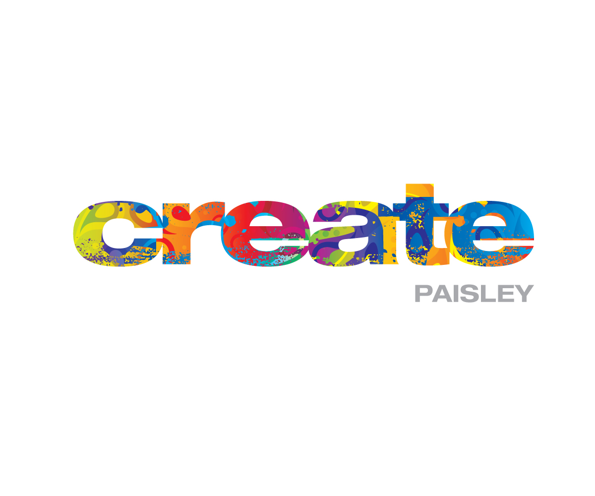
This customer received 48 logo designs from 10 designers. They chose this logo design from Simon Hon as the winning design.
Join for free Find Design Jobs-
 £180
£180
-
 48 designs
-
 10 designers
Logo Design Brief
Create Paisley is looking to rebrand its visual identity including logotype, colour palette, and typography. Create’s original logo was a simple, unplanned design that represented more of the Paisley street culture. Though we continue to connect with young people of this demographic, we are are also looking to relate to a wider audience and gain the support of schools, churches, grant funders, the local council, and the wider community. Our brand should represent who we are and what we do. We are an innovative, grassroots youth charity empowering young people through music, the arts, and media. See our attached branding pyramid for more details.
Our goal is to establish a visual identity for Create Paisley to be used on all printed materials (i.e. business cards, letterhead, brochures, etc...) and digital media (website, social media, etc...) by 31 October. Design submissions should be presented by 2 October, 2014.
Initial design submissions should be presented by 2 October, 2014. Submissions should include two to three potential designs including logotype, colour palette, and typography with descriptions of how the design fits within the branding pyramid. Designs will be received from multiple artists and reviewed for selection. The designer of the selected visual identity will then need to complete visual identity guidelines for usage. For details of Create Paisley, its work, and objectives, refer to the attached Create Branding Pyramid and Offerings and Outcomes List.
Stage One:
Submit two to three potential designs by 2 October, 2014 including the following elements based on the Create Branding Pyramid and Offerings and Outcomes List with descriptions of how each design fits within the Branding pyramid.
• Logotype
• Colour palette
• Typography
• Sample business card, letterhead, and t-shirt !incorporating design elements into each.
Stage Two:
The designer of the selected visual identity will need to complete a visual identity guideline for proper logo, colour and typography usage.
Use of the visual identity will represent Create Paisley internally within the charity and externally for publicity through all forms of print and digital media.
We want our audience to think or feel that this is a relevant and authentic community of people where young people can express their creativity, feel accepted, and do innovative things to help the community be a better place. We want our audience to get involved as young people, volunteers, and partners.
Our organisation’s tone of voice is imaginative, relational, active, authentic, relevant and optimistic.
Brand essence:
We are a creative, grassroots youth charity.
Personality:
We are an innovative, grassroots charity engaging and empowering young people and the wider community to inspire the positive transformation of Paisley through creative a!ctivism, media, culture and the arts.
Top 5 Features:
1. We are a safe community for young people that encourages freedom of expression through music, media, arts, and culture.
2. We develop self-confidence by being inclusive and through youth lead activities.
3. We facilitate personal development through education and training, and provide opportunities for physical, emotional, and spiritual enrichment.
4. We positively impact our town, Paisley, and county through creative media, social justice.
Our competitors are Erskine Music & Media Studio, Loud ’n Proud, and YMCA Paisley. Erskine Music & Media’s message is: A diverse, strong community for young people run by young people centred around music and media. Loud & Proud’s message is: Scotland’s best music school - playing, teaching and living rock and roll. YMCA Paisley’s message is: Bringing peace, hope and justice to broken lives. (Their message is unclear, but they do street work with young people.)
• Brand should be accessible to young people ages 12-25 years old.
• Brand should represent credibility to partnership organisations, funders, and the community.
• Brand should be reflective of Paisley and the wider Renfrewshire community.
• Possible appropriate branding imagery might include musical imagery, audio/video imagery, arts imagery, iconic buildings within Paisley, representative themes of the town, or the Paisley pattern.
• Our visual identity and logo should have a universality to connect with young people of successive generations without being trendy. It should be simple and understated, but reflective of what we are about without ambiguity.
Brand usage and protocols should be defined by designer.
Target Market(s)
Our primary audience for Create Paisley is young people within Paisley and the greater Renfrewshire area aged 12-25. Our secondary audience is the wider community including schools, churches, and others involved and concerned with youth work. Our stakeholders are local, regional, and national funders who support youth work and/or the arts.
Industry/Entity Type
Charity
Logo Text
Create Paisley
Logo styles of interest
Emblem Logo
Logo enclosed in a shape
Abstract Logo
Conceptual / symbolic (optional text)
Font styles to use
Look and feel
Each slider illustrates characteristics of the customer's brand and the style your logo design should communicate.
Elegant
Bold
Playful
Serious
Traditional
Modern
Personable
Professional
Feminine
Masculine
Colorful
Conservative
Economical
Upmarket
Requirements
Must have
- See Project Description above...
- Needs to represent our culture. Paisley is an urban, post-industrial town built in the Victorian era. It is historically working-class and is also a suburb of Glasgow, Scotland's largest and culturally-rich city. Paisley has a long history in the craft and textile industry and has numerous arts organisations. Our logo/branding should be reflective of these aspects.
- The design should also emphasise the name "Create", not Paisley. Paisley is just our operating location.
Nice to have
- See Project Description above...
- Love this guy's style and especially love his logo: http://boxdoginc.co.uk
- The www.blurgroup.com logo is also nice... see attached.
- Maybe a hand-drawn look like Tim Burton, but not creepy: http://timburton.com/ Certainly doesn't need that look, just an approach. Modern, but urban.
Should not have
- See Project Description above...