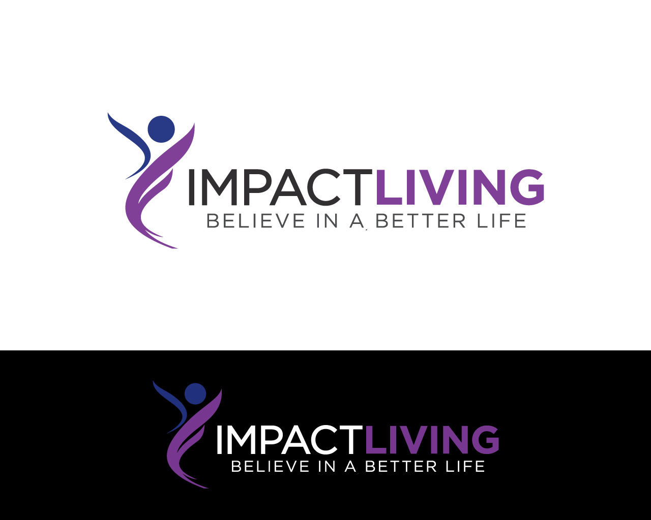
Award winning national supported housing charity needs a logo design

Want to win a job like this?
This customer received 39 logo designs from 19 designers. They chose this logo design from sooperdesigner1981 as the winning design.
Join for free Find Design JobsLogo Design Brief
Impact Living is a UK based not for profit organisation specializing in supporting young adults with a variety of issues such as homelessness, alcoholism, drugs and mental health.
Our current branding can be seen on our website www.impactliving.org
We would like a fresh logo design including a symbol that represents our core values:
Caring and support for our clients
We provide a quality home our clients can be proud of.
We care and support our clients giving them hope and belief in a better life.
We use the following pantone colours
PANTONE 2593 C - #7d2d97
PANTONE 2746 C - #0b1f8f
We would like an evolution of the current logo we are not bothered about keeping the three squares. We would like to use similar fonts.
Please provide original AI or PSD files with all layers in tact.
The current branding has the strap-line of 'safe supportive quality homes.'
We are going to change that to 'Believe in a better life'
IMPACT LIVING
Believe in a better life
Target Market(s)
People who fund the organisation including:
Other charities
Private sector companies
Philanthropists and people with a social conscience.
Industry/Entity Type
Charity
Logo Text
IMPACT LIVING - Believe In A Better Life
Logo styles of interest
Pictorial/Combination Logo
A real-world object (optional text)
Abstract Logo
Conceptual / symbolic (optional text)
Character Logo
Logo with illustration or character
Font styles to use
Look and feel
Each slider illustrates characteristics of the customer's brand and the style your logo design should communicate.
Elegant
Bold
Playful
Serious
Traditional
Modern
Personable
Professional
Feminine
Masculine
Colorful
Conservative
Economical
Upmarket
Requirements
Must have
- A Symbol reflecting our core values (see brief description)
Should not have
- inappropriate content
Do not include anything too ostentatious.
Three Squares(this part of the old logo needs to be phased out