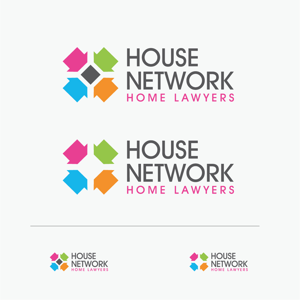
Improved logo for our successful estate agency business

Want to win a job like this?
This customer received 112 logo designs from 22 designers. They chose this logo design from ABG as the winning design.
Join for free Find Design JobsLogo Design Brief
We need to make our logo more dynamic and bolder, we've had the same logo for many years now, we like the colours of the existing 4 houses on the left hand side of the logo and our brand is powered these colours so would need to keep that in the theme, at the same time we're not afraid of change if it can be more exciting and bolder. We're a real estate company and we sell properties through england & wales up to 300 properties per month, we charge a very low fee typically £600 and we offer amazing customer service alongside a really good website which you can see www.housenetwork.co.uk.
We're 10 years old as a company, professional, proven, trusted, enthusiastic, modern but with traditional values. I've uploaded a copy of our existing logo. We're open to suggestions and are happy to drop the .co.uk part of the logo if need be BUT PLEASE PROVIDE BOTH VERSIONS.
We would also like to see versions of the logo with the strapline 'home of the clever seller' underneath it or someone else if you think it would work. So just to clarify we'd like versions:
- with .co.uk
- without .co.uk
- with the strapline 'home of the clever seller'
- without the strapline 'home of the clever seller'
It's important that the logo sits well within our current website and on social media, print media etc.
Industry/Entity Type
Business
Logo Text
House Network