3 pages for Textpayers.com (design required, not ecommerce coding)
Want to win a job like this?
This customer received 68 web designs from 6 designers. They chose this web design from webxvision as the winning design.
Join for free Find Design Jobs- Guaranteed
-
 £305
£305
-
 68 designs
-
 6 designers
Web Design Brief
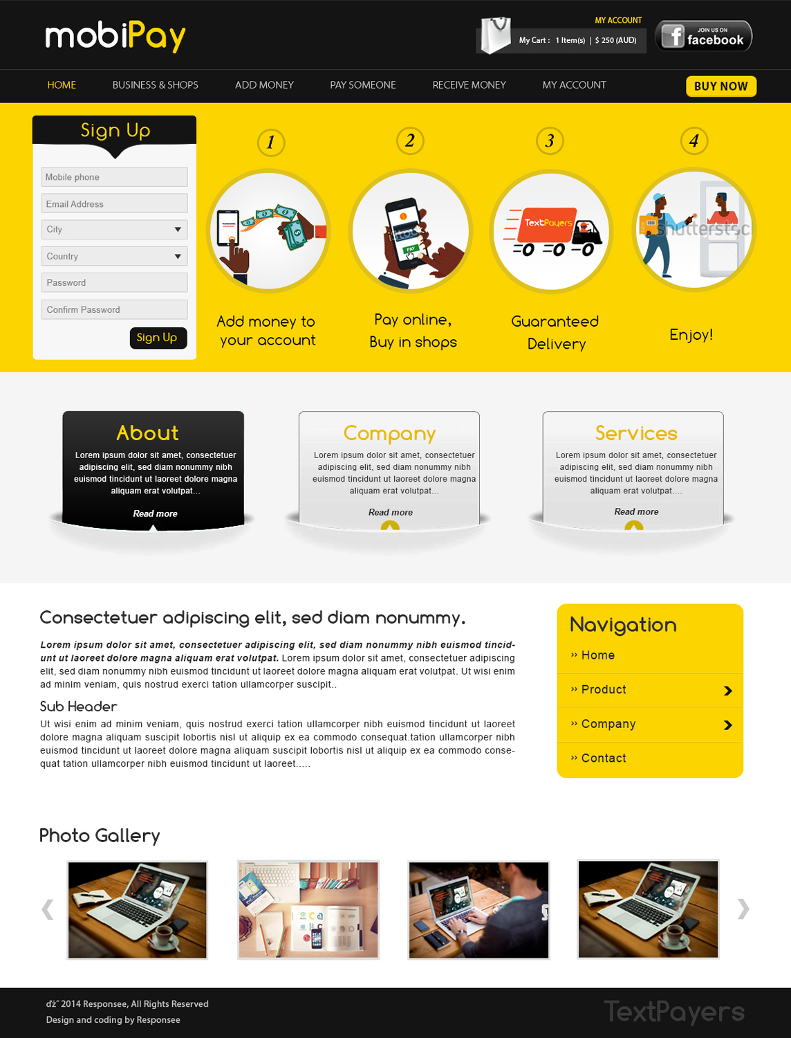
We are a new start up specialising exclusively in enabling e-commerce in Africa so that African businesses can place a "buy now" button on products and services they offer on the internet. The mechanism that powers this is heavily grounded in mobile payments.
Because of this, the service will also be used for in-shop and person-to-person payments.
The main objective for looking for a professional design is to encourage people and business owners that land on the website from computers or web devices to be impressed by its appeal and message and then eventually sign up.
We would like to see good use of black fonts on yellow backgrounds in the design.
Website source code attached.
Target Market(s)
Africa - Countries like Ghana, Nigeria, Cameroon, Zimbabwe, South Africa, etc.
Industry/Entity Type
E-Commerce
Number of Pages Required
3 page
Font styles to use
Look and feel
Each slider illustrates characteristics of the customer's brand and the style your logo design should communicate.
Elegant
Bold
Playful
Serious
Traditional
Modern
Personable
Professional
Feminine
Masculine
Colorful
Conservative
Economical
Upmarket
Requirements
Must have
- Key requirements of this design:
- 1. Suggest a simple text based logo
- 2. The design should be mobile responsive - current template is responsive
- 3. Pages:
- 1. Main Page: Should have a large graphic explaining our purpose. I have attached one we commissioned earlier. The final one should be bigger, maybe 940x400. Current illustrations shifted to the right and a large "Sign Up" button on the left. Under the graphic, should be a keyword heavy message to the visitor
- 2. Business and Shops page (business.php):
- Should have a large graphic maybe 940x400 illustrating the textpayers to businesses. Narrative should be on the right. It should show a "Pay with Textpayers" button and a click hovering and text to the right. This shows the narrative for online use. There should also be an illustration for in shop payments.
- The left of the graphic should be a larger "Sign Up" button for registering.
- 3. register page: registration requirements:
- 1. Mobile phone - text
- 2. Email address - text
- 3. City - drop down
- 4. Country - drop down
- 5. Password
- 6. Confirm Password
- Website source code attached.
Nice to have
- lots of yellow background... under black text ..
Should not have
- We are not big on flash.
- Also, this is not for ecommerce coding. we are more interested in the design.