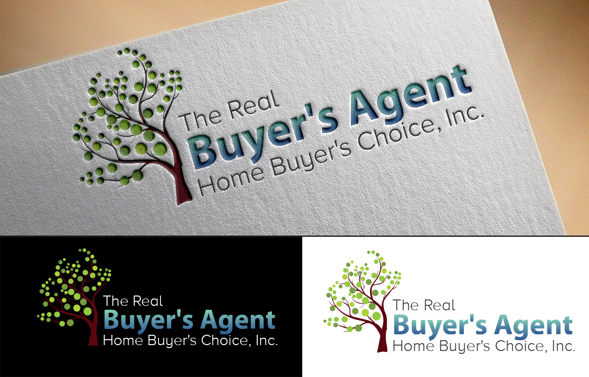
Residential Real Estate Agency Logo & Business Card

Want to win a job like this?
This customer received 147 logo designs from 31 designers. They chose this logo design from MT as the winning design.
Join for free Find Design Jobs- Guaranteed
- Bundled Project 1
Logo Design Brief
We need a logo and business card (tent style) for an existing real estate team in Mount Pleasant, South Carolina which is located just minutes from Charleston. The existing site, logo, business cards, marketing materials, etc. are quite dated in terms of typography, colors, logo image, etc. and we are separately redesigning all components.We are looking for fresh designs, that will stand for a period of at least five years. Color choices should translate warmth yet vibrance of living in an ocean community. Very open to again relevant, tending colors with the power to last.Emphasize: BUYER'S AGENT in logoDue to legal requirements the logo text is quite lengthy. See above comment on the emphasis of words when designing. According to law we must list the "DBA" (doing business as" as well as our legal entity which should be de-emphasized in size.Small real estate firm so like it to look more "boutique" in feel.Font Style choices we like include "The Brandon Grotesque Designed by Hannes Von Dohren," Proxima Nova, and Myriad Pro Regular. Typograhy is important. New web design has strong focus on flat design, mobile responsive, and vibrant with scroll navigation with video embedded content.See attachment of logo designs we dislike.
Updates
On all designs, if you are incorporating design art images, please explain your thought process.Keep in mind, the logo does not need to have art images. You can select any style for the logo as long as it is relevant to current marketing trends and can have some "staying" power.Good work thus far.Note: the entire legal name needs to be in the design. Feel free to use "The Real" and "Home Buyer's Choice, Inc." as borders. Get creative as long as BUYER'S AGENT stands out. Added Tuesday, February 17, 2015
Creative Brief Add On Instructions:1. Avoid cliché images and symbols: overused design concepts like building structures, roof tops, and homes.2. Other symbols: think unique. What other unique patterns represent the real estate business? Geometric shapes likes boxes, triangles, origami-style symbols give a different approach while maintaining the meaning of real estate.3. Although real estate deals with houses and buildings-what other images can represent a house or give the feel of a home? Think trees, picket fences, keys, locks, stone pillars…images can be countless.4. Experiment with typography – you do not have to add an image or a symbol in the logo; strong typography also works well. Nothing childish.5. Colors: like blue, grey, silver, gold, black, and brown commonly represent professionalism but you can compliment/contrast these colors with red, orange, yellow, purple, etc. to have a more relevant trendy edge.Remember, we do not like the same old images and want something different. In terms of this real estate agency think of these terms:• boutique• high touch• flexible• advocate• educator• accommodating• full servicePlease: do not forget to explain your approach and how your concept represents this real estate business. Added Wednesday, February 18, 2015
Project Deadline Extended
Reason: Several late submissions need to be reviewed.
Thanks,
David
Added Tuesday, March 3, 2015
Target Market(s)
The age demographic is all age groups however current trends show young professionals and young families predominantly buying into this growth area.
Industry/Entity Type
Real Estate
Contact Information for Business Card
Business card will be a tent style. If you have other options that may "stand out" and provide an area for messaging, please show. Open to new layout from traditional.
All logo images should submit a business card as well.
Logo Text
The Real Buyer's Agent, Home Buyer's Choice, Inc.
Logo styles of interest
Pictorial/Combination Logo
A real-world object (optional text)
Wordmark Logo
Word or name based logo (text only)
Lettermark Logo
Acronym or letter based logo (text only)
Font styles to use
Other font styles liked:
- Font Style choices we like include "The Brandon Grotesque Designed by Hannes Von Dohren," Proxima Nova, and Myriad Pro Regular.
Look and feel
Each slider illustrates characteristics of the customer's brand and the style your logo design should communicate.
Elegant
Bold
Playful
Serious
Traditional
Modern
Personable
Professional
Feminine
Masculine
Colorful
Conservative
Economical
Upmarket
Requirements
Must have
- Must have use of "BUYER'S AGENT" prominent in the typography of the logo. Like the ELPIS, Nest, and Golden Gate logos styles but you should not replicate but gives indication of style.
Nice to have
- Vibrant but professional color schemes.
- See fonts: Font Style choices we like include "The Brandon Grotesque Designed by Hannes Von Dohren," Proxima Nova, and Myriad Pro Regular.
- Like abstract imagery.
Should not have
- Should not use the color GOLD.
Files
Download all files - 0.2 MBPayments
Total
US$519
Project Deadline
09 Mar 2015 16:21:35 UTCProject Upgrades
Bundled project(s)
- offering US$80 business card design to winner