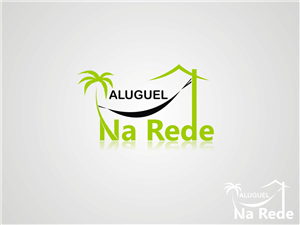
Aluguel Na Rede (Rent On The Net)
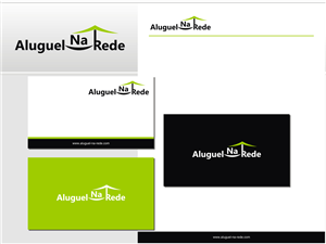
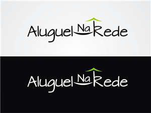
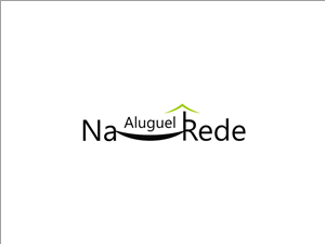
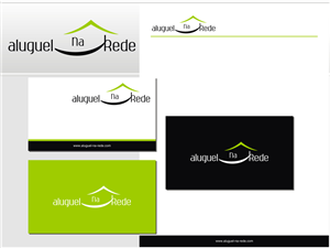
Aluguel Na Rede needed a logo design and received 51 Elegant, Playful, Internet logo designs from 8 designers
Designs
Designers
Budget

1 - 20 of 51 logo designs submissions
This is what Aluguel Na Rede was looking for in their logo design
My company is a website for Real State rental services.
I draw a kind of logo I like, but I do not have the tools or talent of a designe. Therefore, it would be nice to see how you would work on it. See attachment.
The idea of the name comes from the double sense the word Net has, so that someone who is renting using the net can be on the internet or just relaxing lying on a net.
The facility and confort are the main message behind the name, and once we work with season rents it would meet with peacefull colors (sky blue, ocean green...) - feel free to change, this is just my mind thinking but I am not a designer.
We will sell services to help the contractors and renters on their research, one more motive to foccus on the facility and the confort.
We are Brazilian, but it pretends to be an international website. The words are in Portuguese. Aluguel Na Rede = Rent On The Net
Read more