physiotherapist needs creative but clear logo design of Xrecovery
Xrecovery needed a logo design and received 111 Conservative, Professional logo designs from 51 designers
Designs
Designers
Budget


1 - 20 of 111 logo designs submissions
This is what Xrecovery was looking for in their logo design
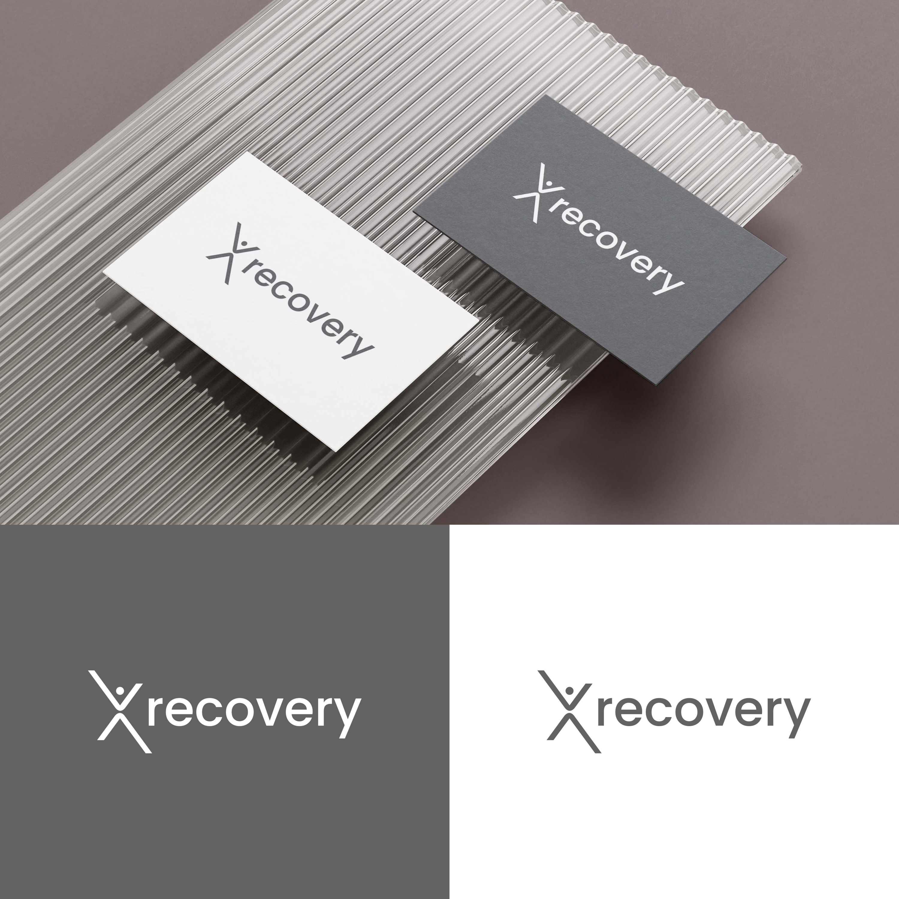
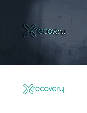
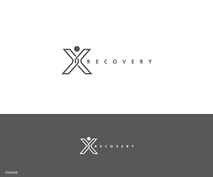
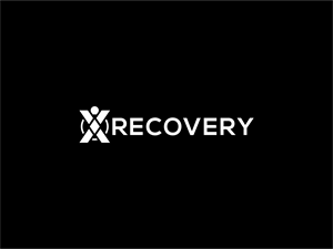
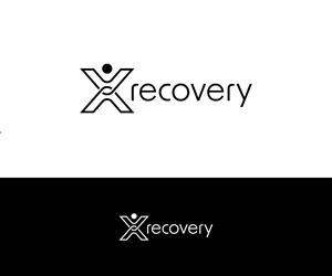
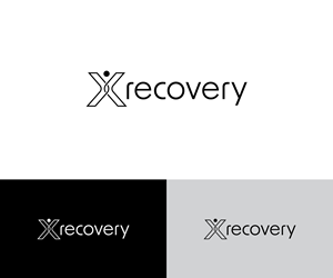
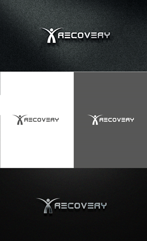
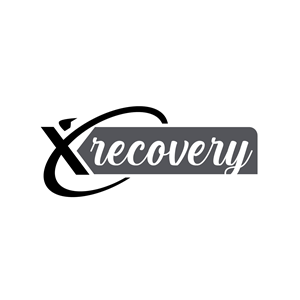
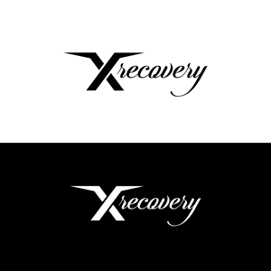
I need a logo design for a fresh start with a new website for my clinic. The name is Xrecovery based in Denmark. My name is Ronnie, I am a 42 year old male.
My specialty as a therapist is to test my clients' compensation patterns and find out the reasons why they have pain in their body. Then we work to activate the muscles and areas of the body that are closed down. I also work with performance optimization.
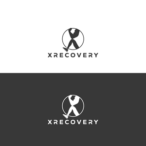
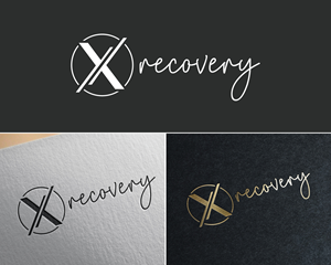
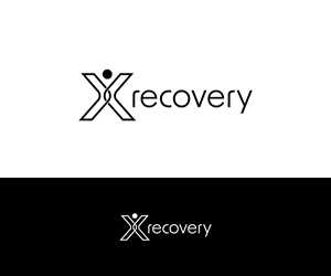
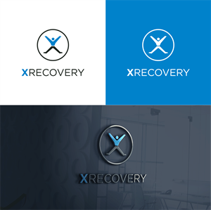
The reason I chose the name Xrecovery for my website is that for me the X symbolizes the body. Arms and legs, can you see it? :)
Another thought for the X is that all constructions must have a strong foundation. For me, the most important muscles in the body are those located centrally, which are popularly called the core muscles. The center of the X.
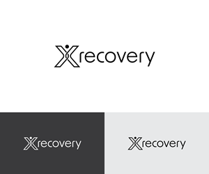
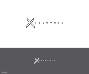
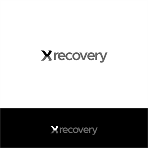
My immediate thought is that the X should be the logo itself, and recovery should be next to it.
Regarding colors, my immediate thought is that the logo should be white or black/dark grey
The …
Read more