South Origin — Manuka Honey Logo (Nature-Origin style, EN/CN bilingual)
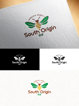
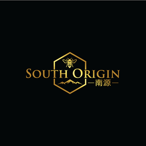
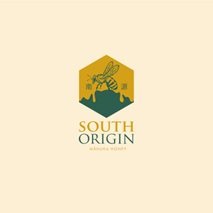
Primary: South Origin ;Chinese companion (optional): 南源 Descriptor for product lockup (optional): Mānuka Honey needed a logo design and received 28 Modern, Professional, Food manufacturing and health product manufacturing industries logo designs from 8 designers
Designs
Designers
Budget


1 - 20 of 28 logo designs submissions
This is what Primary: South Origin ;Chinese companion (optional): 南源 Descriptor for product lockup (optional): Mānuka Honey was looking for in their logo design
About the brand
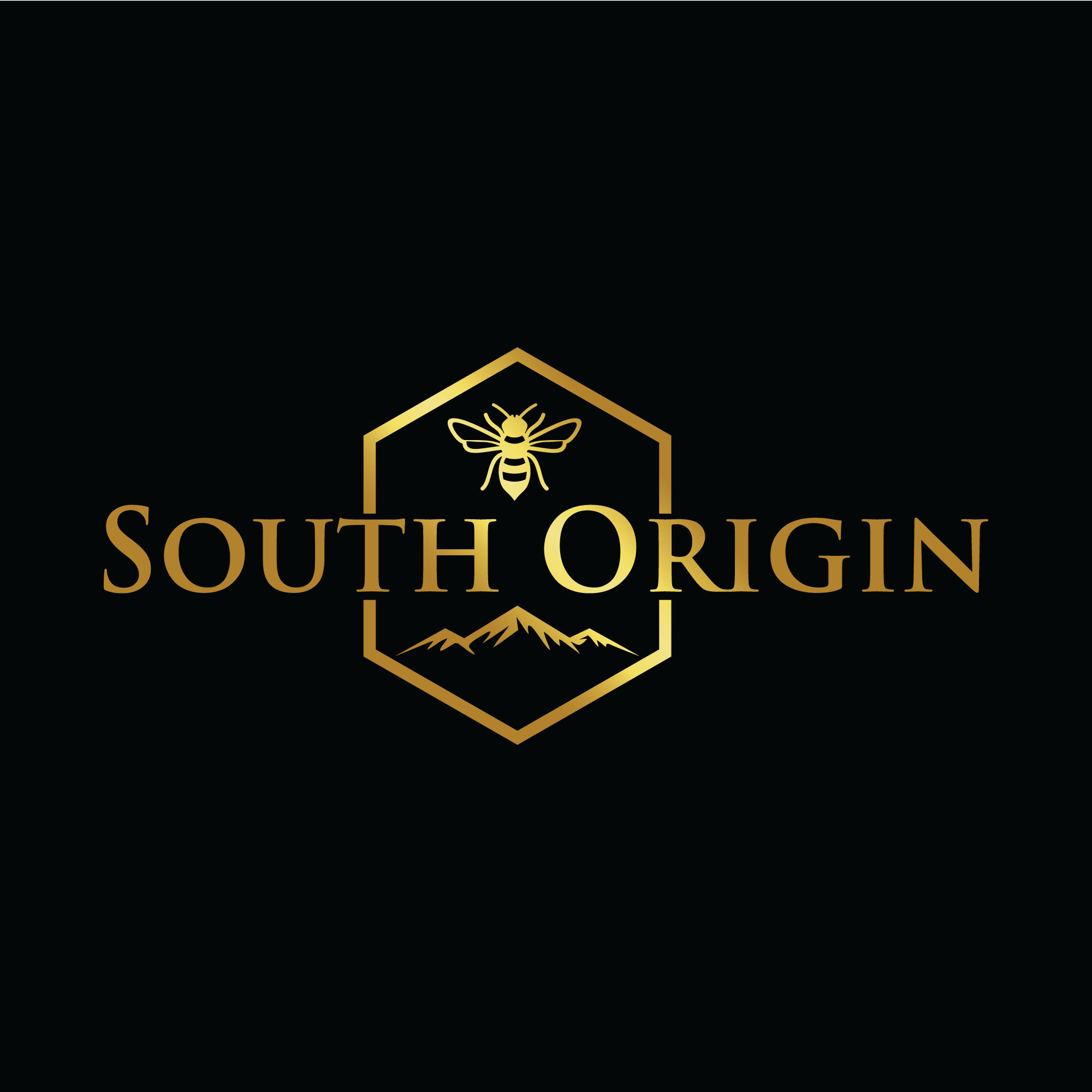
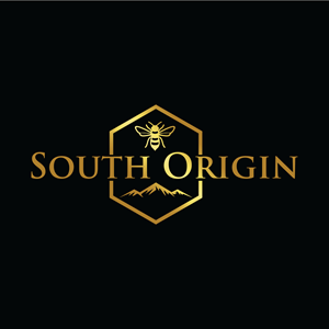
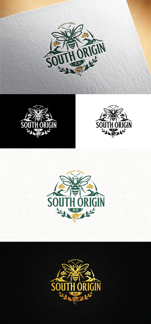
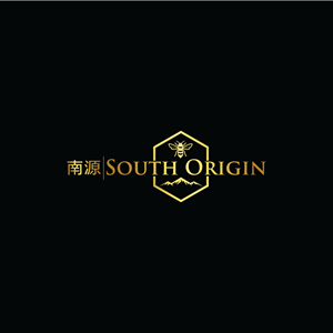
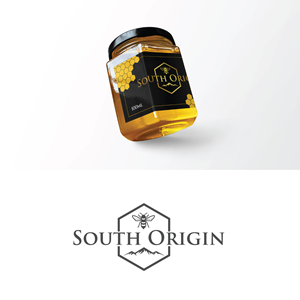
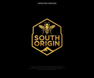
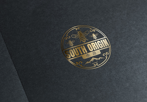
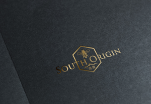
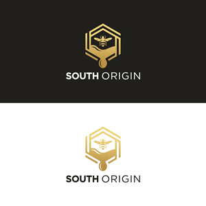
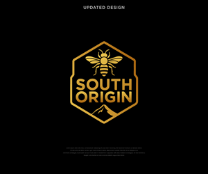
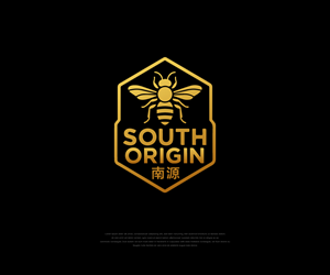
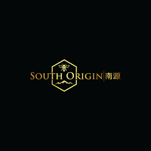
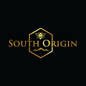
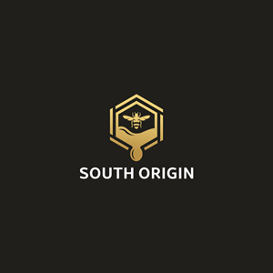
South Origin is a New Zealand-based Manuka honey brand exporting to China. We want a nature-origin look and feel that communicates purity, trust and provenance (forests, bees, mountains, clean water).
Audience & use
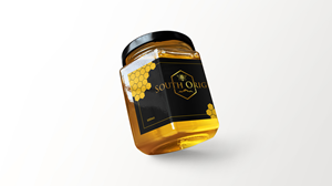
Premium FMCG consumers in NZ & China. The logo must work on jar labels (250g/500g, round lid), shipping boxes, website header, social avatar and small favicons.
What we want
• Primary wordmark: “South Origin”.
• Optional CN companion wordmark: “??” (please provide a bilingual lockup version).
• A simple, memorable symbol (optional): abstract bee/hexagon/honey drop/leaf/hill—subtle and refined, not cartoonish.
• Style: minimal, organic, calm; avoid medical/clinical crosses or national flags.
• Must be highly legible at small sizes and look good in 1-color/white-on-dark.
Deliverables (required)
• Vector logo (AI/EPS/SVG) + editable text.
• RGB/CMYK/HEX & Pantone swatches; black/wh…
Read more