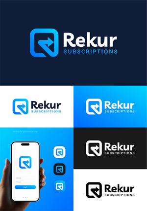
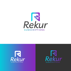
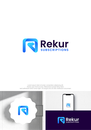
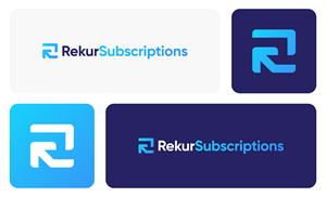
Subscriptions app logo for B2B software
Rekur Subscriptions needed a logo design and received 129 Upmarket, Modern, Saas ecommerce logo designs from 64 designers
Designs
Designers
Budget


1 - 20 of 129 logo designs submissions
This is what Rekur Subscriptions was looking for in their logo design
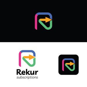
There are two parts to the logo we need to think about: the icon, and the full logo.
Icon:
- Will be represented as a square icon. See attachment for examples of competitors, logo needs to stand out on this page
- Thinking an arrow with a unique tail to show that we specialize in subscriptions
- Instead of a clean circle, show more of a curved line to represent that it’s not as simple as recurring billing, or one that looks a bit like an “R”
- I like the idea of a black or dark coloured background with white or bright colours
- Try splitting up the arrow into 4 or 5 sections, each represented by a colour or pattern (each section will represent a part of the subscription flow that our app manages)
- See attachment with some scribbles to help explain what I mean
Full Logo:
- Use the icon from above, but without the square surrounding it
- "Rekur Subscriptions" should be a sans-serif font, clean, professional, maybe slightly italic. Font …
Read more