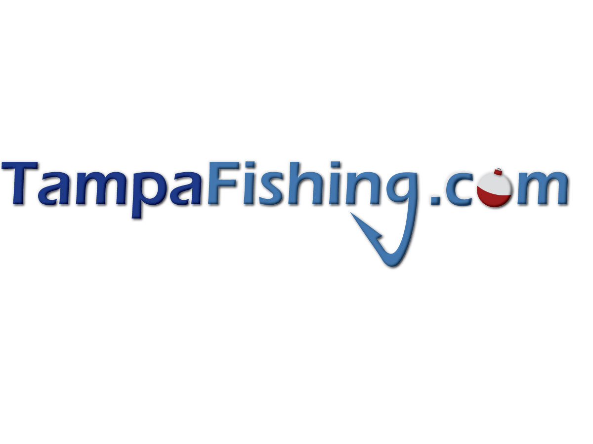
TampaFishing.com
TampaFishing.com needed a logo design and received 31 Bold, Modern, Domain logo designs from 5 designers
Designs
Designers
Budget

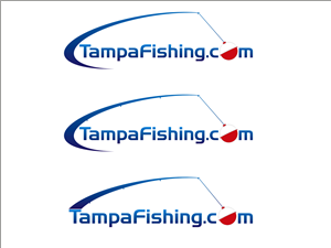

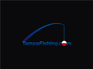
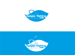


1 - 20 of 31 logo designs submissions
This is what TampaFishing.com was looking for in their logo design
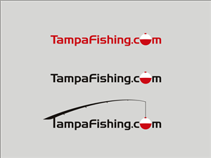
This is a primarly a website logo. It may also be used for the side of a boat. I would like to keep the dementions similar to the way it is typed above. I would like for the domain to be easy to read and very memorable. I think keeping the T and F Captialized would be best since it is all one word. I was thinking about making the O in .com a tradational white on top red on bottom bobber. I was thinking if the letters are circular three dimentional it would be easy to incoporate the red and white in a bobbler like design. I also thought about making the g into a hook. I am open to either which ever looks best the hook or the bobber would be my trademark. I put a copy of another site logo im not really using to give and Idea of what i am thinking. Though I would like the bobber to fit the surrounding text better and still resemble and o. Read more