I.T. On Call Store
Want to win a job like this?
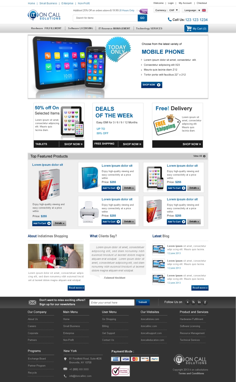
This customer received 109 web designs from 18 designers. They chose this web design from Sbss as the winning design.
Join for free Find Design Jobs- Guaranteed
-
 US$1165
-
 109 designs
-
 18 designers
Web Design Brief
The design is for eCommerce home page but I would like it to complement this site: http://www.itoncallsolutions.com/ but... it should also have independence as a standalone site.
The best design will be able to effectively mix corporate with a high quality small business consumer feel. It should be completely custom design, not a template look or feel. I want the users to get the feeling that this is the place to go for buying tech for business. We sell the same products as CDW.
You can be creative as you wish, as long as the elements of a great eCommerce site are present.
I would like your 'design' to blow these away:
http://www.shopping.hp.com/
rakuten.com
http://www.cdw.com/
Here are references:
Call to action
http://econsultancy.com/us/blog/62829-seven-tips-for-designing-an-effective-ecommerce-call-to-action
Effective Ecommerce design
http://www.inc.com/ss/7-tips-for-effective-e-commerce#0
91 points of ecommerce
http://moz.com/blog/holygrail-of-ecommerce-conversion-optimization-91-points-checklist
UPDATE 07/11/2013:
Please look at the category sample png files. I see already many people are using the main menu from itoncallsolutions.com and I do not mind your creativiety, but this is an eCommerce store and people need a menu to get to the categories and/or product types. I don't want to limit anyone creativity by the png samples. I'm also not using them to show I like them in any particular way or form, just that it's needed, whether it's a button (dropdown of course) that says 'Categories' or 'Products, whether it an accordion, horizontal or vertical.
Thanks
UPDATE 07/12/2013:
Please find other use of space that has been used for About Us paragraph (if you've added it to the page). About Us should have it's own page and the purpose of the design should be to sell products (and some services as products). Please put a link or some other creative method to lead users to the About Us page.
Updates
Project Deadline Extended
Reason: I've raised the award, including 1st, 2nd, and 3rd place and participation payments so I will also extend 7 days.
Thanks!
Added Thursday, July 11, 2013
I've updated the product brief. Please scroll down to where it says: UPDATE 07/11/2013
Thanks!
Added Thursday, July 11, 2013
UPDATE 07/12/2013:
Please find other use of space that has been used for About Us paragraph (if you've added it to the page). About Us should have it's own page and the purpose of the design should be to sell products (and some services as products). Please put a link or some other creative method to lead users to the About Us page if you must but not on the real estate of the page.
Thanks!
Added Friday, July 12, 2013
Added updates to the brief 7/14/2013.
Thanks!
Added Sunday, July 14, 2013
The voting is in and the project is complete. Thanks everyone for joining, all of those who participated are truly amazingly talented. But, there were only 3 prizes. I will be having further projects down the line to develop other pages to this site after the initial implementation is completed. I truly would like to have you all back.
- Thank you.
Added Friday, July 26, 2013
Target Market(s)
corporate decision-makers AND small business consumers
Industry/Entity Type
Small Business
Look and feel
Each slider illustrates characteristics of the customer's brand and the style your logo design should communicate.
Elegant
Bold
Playful
Serious
Traditional
Modern
Personable
Professional
Feminine
Masculine
Colorful
Conservative
Economical
Upmarket
Requirements
Must have
- Call to action.
Openness (non-clutter).
These elements:
Search box
Logo
Tagline
Telephone number
Contact details
Address
My account / sign in
Shopping basket / checkout link
Latest offers
Promotional area
Email sign up
Delivery information
About us
Link to press office / corporate site
Terms and conditions
Sitemap for the footer.
Delivery offers: free
Personalized recommendations
Social media links
Accepted payment methods
Link to blog or community section
Change language / country
http://bigideasblog.infusionsoft.com/sales-leads-landing-page/
UPDATE 07/14/2013
Category Menu. This can be a dropdown, horizontal, vertical, etc. But shoppers need to know how to get to the products they want to buy.
Nice to have
- Trustmarks
Blog/Blog link
UPDATE 07/12/2013:
Make the footer useful.
UPDATE 07/14/2013 (Suggestions of elements to differentiate your designs)
-Quick Shop: A quick buy module/section: Where a user can put in a SKU number or Model number to quickly add the product to their shopping cart.
-Featured
-Best Sellers
-Specials
-Trending Tags/Tag Cloud
- Activity Stream
- Cross Sell/ Up Sell
- Testimonial
- Social Network Feed
- Live Help
- Feedback/Support/Contact Tab
- Show logged in user (i.e. Welcome, John Doe)
Should not have
- The design SHOULD NOT be generic like this:
http://www.designcrowd.com/design/52392
http://www.tigerdirect.com/
The page should not feel over cluttered. It should not have low quality icons or design elements. Navigation should not be hard to discover or confusing.