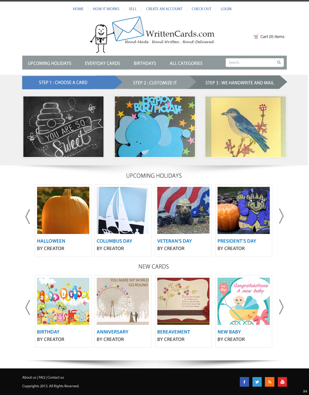
Online Greeting Card Marketplace redesign

Want to win a job like this?
This customer received 46 web designs from 11 designers. They chose this web design from pb as the winning design.
Join for free Find Design JobsWeb Design Brief
WrittenCards.com is a two-sided greeting card marketplace. Buyers purchase hand-made cards online, indicating their message. Sellers hand-write the message and mail directly to recipient.
We are getting decent foot traffic but low sales. I'm also not drawing a lot of Card Designers to sell their products. Feedback has been that it's cluttered, boring, and out of date.
I've always enjoyed vibes such as Tori Spelling and Martha Stewart. I was going for pale blues and chocolate browns (as can be seen in WrittenCards Facebook and Twitter pages).
Attached document is my not-so-great attempt to redesign, which is uninviting and unpolished.
Need a new homepage and a second similar page when shopping (click on any category to see what I mean, e.g. Halloween).
Updates
Project Deadline Extended
Reason: To allow requested changes to be completed.
Added Wednesday, September 18, 2013
Industry/Entity Type
Shopping
Look and feel
Each slider illustrates characteristics of the customer's brand and the style your logo design should communicate.
Elegant
Bold
Playful
Serious
Traditional
Modern
Personable
Professional
Feminine
Masculine
Colorful
Conservative
Economical
Upmarket
Requirements
Must have
- I think my logo (stick drawing of a man with an envelope) is what is currently driving a lot of traffic and should stay in the design, pending minor tweaks.
I'll need all the details of the final design to give to the programmers (font styles, color numbers, etc).
Nice to have
- I was thinking of a dotted frame to surround each picture? White Pearl luminescent or a metallic? I just don't know if it works.