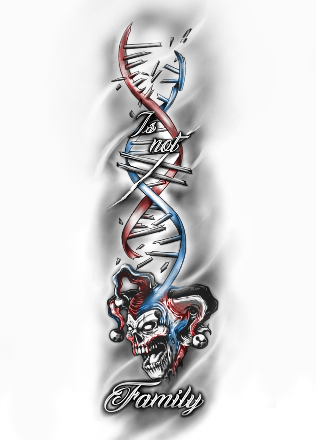
DNA does not equal Family
Want to win a job like this?
This customer received 36 tattoo designs from 8 designers. They chose this tattoo design from Jezzus as the winning design.
Join for free Find Design Jobs- Guaranteed
-
 €90
€90
-
 36 designs
-
 8 designers
Tattoo Design Brief
Start with the design I've attached, but it's not as good as I want. DNA is too long and stretched out and doesn't shout "DNA", I don't like the way they've tried to integrate the "does not equal" sign, and I think I want "Family" perpendicular to the overall direction of the rest of the piece. I would also like some colored highlights to the jester (I've included a pic of that for reference as well) and maybe in the DNA strand? Also I do not like the way they've just stamped the initials at the bottom - any way to work them in better? Lastly, I'm not sure the jester's face will translate well into a tattoo?
Will be on forearm from elbow to wrist, roughly 20 or so centimeters
Lastly, everything else I have is black/white. For this one I don’t want overwhelming color, I’d like to make the jester (and maybe the DNA?) pop with maybe some highlights, but not full color.
Font styles to use
Look and feel
Each slider illustrates characteristics of the customer's brand and the style your logo design should communicate.