Grigg Thoroughbreds Logo Design
Want to win a job like this?
This customer received 50 logo designs from 19 designers. They chose this logo design from AlexMorisseau as the winning design.
Join for free Find Design Jobs-
 A$120
A$120
-
 50 designs
-
 19 designers
Logo Design Brief
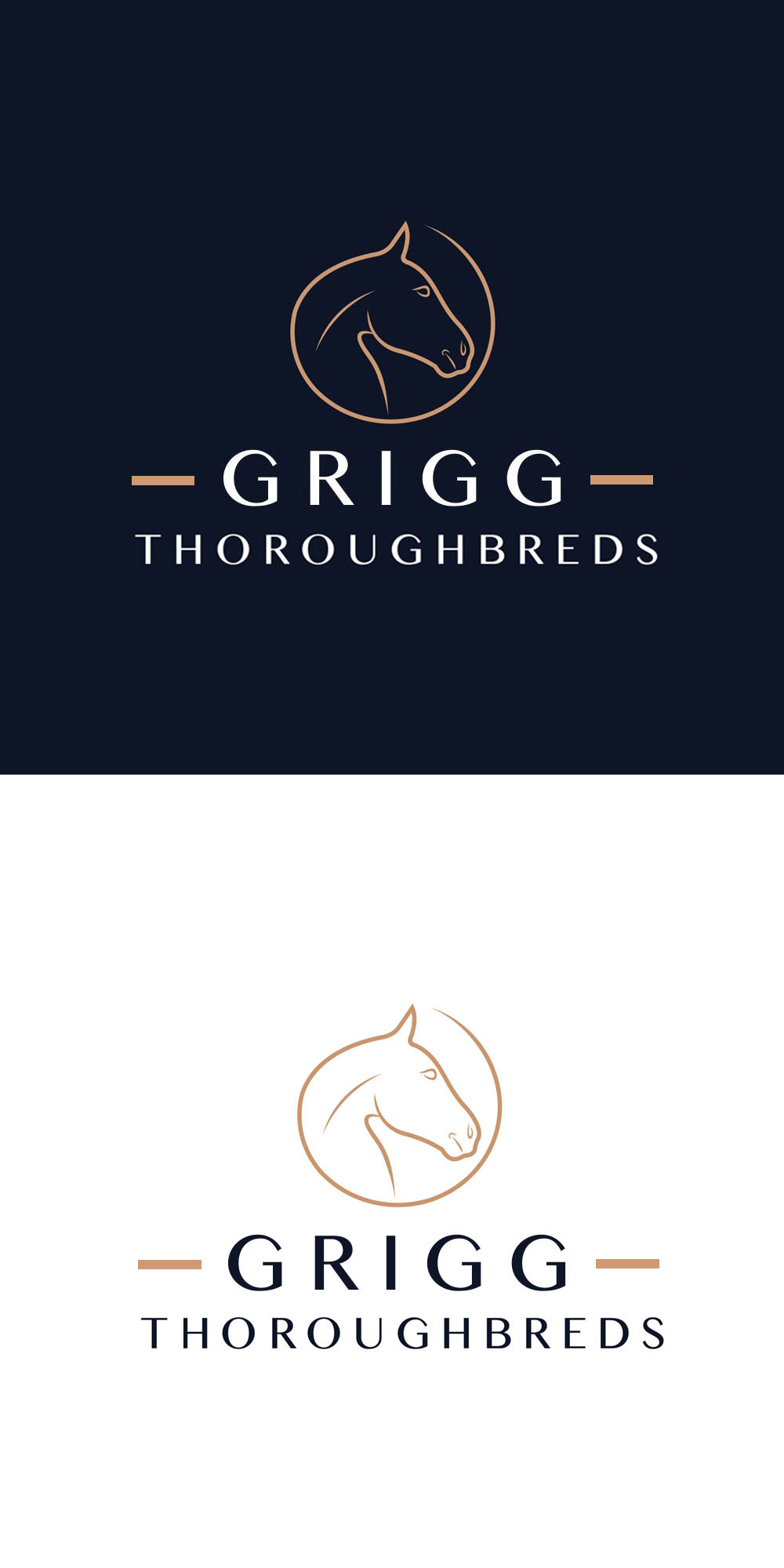
I have the exact font, the exact horse head part of the logo and the exact colours that I want used for the logo, I just want the sizing and design element improved so that the logo would look good on a baseball or trucker cap.
I would like the horse head component to be at the top of the logo.
Centered beneath the horse head component I would like the word GRIGG (in the exact font provided). Beneath the word GRIGG I would like the word THOROUGBREDS centered (in the exact font style but slightly smaller font).
As the word GRIGG is shorter than THOROUGHBREDS I would like two horizontal lines on both sides of the word GRIGG to meet the start and ending of the word THOROUGHBREDS so it looks balanced.
The horse head part of the logo is TAN coloured (provided)
The wording "GRIGG THOROUGHBREDS" is white on a dark navy background.
The horizontal lines on the both sides of the word GRIGG should be tan coloured, the same as the horse head please.
Target Market(s)
Thoroughbred breeding / racing enthusiasts
Industry/Entity Type
Thoroughbred Industry
Logo Text
Grigg Thoroughbreds
Colors
Colors selected by the customer to be used in the logo design:
Look and feel
Each slider illustrates characteristics of the customer's brand and the style your logo design should communicate.
Elegant
Bold
Playful
Serious
Traditional
Modern
Personable
Professional
Feminine
Masculine
Colorful
Conservative
Economical
Upmarket
Requirements
Must have
- The exact colours, horse head logo and font type. This is an established business.
Nice to have
- The logo needs to look balanced and to fit nicely on a peaked cap.
Should not have
- Please DO NOT use any colours other than those provided provided in the supporting images uploaded