Grigg Thoroughbreds Logo Design
Grigg Thoroughbreds needed a logo design and received 22 Bold, Serious, Thoroughbred Industry logo designs from 8 designers
Designs
Designers
Budget


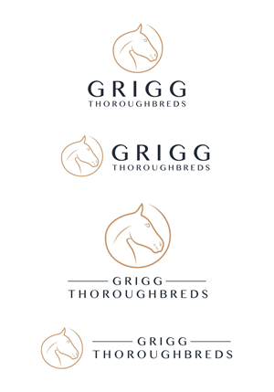


1 - 20 of 22 logo designs submissions
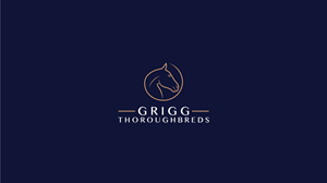
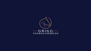
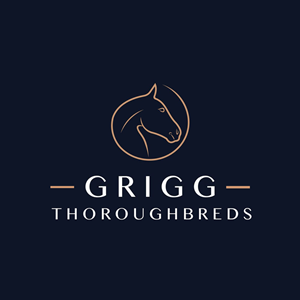
This is what Grigg Thoroughbreds was looking for in their logo design
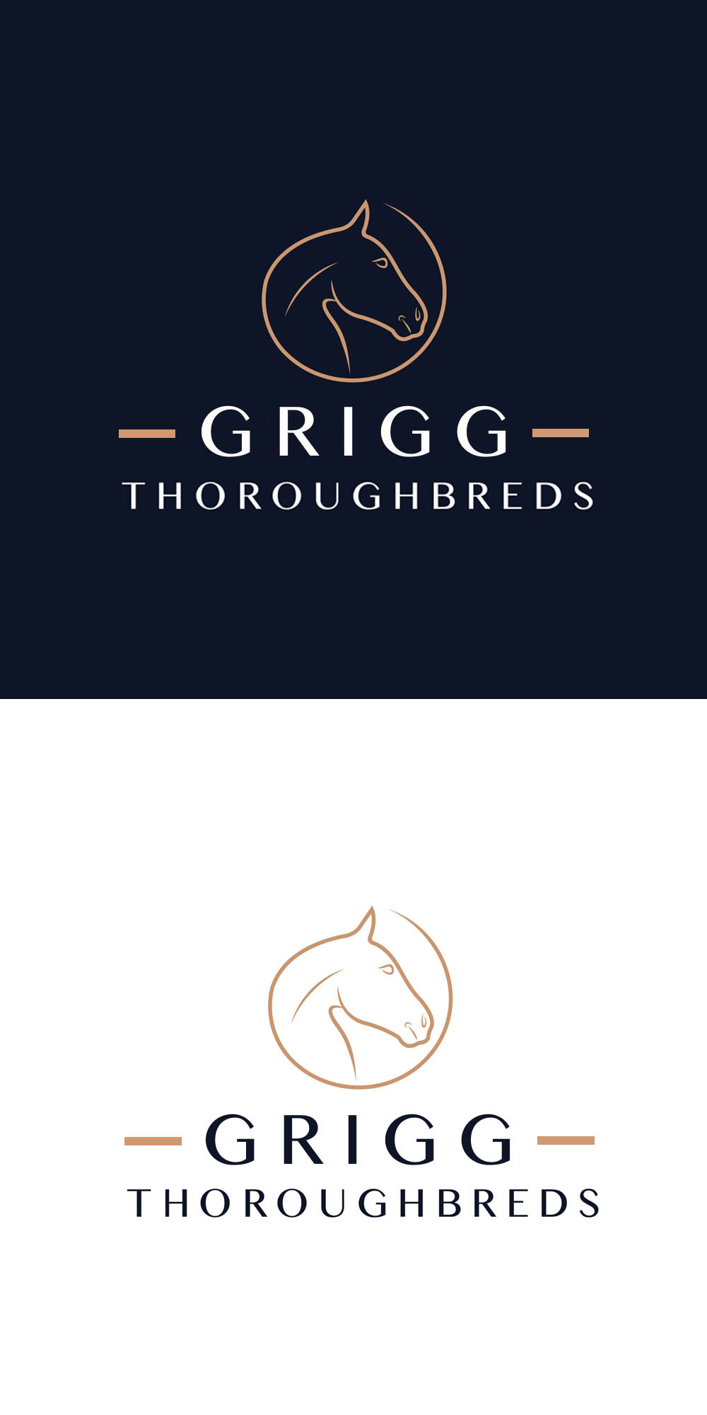
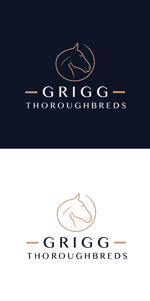
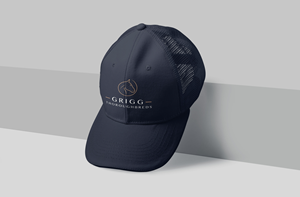
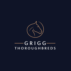
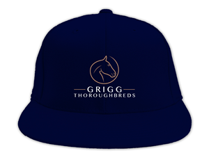
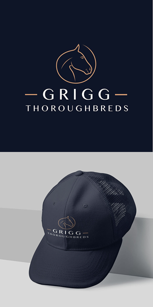
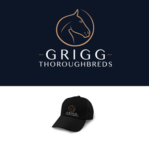
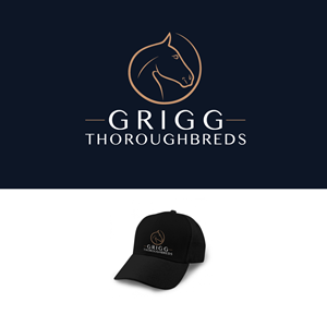
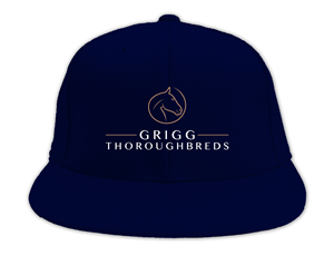
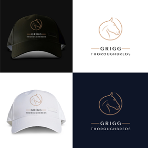
I have the exact font, the exact horse head part of the logo and the exact colours that I want used for the logo, I just want the sizing and design element improved so that the logo would look good on a baseball or trucker cap.
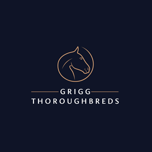
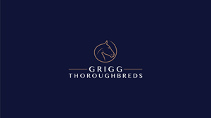
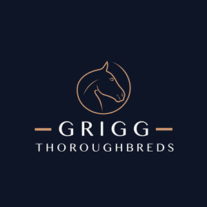
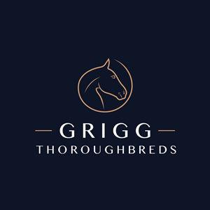
I would like the horse head component to be at the top of the logo.
Centered beneath the horse head component I would like the word GRIGG (in the exact font provided). Beneath the word GRIGG I would like the word THOROUGBREDS centered (in the exact font style but slightly smaller font).
As the word GRIGG is shorter than THOROUGHBREDS I would like two horizontal lines on both sides of the word GRIGG to meet the start and ending of the word THOROUGHBREDS so it looks balanced.
The horse head part of the logo is TAN coloured (provided)
The wording "GRIGG THOROUGHBREDS" is white on a dark navy background.
The horizontal lines on the both sides of the word GRIGG should be tan coloured, the same as the horse head please.
Read more